Design submitted by Sam from Germany.
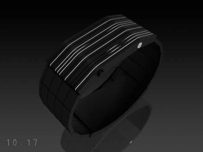
Sam says: “This was a spontaneous idea. I looked at my Playstation 2 (the biiiig old one) and saw the gaps. I imagined, how it would look if the gaps are lit up. Then I thought about how to tell the time in lines.
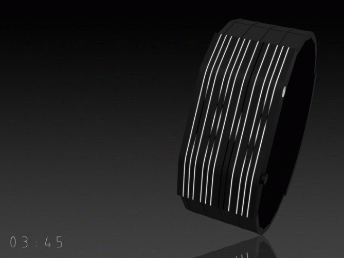
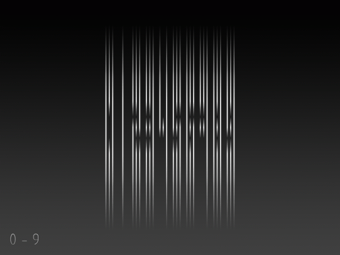
The watch shows the four digits of time (or the date, if pressing the button twice). Each number is made of three long vertical lines. Those lines are interrupted in certain regions and therefore create the shape of the known numbers. The case and straps are made of dark brushed gunmetal. The case in bent and adapts to your wrist. This watch design is suitable for all and is somewhere between a bracelet and standard watch, so it might appeal to both men and women. It does not look too extravagant but still stylish. It is neutral in color but extraordinary in it’s appearance.”


excellent design, I loke the force of the shapes. AWESOME.
LikeLike
Hi Sam, I can not read the numbers? Could you give me an example of exaggeration for me to understand?
LikeLike
@ Gabriel: thank you 🙂
@ Patrick: Sur la seconde image, essayer de brouiller votre vue (fermez les yeux presque complètement ou louchez légèrement) Et concentrez-vous sur la section du milieu aves ces interruptions.
I hoped to find a balance between readability and “ehhh what?” 🙂
LikeLike
My first impression was: that one looks so good to my suit. Very sophisticated. It needs a little concentration to read it, but when you know how the numbers are displayed it works. I prefer concentration to counting shapes. Not perfect but sexy! Bought!
LikeLike
I had already done, but I was not on this solution, it is clearer now, thank you Sam
In fact, you speak really good French?
Weiterhin ein Ja, Sie sind sehr starke Sam!
LikeLike
Hi guys, interesting stuff. Nice design again Sam, looks beautiful. I have a PlayStation 2 so I know exactly what you mean about the grooves.
I am leaning towards not being able to read this at a glance though. I follow the top picture but it takes time to read. For that reason, this isn’t for me.
LikeLike
A very classy design (once again, I like your choice of gunmetal for the colour) with a creative yet intuitively readable (once you know the trick) display – nice combo, Sam! My only concern is that the design relies heavily on getting the implementation of the light-obscuring mechanism for the interruptions just right. It could be a tricky thing, but if Tokyoflash can pull it off, then this will be a great product!
LikeLike
Well Sam, I bow to a master….=)
I’d say this is without doubt one of the best designs (top three, easily)) I’ve seen here… There’s really nothing I dislike about it, the only little thing I think could be improved is the face. The elongated rectangular shape is fine, but to my taste it’d be even better if it was either closer to a square, or if the lit lines went around the strap as well. Or both, perhaps…=)
Regardless, all thumbs up!
LikeLike
Oh that’s nice! If it is technically possible, I’m voting for the around-the-strap-lines. I wonder about the price then 😀 Thanks so much for your words!
LikeLike
Hey, how much can a few OLEDs and some wiring cost? =)
Praise where praise is due my friend…
LikeLike
Thats a good attitude.
I actually would like to spend a day with Tokyoflash and see what they do to research for technology and calculate production costs and weighing pros and cons… But this would maybe limit my idealism 😛
LikeLike
@ Aphosno: Oh yes, concentration, you’re right. It seems to be a little barrier for you 🙂 Thanks!
@ Patrick: I learned french in school, but I need dictionary and…the google translator. Cool, that you get along better now with the watch. Thanks for taking the time!
@ Avatara: Hm yes, there is a progression in the images. Top: a rare perspective when you have it on your arm, detail view for the buttons. Middle: more convenient view. Bottom: Best view (orthogonal). It’s cool you want a watch you can read quickly 😀 Thanks for your point of view!
@ TheOneAndOnlySquirrelKing: I hope there is a technology wich can give light emitting diodes a gradiation. I really would like to have that effect here. Without it, the watch might look toooooo classy 🙂 Thank you for your opinion and your technical hint!
LikeLike
it does remind me of PS2 😀 haha i love black and white~ neutral colours would suit any outfit~
the design is cool, but i just can’t seem to read the time :’c lol
i also like Ander’s idea of lines around the strap 🙂 maybe if you engrave lines on the strap instead of square tiles, the design would look much more wholistic 🙂 (you might like to follow the lines of the timer in the middle)
All the best Samu-kun~ ganbatte~ yay
LikeLike
This is a great concept! Makes my eyes a bit blurry when looking at it too long. Numbers are a bit unclear, but guess it would be easier to read in real. Outlooks is a 5 out of 5!
LikeLike
Once you figured out the time, your eyes can rest 🙂 Thanks alot for you input. And your vote 😀
LikeLike
YES!!!
I love the case Sam! What happened to the strap?? You should have keep the pattern all along!
Like it a lot anyway!
LikeLike
Oh I was shy this time, tehehe. I will visualize a lines-all-over-the-straps design soon since you’re the 3rd one who like that 🙂 Thanks for you entry!
LikeLike
Cool!
And maybe you can find a nice animation too. This watch seems related to natural element. Even, I was wondering if the front panel could be made in dark wood and metalic coated in black or something like that. This watch is definitely playing with shadow and lights… A smooth and natural animation might be good!? 🙂
LikeLike
That my friend is buyable the problem i have with most of the tokyo flash watches is the fact that they are to flashy for my tastes. This one is cool and not “in your face” about it. 5 star 😀
LikeLike
That’s quite a statement! Yeah I’m trying different styles and this time it was a less toy-ish approach to a watch. Thanks for your entry!
LikeLike
I love the design. Is so awesome. I take me sometime to understand how to look on the number. Now is so clear to me.. like it so much.
LikeLike
Yeah, it’s cool when people actually take their time. I’m glad, the design kept you here and I hope this works for more people 😀 Thanks for your input!
LikeLike
again, another awesome design. and again, where do I purchase it????
LikeLike
It is written in the stars… 🙂
LikeLike