
Design submitted by Sam from Germany.
Sam thought about how to make the center of the watch hollow, but without showing skin of the person who wears the watch, and he came up with this watch design.
Sam used two mirrors to let the LED ring reflect again and again, and therefore create a deep tunnel. This optical effect creates a hole, but it is only virtual.
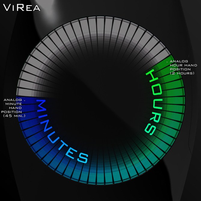
There is a ring of 60 LEDs. Green LD shows the hour position, just like the hour hand of an analog watch. Blue LED shows the minuted position. The space between these LEDs is filled up with a gradient from green to blue. The rest of the ring is lit up in white. There are no numbers to make it simple and intuitive.


Great idea Sam!
And this time, No hair problems!!
You made the case very plain this time! What is on the side? Buttons? Very well integrated in the design!!
Very nice!
LikeLike
Waaa said, you was quicker 😀 I would like to lead your attention
here. This is an example of how the virtual reality works.
Thanks for your opinion! Yes I integrated the button in the case. Time setting is on the backside, since you don’t need it so often.
LikeLike
clearly from outer space watch.like it very much
LikeLike
Es muy bonito.
LikeLike
Yes Sam, still a very beautiful clock with exact time, as I like (I do not even need to shave several forearm, awesome!)
Scientists say that even time is distorted in a “black hole” in this case, it is completely mastered.
Another yes, I must start saving to get one, more …
Sehr schönes Design!
LikeLike
OMG that watch is beautiful! Nice design! Though I personally would prefer blue and red (I am very colourblind on green).
LikeLike
Oh then you get this version. Mix color magenta is nice 🙂
I am curious, how do you see green? Is it grey?
Thanks for your input!
LikeLike
Wow, Sam that version in the link is the best design I’ve ever seen. I could stare at it all day. I like it even more than the 7RON watch, which I didn’t think was possible. I really hope I get the chance to spend my money on this.
I perceive different greens in various ways. Dark greens just appear brown/grey and light greens I simply can’t see, it’s hard to describe. I can see some very vibrant bright greens though, so could probably see colour in 2 or 3 of the most vibrant green LEDs on this watch. It depends on the richness of colour and strength of the light source. Basically, when I look at a rainbow I just see red, orange, yellow and blue and nothing seems to be missing. Sorry for the long answer, and good luck with this design. Hope you make the magenta come true 🙂
LikeLike
Wow thanks for the green explanation. I never knew! No answer is too long here 😀 Color blindness – that’s a point noone thinks of when creating things. I can imagine, it is hard to describe. Well a series of watches with different LED colors always sell good (see Tokyo Flash).
LikeLike
Short version: 5 stars!
Longer version: This one tops your Vaco watch even. You killed the hairy hole problem (wich was buggy but not that bad) and the time reading looks even more sexy. 60 leds seem to be producable too. Blue and green are very cool colors. The tunnel effect just rocks. Think about the name black hole watch. I would buy it, but what material is the case. It is not plastic I hope. Patrick is right: Sehr schönes Design!
LikeLike
@ Patrick & Aphosno: Yeah no manly hairs anymore 😀 Black hole is a nice title for this watch. The material is dark polished gunmetal. Thanks again for your nice words!
LikeLike
This is a wow watch. I would buy it in an instant. I also submitted a design this weekend based upon an infinity mirror but yours is much more stylish. Really nice job Sam.
LikeLike
Thank you David 🙂 I’m looking forward to see yours. Infinity rules!
LikeLike
Wow! when i saw this on the facebook group, it just looked like a watch. but now i’ve read your spec its a brilliant idea! Very clever, and if the watch was thinner than the depth of field if shows, that’d be amazing!
LikeLike
great watch design id give it 6 stars if posible
LikeLike
Amazing design, Sam! This is definitely a must-produce item for Tokyoflash. The only thing I would suggest is to maybe add some kind of subtle indicator next to the positions for the hours (or at least on 12, 3, 6, and 9) for added reference – with 60 LEDs in an infinity mirror, you might lose yourself trying to tell the exact time 😉
Other than that, have you thought about any variations in the case design? I love the colour and material choice (gunmetal is always a great look) but I wonder if fitting all the watch components into such a slim-looking case might be a bit hard. I am curious to see how this design would work in a bigger, more masculine case…
Once again, great work! I really hope this design ends up going somewhere.
LikeLike
@ Rascale & TheWhispofSmoke: Thank you so much!
@ TheSquirrelKing: Oh that’s a very good idea. Four subtly embossed indicators in the case would improve the time telling.
I can try a more masculine design for the case (a little bit more edgy and thicker?) I tried to make it not too feminine or masculine since mostly the other side doesn’t like it. But this case is not the last decision. I just had the rule to be smooth and simple and not more cool than the display – that allows a wide variety of cases 🙂
Thanks for your brainstorming!
LikeLike
Or, instead of embossed indicators, I wonder if the LEDs for the hours (or, again the 12, 3, 6, and 9) could have a slightly different shape than the others. I’m not sure what shape to suggest or exactly how this would look, but it seemed like an idea that might be fun to play with 🙂
As for the case, I think you were on to something with the direction of this and your vaco design, it just seems like having so many LEDs and the infinity mirror setup would require it to be thicker in width and depth to be feasible. That, and and I might have a personal bias towards slightly more edgy/thicker/more masculine designs 😉
LikeLike
sam,
this design is beautiful! i agree that a few subtle indicators would be helpful for exact time telling…but i hope you don’t change the case to make it too masculine or too big, because then i can’t wear it, and i REALLY want to wear it!!! 5 stars for sure! i would definitely buy it!!!
oh, and great color choice!
i had an idea to make a watch based on an infinity mirror a while back – although i was thinking digital — but i never sent anything in..
this is better than anything i would have done anyway, though..great work!
LikeLike
personally I’m looking for a watch that creates a challenge to read but for a new looking type of watch this is a fantastic idea absolutely wonderful just not my cup of tea!
LikeLike
@ Heather: Thank you Heather. I tried another type of case (link below). This is also not the last decision 😉 Talking about unsubmitted ideas: I have a four-numbers-in-a-round-case-idea like yours in my sketch book, but I didn’t develop it because other ideas suddenly overtook my attention… decisions, decisions 🙂
@ Rob: That’s a legitimate position. Check out my Screwz watch, that’s my most complicated one 🙂
@ All: This is one way to emphasize the hours – I moved the hour LEDs a little bit to the inside. The virtual tunnel looks more structured in this version…
I tried a little design change here. I made the case a little more edgy and thicker, just to see how it looks like. I added 12 hour indicators to the case here. What do you think?
LikeLike
Nice job on the design tweaks, Sam! I think they both look cool, but I am really digging the direction of the second one. Adding a few extra edges and some sharper lines to the case creates some nice contrast that complements the display at the same time, imho. Keep it up!
LikeLike
When can I buy this? Seriously, I love it.
LikeLike
The old Infinity Mirror trick from the 70’s! There is already a couple of watches out there using this idea but none as nice as what you have designed. It’s a really nice take on an old idea. Good Job.
Rave version:
http://www.raveready.com/Infinity-Tunnel-Watch-p/infinity-tunnel-watch.htm
LikeLike
cool, very tokyoflashy !!!! 5 stars
LikeLike
Sam, I preferred the second of your revised designs there. The one where the hour indicators were discretely embedded into the case (which also looks good). I personally didn’t like the design with the hour LEDs moved inside, it seemed to break the smooth flow of the circle which I think looked best when it was even thickness all the way round.
I really hope this watch gets produced.
LikeLike
Wow thanks at all for your input. Feels good!
@ Skinbyte: Yeah maybe this watch will be normal in the 2070s 😀 The rave version looks interesting.
@ New Duke: Yeah, the discrete LEDs fit more to my single ring intention and simplicity. Very good comment!
LikeLike
Okay next update, here is a version with a deeper, narrower and slightly bent virtual tunnel. I also tried different colors. For better understanding, please check the animated image. It is big, so it might take a bit to load.
🙂
LikeLike
Glad to see you’re still thinking about this! I personally preferred your earlier design. The deeper, narrower tunnel is impressive but I think it is a bit too much and I prefer your earlier design. The more subtle, shallower tunnel from before seemed more discreet, mysterious and classy. Less is more. But that’s just my humble opinion 🙂
I’m quite open minded on the strap, so long as it is a dark colour/material that doesn’t interfere with the watch face. I’d prefer it not to be too thick though as I would want to wear it under my suit shirts. I have the 01 KERALA TRANCE LED watch, but it’s too thick so I can’t wear it with a shirt, it doesn’t fit under the shirt cuff.
LikeLike
Yes I try little variations. I personally like the original most, but it is always good to be flexible and look over one’s horizon. I like to share my thoughts about tunnel shape and depth and LED colors and case handling 🙂
Yes please, not too thick. The KERALA is also edgy wich makes it harder to pull the cuff(?) over it.
LikeLike
I think the original tunnel was the best, because it looked like an infinity hole. The slightly bent one doesn’t look like it goes forever. Also I like the simpliest style here better (You know what I mean 😉 ) But for exact reading I like the indicators in the case more than in the LEDs 🙂
LikeLike
Nice design Samu-kun~ What a lovely idea~ a time hole in our hands~ 😀
I just love watches with no numbers shown. Simplicity and sophistication often collide don’t they 🙂
I can see some developed work from your later posts, but I think sticking to 2 main colours (with 1 in-between colour) would be nice – somehow this makes people think that the relationship between hour hand and minute hand is connected by the second hand. That is a nice concept.
I looked at the watch and i thought about how people in the earlier post mentioned about black hole and red+blue combination – haha~ and i thought… umm Doppler effect!! HAHAHA~~ If you hope to gain buyers from both genders, I think red+blue combination might be a better choice, but since not all people like pinkish-purple as an in-between colour, why not try 3 primary colour as a combination? – however this idea is totally different to the one i mentioned before 😮 you might want to fade the 3 colours into background rather than colliding into other colours – This creates a sharper image I bet~
Somehow no one mentioned about the wrist strap yet :D~ I like the slim smooth design you have right now. But depending on your intent, you might still want to try different designs for the strap, so it can relate more & connect better to the “virtual tunnel” in the middle~ 🙂 oh oh how about making a thick edge hard back steel lock-on strap? like a handcuff or a bangle? 😀 time is something we cannot just shake off from our hands right? 🙂
Sorry for writing so much.. my hands couldn’t stop typing~ ganbatte with designing~ I rate it 5-star~
LikeLike
GN, about the length of your post, you are forgiven 😀
Doppler effect would be a cool name! A little nerdy… but in a good way! A black hole and moving light…. You are right about the color combinations. I could use red, green, blue as main colors wich have yellow, magenta and cyan as mix colors. That would be a series of three watches wich might appeal to a wider span of customers. Fading the colors into the background – you mean three solid colors on the ring and they blend in each other with growing tunnel depth?
About the strap. I’m pretty flexible on that. I’m not sure, if it has to have a connection with the time tunnel. Maybe it is good, when the tunnel really stands out. The slightly embossed indicators are a little strap “preparation” for the tunnel. About the closing mechanism, I like this “hidden deployment clasp – that fits to my imagination of the straps.
Thank you very much for your comment! That makes me think (wich is good) 😉
LikeLike
“you mean three solid colors on the ring and they blend in each other with growing tunnel depth?”
– Yes yes that’s what i mean 🙂 your idea about using red, green, blue as main colours is nice 😀 I like that.
I can’t see the site you mentioned in your reply 😮 but it’s all good~ i understand what you intend to show now with the strap 🙂
Thank you for the reply too~ wish you all the best for making cool designs like this 😀
LikeLike
I’m not sure, if blending by tunnel depth can be done, since the mirrors only reflect what is there. You always have a degradiation, so the tunnel will get darker. If you bend the mirror, you can make the tunnel’s end narrower, so you can make it end before it gets dark. But color changing or blending into each other… Maybe with a mirror wich has a slightly rough surface. The blur effect would accumulate and in the end the tunnel could be misty…
Thank you GN!
LikeLike
exelente reloj genial me gusta
LikeLike
I already posted but I need to tell you I want this one!
LikeLike
THIS IS A SEXY WATCH!!!!!!! but u shoold change the strap. its to bland/ boring
LikeLike
@ antonio: Muchas gracias!
@ Aphosno: That’s good to know 🙂
@ Azn: Thank you! I’m pretty flexible concerning the strap, as long as it fits to the case and does not distract from the display.
LikeLike
Hi Sam, We have been really admiring your designs and some of them look very doable. We are in the process of making 8 designs from the blog now, so a bit overwhelmed. I think you will be seeing an offer coming your way in the next couple of months for at least one of your designs perhaps more. Keep up the fabulous designs as we truly enjoy and admire your artistic talent.
Sincerely,
Tokyoflash Design Studio
LikeLike
Congratulations to you Sam!
LikeLike
Thank you Laszlo, I appreciate it.
LikeLike
Dear Tokyoflash, Dear visitors,
Now I am overwhelmed. It feels good that sharing my passion to create things finds an audience and even meets with your approval. Thank you to all who supported my designs! Without your votes and comments this would never have gotten this far. I had no idea how the reactions will be. I’m an idealist, and not so often a realist 🙂 I wonder wich watch it is. This one maybe?
Eight watches from the blog, I cannot imagine how much work this is. I mentioned it on other occasions, I think it would be cool to keep a record of the development of the watches if possible. I love those A-Z steps of creations.
This is a wonderful blog – a collection of great watch designs. I am proud to be in such company.
Thanks for your kind words.
Sincerly,
Sam from Germany
LikeLike
Congratulations Sam! You absolutely deserve it!
I’m happy as much as my watch would have been chosen!
LikeLike
Thank you Tamás! I am happy too 😀 I am looking forward to the next steps.
LikeLike
Wait…..is this coming out soon? Or at least, is the Rogue coming back…..I want it! Please bring it back! Someone tell me please.
LikeLike
One of the best I’ve seen on this blog, if not THE best. Stunning.
LikeLike
I just also want to say that the time telling mechanism from your earlier “light tube watch design” combined with the aesthetics of this watch (no hole to show your arm hairs) would be worth exploring also.
LikeLike
Oh cool thanks alot!
The combination of those two ideas is an interesting idea! Maybe this and the other display design cen be put in one watch. Switchable… For the light-tube-watch diplay design, I would need twice the amount of LEDs though. 120 LEDs… If the price is good, oh yes please!
🙂
LikeLike
This thing will probably be hard to produce.
LikeLike
I love this watch, but the way that one must read the time is a real deal-breaker for me. It simply isn’t natural.
I feel that the colour should always fade clockwise from hours to minutes, so that it makes it easier to tell the time.
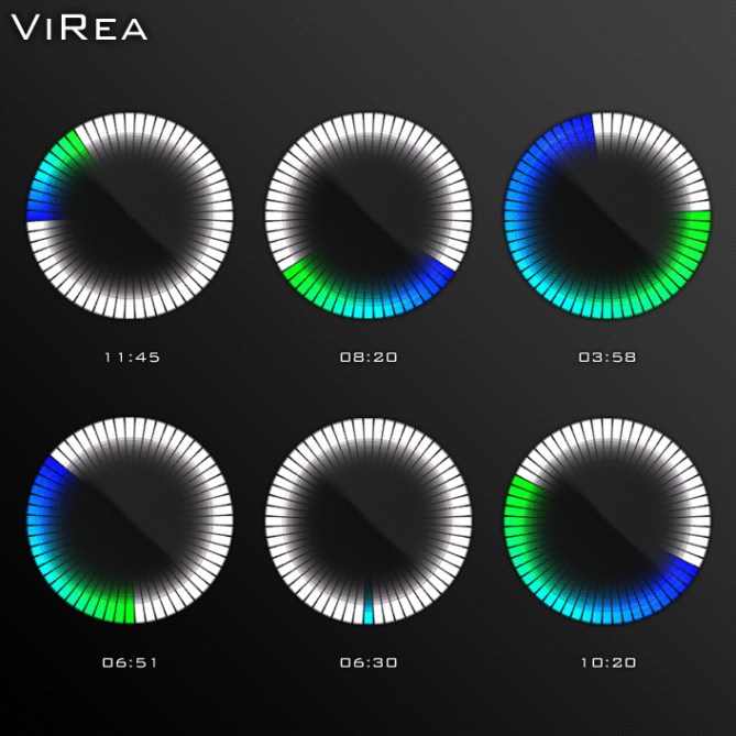
For example, if you look at the image with the different times on it, it is easier to read 3:58 and 6:51 than it is to read 11:45, 8:20, and 10:20. Going counter-clockwise around the clock to find the minutes after looking at the hours is not natural. There is added confusion when in some cases the colours gradient goes clockwise (like in 3:58 and 6:51) and counter-clockwise at other times (11:45, 8:20, and 10:20).
On the other hand, following the colour gradient clockwise from the hour to the minute simply makes the most sense.
LikeLike
@ Ace: Tell me what do you think would be the difficult part?
@ Alexander: Thanks alot for that point of view! Noone else has seen that. Although 2% of the watches here comply to natural reading, I agree with you. If it eases up reading, then the clockwise option is reasonable. I believe, that shouldn’t be a problem to specify that 🙂
LikeLike
No problemo. I would love to see this watch go into production and I think its function should be consistent and as sleek as its design, and this is one sleek watch.
LikeLike