
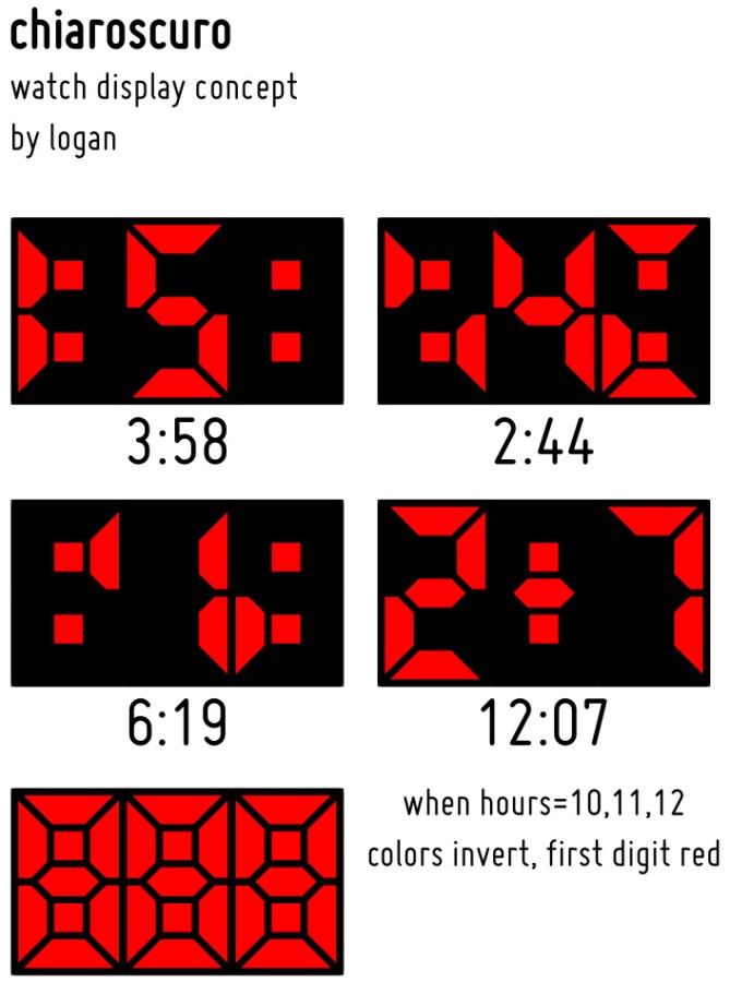
Design submitted by Logan from the USA.
Logan has combined negative and positive shapes cleverly in his new watch design.
Time is displayed in three digits, alternating between negative and positive displays. For 10, 11, and 12 o’clock, the display inverts to distinguish 11 from 1 and 12 from 2 (the first and last digits are positive instead of negative, the middle digit is negative instead of positive).
Alternating between negative and positive turns the humble seven-segment display into a work of art.


This is definitely my favourite concept in along time, just enough difficulty to read to confuse but with a little explanation it becomes clear. Retro in a way too.
LikeLike
Oh wow how clever. I was thinking about positive-negative fun too, but this one rocks! Thats pretty tokyoflashy!
LikeLike
Wow great job!!!! this is a killer watch i would totally buy this idont like it ! ILOVEEE IT!!!!!!!!!!
LikeLike
niiice. the designs on this blog have really been getting impressive (is it the contest?). definitely agree with the comments above me. displaying the time in this manner is very slick. The case, meh. But I don’t think that’s the point here. I especially like how there are only 3 fields. I always hated how normal digital watches required the first field for the 1 of the 10, 11, and 12. But you do away with that in this design. bravo!
LikeLike
Really interesting display!
I always loved the Negative watch. I guess it is the updated version!! So cool!
LikeLike
Thanks for the feedback, everyone!
LikeLike