
Design submitted by Anders from Sweden.
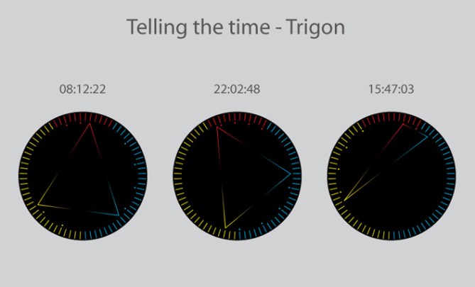
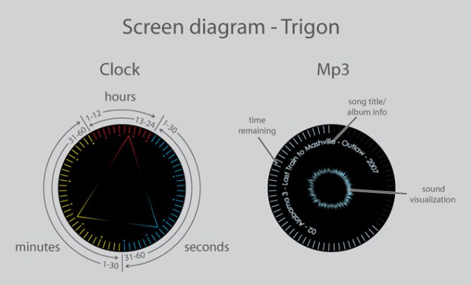
This idea comes from the trinity of hours, minutes, and seconds. 24 hours and 60 minutes and seconds added together and divided by two makes 72; one fifth of 360. Hence, the 72 LEDs around the face. 12 red for hours, 30 yellow for minutes, and 30 blue for seconds.
The time-telling LEDs are colored to differentiate them, and as time passes dots appear on the face to make reading the time easier. Two fading lines originate at each indicator, all pointing at each other, forming a triangle. Indicators move counter-clockwise the first half of the day/hour/minute, then back again.
The different functions (clock display alternatives, MP3 player, GPS navigation) are controlled by side buttons and a ring control around the face of the watch. The discreet, masculine styling appeals to fans of traditional watches. The possibilities of the comparatively large HD screen, bluetooth functionality and smooth controls attracts tech-heads.


Wow Anders. I love the display 🙂 The strap is too crystall-ish for me buuut it fits the trigon topic – consquently designed. Veeeeeery wise decision that you made the dot divisions of the three scales. Very helpful! Stylish display. You have my vote.
LikeLike
Thanks Sam, always nice to have a fan…=)
Yeah, I noticed that the display needed something to make it more readable…
LikeLike
Anders, this one looks excellent. I love it, 5 stars from me.
LikeLike
Thanks! =)
LikeLike
Okay… for starters… did i miss something or there is no way to tell if time is AM or PM ? Same goes for minutes and seconds. How can we know if this is 1PM and not 11 AM quarter past and not quarter to… and 15 not 45 seconds(seconds are not best example BUT STILL are.)?
It’s not bad, face of the watch seems to require some counting before we know the time… and in current shape i would be afraid that time display would be TO small to read time well and fast enough.
Strap looks to heavy and in my opinion doesn’t quite fit the “spirit” of the watch.
I imagine this watch to be quite big considering MP3, GPS etc. that’s one reason not to buy it.
LikeLike
Okay sorry don’t mind point about HOW TO TELL DIFFERENCE BETWEEN AM and PM… Already figured it out sorry 😀
LikeLike
If you make the dots after 5 digits, for all (hours, minutes and seconds) it is easier to read. Letting it be every third digit for the hours, is confusing. Besides that, the strap is too brash to me. And also besides that… the watch is a total buybuy for me!
LikeLike
It’s not a good idea to space the hour dots 5 apart, since 12 isn’t evenly divisible by 5, so the last dot wouldn’t be at the last hour indicator (like it is for minutes and seconds)… The options are to space them 3, 4 or 6 dots apart…
LikeLike
Ok love the watch!
The strap is so bad-ass! I mean, I cant even find words to describe it!
And the watch it self! The design, the way it shows time, MP-f***ing-3! Love!
So after the subtle 7ron watch, I am SO getting this, something with more POWER! 😛
5 from me!
LikeLike
Thanks for the comment! Good to get a positive comment on the strap (for once)…=)
LikeLike
I like the strap too. And I like the time displayed with a triangle, but in a different manner than the other triangle watch. AND there’s a sound visualizer on there?! Nice! That does give me concern for battery life, but that’s merely a technical hurdle, for the next step. I also like the three colors to help distinguish the different sectors and to clue in how to read it. But I might prefer different colors.
LikeLike
Simply superb!
LikeLike
I love it! Really good job here Anders!
Still, I m not a big fan of multi colored display. So maybe one color use (for the time) and a thin line to separate minutes/ hours/ seconds and it would be perfect for me!!
LikeLike
I like the face of the watch but I prefer a different kind of strap. Really good idea!
LikeLike