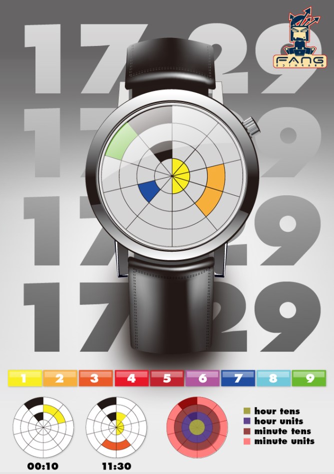
Design submitted by Stefano from Italy.
Stefano describes this concept as a watch design with Italian taste. Every number is depicted using coloured LEDs. As you can see from the main picture, four colours make up the four digits of time; 17:29 = 1=yellow, 7=blue, 2=orange, 9=green. Ideal for fashion lovers and those who like colour!
Quite a mainstream design on first appearance, but more interesting when you investigate further. With 9 different colours making up the display, as the time changes, the colours would change to give you a different colour combination for every time of the day. Wouldn’t it be interesting if the colour got brighter or darker as the day moved on.


Hmm, I am Italian and I don’t get how this is Italian. I know some good modern design comes for Italy but this does not seem to be the case.
This design has too strong of a reference to traditional watches styles to be considered innovative enough for me to ever want to make a purchase. Since the dial is the only interesting part of the design, the case and strap feel like they were taken off the shelf giving the whole watch a cheap feel. On the up side, this could easily be changed to something more up to date and in line with the dial concept.
LikeLike
Well obviously two different opnions/ tastes. Even Italy has and had inconsistency in style over the centuries.
The shell is too traditional indeed, I believe that times are over. Make modern case and straps for this one please 😉
The display. It’s not easy to read when you cut the rainbow in 9 pieces – nine colors you have to remember. But since they are in a rememberable order, I believe you could learn that. Maybe a more easy system can be found… Ok, besides the hardness, it is such a cool display! Very artistic. It’s a must have for those who like minimal/ abstract arts. Those people would’nt have a problem with colors 🙂
Nice entry with a unique idea!
LikeLike
The display looks cool. It is hard to read but hey, you could say that to many already built watches. The style is a bit retro but it is ok. Not overwhelming watch but a good entry for the blog.
LikeLike
I like it, but I kind of wonder why does it has this regular look while it is so hard to read. Maybe the opposite, simpler way to read and more unusual design would work a bit better? I m such a big fan of italian design so I m sure you can do even better!
LikeLike