
Design submitted by Heather from the USA.
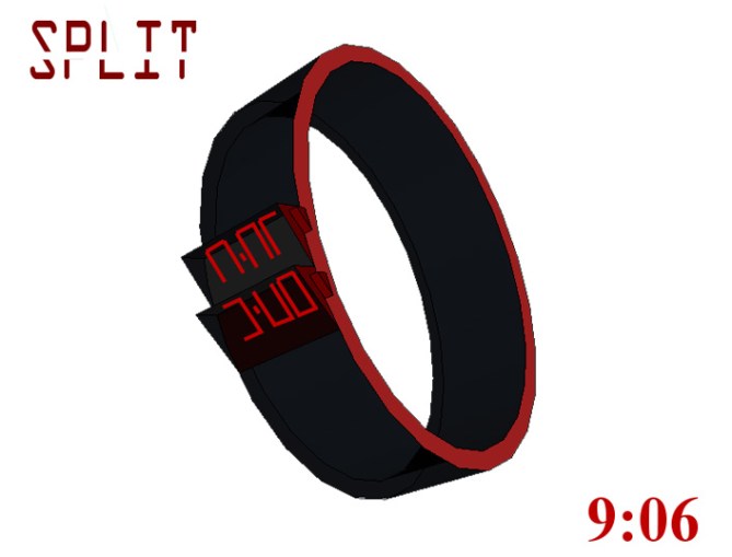
This watch design was inspired by the Optical Illusion watch from the Tokyoflash Design Studio. Time is hard to read, unless you look at it just the right way — and then it’s easy!
There are two slanting screens, one behind the other. LEDs are used to display time as digits, except that only the top half of the digits are shown in the back screen, and the bottom half of the digits are shown in the front screen. From the right perspective, the digits can be read very clearly.
This design can be made in different colors to appeal to both men and women. There is no counting involved, and the time can be read easily and quickly at a glance.


When you vote or comment on this watch, please vote based on the idea, and not just on the drawing. The drawing itself may not look realistic, but my design is the idea. I, for one, would love to have a watch like this – everyone I know would be jealous, because it’s so different, yet so easy to read. 😀
Thank you.
LikeLike
Well done Heather, another interesting concept. The idea is unusual, clever, fun, simple and unfussy. I like it but I would definitely like to see this idea in a more masculine case and strap.
It would also be cool if it were flat and told the time normally and you could press a button that raises the two panels to show the “split time”. A fun, cryptic and interesting talking point for a watch.
LikeLike
I could see some variation on this one, like the watch was broken in the middle or upper part on an angle.
LikeLike
great job i love it i would totaly buy this watch.:)
LikeLike
Simple but efficient idea to make the time look cryptic! Can be read easily but on the first glance people go “what is this?” Good job again 🙂
LikeLike
great job Heather. Great ideas. I hope it goes out so i can buy one for myself. I would be the baddest guy in the office wearing this thing!
LikeLike
Great job. Amazingly intricate designs. Keep making more. I hope to see it on the homepage soon.
LikeLike
this watch is much cooler than my designer watch, ughh i want this watch so bad
LikeLike
Hey nice concept Heather. This would confuse many people at first glance but the time is right there in your face.
LikeLike
I don’t like the triangular shapes. If you can get this split effect on a flat case, it would be cool. But actually, you go with the watches’ name and so I think you did well.
LikeLike
The idea is really great and I m sure this would be a killer watch concept if the shape and materials were a bit refined!!
Congrats heather!
LikeLike
good job well done heather
LikeLike