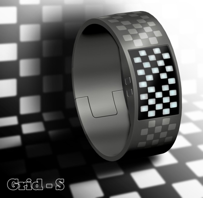
Design submitted by Maciej from Poland.
Maciej says of his watch design – “My idea was to keep things simple, clean, efficient as possible, but still innovative and has a Tokyoflash style. I wanted to create something that has one simple shape and pattern which goes around the watch without any crazy colors or shapes. Something that is modest and outstanding at the same time”.
There is no obvious border between each group of LEDs. Instead there are 26 LEDs with the same shape. First 12 LEDs represent hours, then 10 minutes group, and bottom shows single minutes. There is an option to use different colors for each group or same colors for all LEDs. Case and mechanism are hidden under a dark hard rubber strap which makes the whole concept clean and modest.


nice and simple!
LikeLike
on the track. I guess it s really for people who loves race car. I m personnaly not into that but the partern al around the bracelet and the display is interesting!
LikeLike
Cool, I like the grid formation theme. This might appeal to the punk/emo crowd, they like black and white check.
LikeLike
Wow nice *waves the race flag* I can imagine it in many colors. Very stylish. A bit hard to read but as always learnable.
The all-around-the-watch-pattern is very cool. Makes it look like a fashionable object.
LikeLike
Squares or Block patterns always look nice I feel, something about it. The 3:29 pic reminds me of Tetras. Fun clean look! Sexy time. 😉
LikeLike
時間は読みやすいとは言えないけど、これこそリングにいいんじゃないすかね。パターンがきれいだし、なんか見た目の比率もリングっぽいし。。。
LikeLike
Maybe different colors make it easier to tel the time. But then you loose the concept, wich is very strong. Cool bracelett!
LikeLike
LOVE THE BRACELLET —– but I would want other color combinations — red/black , black and gold maybe, or black and silver..
LikeLike