 Design submitted by Anders from Sweden.
The idea for this watch came from the vernier scale used on calipers and micrometers, combined with the copy protection gadget for the old Amiga game Indiana Jones and Fate of Atlantis.
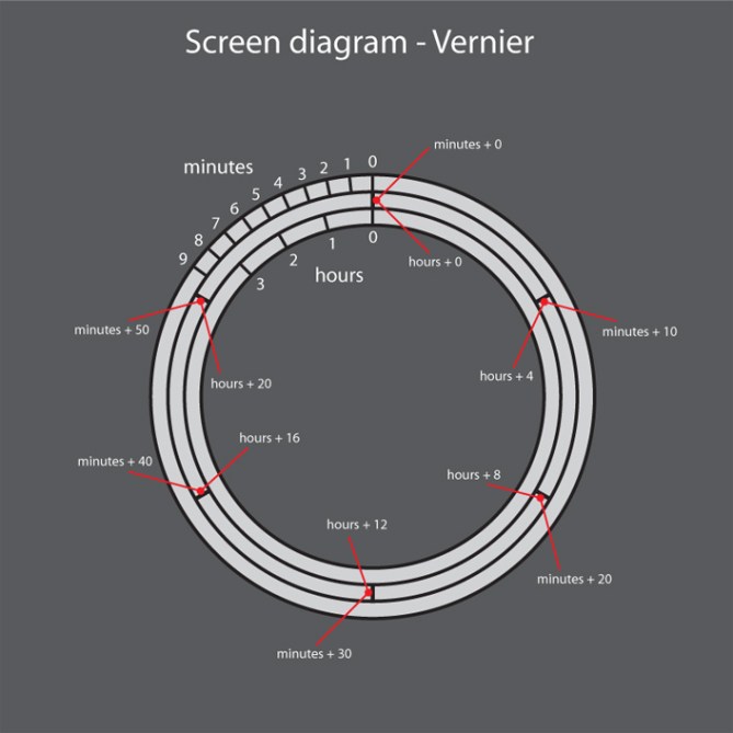
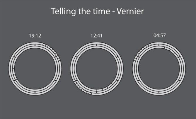
Time is told by three rings, the middle one a stationary reference ring with six marks lit by hidden red LEDs to match the wrist band color. The inner ring tells the hours with similar marks lit by white LEDs, and the outer ring tells the minutes, also in white LEDs. Design submitted by Anders from Sweden.
The idea for this watch came from the vernier scale used on calipers and micrometers, combined with the copy protection gadget for the old Amiga game Indiana Jones and Fate of Atlantis.
Time is told by three rings, the middle one a stationary reference ring with six marks lit by hidden red LEDs to match the wrist band color. The inner ring tells the hours with similar marks lit by white LEDs, and the outer ring tells the minutes, also in white LEDs.
This watch design aims for an elegant, executive style, the dark red wrist band contrasting agains the black and polished steel of the watch body and clasp.
People most likely to like this watch are those who prefer understated elegance rather than the more expressive, attention-grabbing designs.
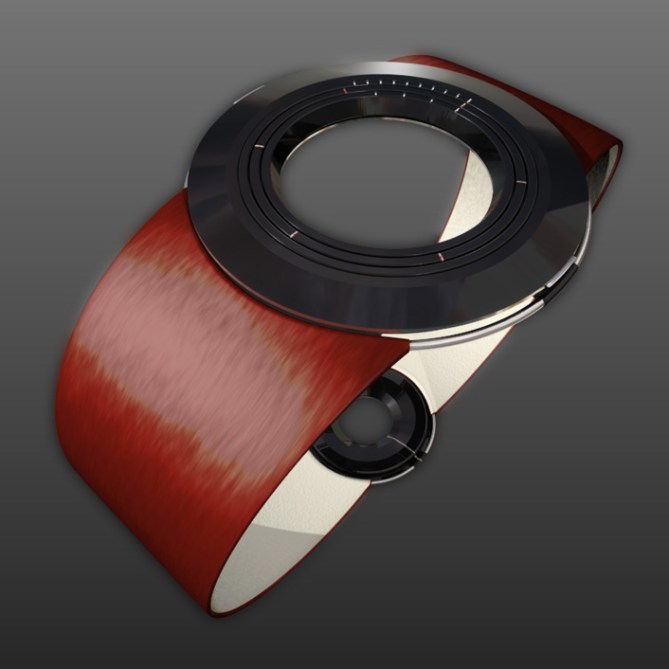
This watch design aims for an elegant, executive style, the dark red wrist band contrasting agains the black and polished steel of the watch body and clasp.
People most likely to like this watch are those who prefer understated elegance rather than the more expressive, attention-grabbing designs.


very elegant design! loving it.
would love to see a cyberpunk/industrial version of it in stainless steel with blue or green led ridges.
LikeLike
Thanks!
It could be done in any number of finishes; polished or brushed steel, titanium, gold even… The possibilities are endless! =)
LikeLike
Nice one, I used to have an Amiga. I didn’t have the Indiana Jones game but I like the retro feel of this design. I first thought the wrist band was wooden which would have been an interesting Scandinavian touch. I like understated designs like this.
LikeLike
Wood? there’s an interesting idea…=) Tricky to get it comfortable enough though…
I had a bit of trouble getting the material to look like leather, and it seems I didn’t quite get there…=)
Oh, and Amiga rules! =)
LikeLike
The time part could be done much better, needlessly complicated I feel. You could have the same look but without all the hassle. Looks wise very cool though I have seen this similar design several times before. I think a few clocks have been made like this as well.
LikeLike
Hmmm, interesting comment. I’d appreciate it if you could explain how you think it could be improved (really, I’m not being sarcastic). I thought it a fairly simple concept, so I’m interested to find out what you mean.
LikeLike
Hi Anders, sure no prob. Well for starters I would have the segments for the hours in the same position as a regular clock. then no need to add up. If you really want to keep the 1-9 min, think maybe it should be on the other side where 1-9 would be found on a regular clock, because I think it’s hard to break the habit or reading backwards I think for many people. I think the look would be the same but would get more sales from people who complain about adding or IT”S TOO HARD. Some people like the challenge as well I’m sure. Nice Design though, like the case shape a lot!
LikeLike
Thanks for the explanation, Tokyo Pimp! Interesting points, I think I’ll have to sketch it out to see if I agree with you…=) But I would say that I don’t think that it’d be harder to learn to read this watch than any of the other designs here (and, frankly, quite a bit easier in some cases)…=)
LikeLike
For sure many other designs tell the time in a more complicated way, but your design is already better than most of those others, so not comparing. 😉 As your design is very unique I think it’s standard shape is quite normal which is a good point. So think and easy way to tell the time on this design really enhances it. Then people like my DAD would even buy!:)
LikeLike
I like the design and method is cool. I understand the concept of contrasting band, but would like a black or gun metal-metallic band, like my Rogue.
LikeLike
Thanks!
A metal wrist band would probably look cool, but the design element of the steel ring which the band attaches to (it’s quite thin, so doesn’t show very well in the image, unfortunately) really only works with a flexible wrist band such as leather, rubber or fabric. I suppose you could have metal links mounted on a flexible band to avoid redesigning the watch body.
LikeLike
It looks great. Really cool design. I like the idea of the rotating rings. The materials are chosen wisely.
Buuuuut, the time reading it tooo hard. Really. Im not sure if I would buy it because of the look and go with the complicated reading… hard decision 😀
LikeLike
Thanks! =)
Actually, I think reading the time is pretty simple (at least compared to some of the other designs), and you’d probably get used to it pretty quickly. All you have to do is look which 6-hour/10-minute section you’re in, and then count the single hours/minutes…=)
LikeLike
Oh I am critical towards those other readabilities too 😀 Actually, the more I see this watch, the more I want it.
LikeLike
Hehehe, glad to hear I’m not the only one getting criticism…=)
Hmm, a good quality in a design, I think…=)
LikeLike
I think this would appeal to engineers & scientists who will be familiar with the vernier scale. Also the wood/leather finish on the strap is perfect for those people too, quite reminiscent of the kind of leather case you get for old scientific instruments. Probably not for the younger tokyoflash crowd, but great if you were a physicist in the 60’s or 70’s!!
LikeLike
Interesting point! Considering my influences, I hope it’d also appeal to those familliar with computer game copy protection in the good old days…=)
Nice thought about the leather, I hadn’t considered that…=)
LikeLike
Very nice watch, well done!
It suggests precision and accuracy both concepts linked with time.
You might try to translate the same concept to the LED technology…
LikeLike
Great great design anders. That s something which I would buy for sure!!
This being said I have to agree with tokyo pimp: it is still a bit complicated to read… (but that s also make it look so cool so I unfortunatly have no good advice to give you here)
Keep it up the great design man!
LikeLike
Thanks!=) I’ve got a few more ideas, it just remains to be seen if I manage to finish them…
LikeLike
I think this is really a good looking watch in an interesting concept but the focal point of the rendering is on the wristband which doesn’t look like the designer’s intent.
If it’s supposed to be leather, your texture is too stretched out in your 3D rendering. Fix the tiling and map coordinates you might achieve better results. In addition, unless your wrist band is really unique, I would take it out of the foreground and try to aim for highlight on the face of the watch instead.
Defiantly a more elegant design then in your face, kind of watch. It’s rare to find elegant design incorporated with innovation and technology. Usually, elegant watches are associated with gold plating, sans-serif fonts and tradition styling……boooooring! It doesn’t have to be that way, you just proved that. I would buy this watch.
LikeLike