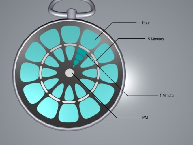
Design submitted by Garett Buttram from Canada.
Garett says: “These are two pocket watch designs. The first is a simple dartboard style design. Lights illuminate the display as time goes by. The second design is has more of a spiral display.”
I think this maybe our first submission of a pocket watch and we have two variations here; one with a more organic look, the other being more futuristic or maze like. I think the maze looking one may be a bit hard to read the hours on. Unless different colors were used or you may mistake the layer. This may be a good thing if you want the sensation of being drunk whilst looking at the time. It does look very cryptic.
The other more organic design is very easy to read the time on. It reminds me of a flower a bit, not sure how other people feel? Could make the design more directed to women perhaps. Tell us your thoughts on this LED pocket watch.
カナダのGarett Buttramさんの作品。
以下はGarettさんの文章です。これらはポケットウォッチのコンセプトデザインです。1つ目はダーツをテーマにしたデザインです。2つ目はスパイラルをテーマにしたデザインです。
これらは2つの提案は、ポケットウォッチでは初のコンセプトだと思います。1つはオーガニックな外観で、もう1つはフューチャリスティックな外観。迷路のようなインターフェイスを持ったタイプは、時間の部分が少し読みづらいかもしれません。異なる色で表示すればもっと簡単に読めるかもしれませんが、時間を読む事を楽しむには、これぐらいミステリアスほうがいいかもしれません。
オーガニックな形状をしたタイプは、時間の読み方が簡単です。私には花のようにも見えるインターフェイスですが、みなさんはどのように感じられるでしょうか。このデザインは女性向きかもしれません。みなさんのご意見をお待ちしております。


Hmm, sorry not really liking this one. Maybe just too plain? Doesn’t say BUY ME in any way. I think it needs a lot more thought into the shape conflicting angles and curves and lines make it seem like it’s all over the place for the bottom design. Top one not liking the Curves or segments. Reminds me of pomegranate seeds or teeth. Again that’s just me, what one may not find attractive another person may fall in love with. Just want to be honest. It would be interesting to see what others think.
LikeLike
I like pocket watches and this predator-like crossfire-ish look of the clock face 🙂 I’d buy it but only if it were a bit simpler to read the time – the spiral version is a bit too puzzling. But then again – i like it more than the flower-like one 🙂 Need some bit of redesign considering the hours count. Would buy, but rated current design with 3 stars so far.
LikeLike
I like the first design better because it is more consistent – it has a nice retro steam punk kinda feeling – too bad this is only a flat image – a sweet casing and chain would help accentuate this layout even further…
The second one is nice but the sawblade look doesn’t fit the maze like center.
LikeLike
The first plant-like design is better. The presentation isn’t the best, so it’s up to our imagination how this watch might look like. The time indicators are ok. It might be puzzling, but when you know tokyo flash, it’s nothing you should be worried about xD
Make it in a lime green plastic case, let it have green, cyan, yellow or white LEDs and voilà, you have a nice piece of design in your pocket.
LikeLike
For design point of view, I prefer the second one personally.
LikeLike
yes, I like the second one two. it is more interesting. I like the target area in the middle.
LikeLike
I’ve looked over the comments about my designs and I’m enjoying what I’ve read, even including the criticism. Over the next few days I’m going to change a few things (color, shape, etc.) and I’ll upload all progress on my deviant art page http://arc15321.deviantart.com/
FYI, this is Garett, thyne awesome designer from Canada.
LikeLike
I’ve uploaded a slightly modified version of the first ‘Dartboard’ design to my deviantart page at http://arc15321.deviantart.com/#/d2yr15e I would like to clarify that the design is in fact not based on a flower, I based it around an actual dartboard and accidentally applied subsurfing instead of smoothing and ended up liking the rounder indicators that came out of that process and stuck with it. I would be perfectly fine with tweeking either models if the designs to get through. The design isn’t for me, it’s for all of you and I want to make something that a lot of you would want to buy.
LikeLike
I like it. The top one that it, I dont like the bottom one very much. It does feel organic as the description says.
I dont think a pocket watch is my thing, but this is a pretty decent idea & looks good.
It sort of keeps the traditional feel with those shapes, but in a very futuristic way – if thats even possible – it just made me think of the movie Time Machine (the remake)
LikeLike
Super idea. Many people need a pocket watch because they can’t wear the traditional kind. Both would also look good as a wrist watch as well. I really like the first design best.
LikeLike
This is actually cool, but the only reason I’d buy a TFW is so I can show it off. Kind of hard to do if it’s stuck in my pocket all the time.
LikeLike