

Design submitted by Lorenzo Gi from Sweden.
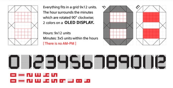
Lorenzo says: “As graphic designer I play with shapes and colors every day. The concept of this watch is intended to create abstract shapes with numbers and fonts. There is just a grid where hours and minutes are merged. It’s a minimal design in its shape, layout and functionality, in fact there is no AM and PM, just two colors, no date.”
Tokyoflash says: Here is a perfect example of how to make the display look unreadable to the untrained eye giving the appearance of something quite alien. We really like the 45 cuts on the corners creating a futuristic look. I think it would work best as an LCD watch as there are many segments and need to be close together to keep it’s appeal.
スウェーデンのLorenzo Giさんの作品。
以下はLorenzoさんの文章です。私はグラフィックデザイナーとして毎日、形や色と向き合っています。この時計のコンセプトは、数字とフォントで抽象的な形を作成して時刻表示をおこないます。時間と分の表示部分にはグリッドがあり、それらの形状、レイアウトは非常にミニマルなデザインとなっています。am/pmや、日付の表示はなく、ただ2色で時刻が表示されるシンプルなデザインです。
以下はTokyoflashのコメントです。この作品は、独創的でありながら、シンプルで読みやすいという、インターフェイスデザインに関するとてもよい提案だと思います。45°にカットされた表示部分がシャープな印象を与え、よりフューチャリスティックなイメージを感じさせてくれます。これらは、表示デバイスにLCDパネルを使用することで、忠実に再現することが可能だと思います。
Perhaps what brings this design together most is how Lorenzo has incorporated the minutes into the center of the hours. This is really quite brilliant. This display has managed to capture many key features that people want in a unique watch design. Graphic designers play an important role at Tokyoflash, as patterns have often been used in previous designs. Lorenzo’s idea behind the concept is great example of how a graphic designer can put their talents into new products.

最大の特徴は、時間表示の内側に分表示を入れた事かもしれません。ほんとうに独創的ですね。このコンセプトは、ユニークな時計が欲しい多くの人々を魅了するでしょう。また、以前、Tokyoflashでは、デザインにパターンを施す際にグラフィックデザイナーは重要な役割を果たしました。新しい商品にグラフィックデザインがどう関われるかというテーマにもよい答えとなったと思います。


This is awesome.
Kudos to Tokyoflash to get people sending in ideas, they are just getting better and better. I really hope you guys at TF can make some of these designs. This one is just fantastic as it is. Well done Lorenzo.
LikeLike
Well put. The designs are getting much better. Though I am not a big fan of the case or strap, the display is really well done. Maybe Tokyoflash could stick this display on some 3D renderings with a few options in case and strap design? Then it may really bring this design out to a top level design in all ways. Think this design shouldn’t be put aside. Make it!
LikeLike
fantastic !!
You have to produce it !! 🙂
LikeLike
Guys, thanx a lot for the comments! I´m the designer of this one 🙂
This idea is born exactly one year ago, when I was looking for a watch with minimal design, and at the same time a nice layout displaying the numbers. Well, at that time I didn’t know tokyoflash, so i designed it myself.
Less is more! 🙂 no AM or PM (why make it so complicated ahha) and no date. Even if it’s possible to use this display to read the date (1-12 month surrounding 01-31 day), i wanted to keep it very minimal and simple.
I was tempted to remove all the zeros, but I didn´t work very well. Hours and minutes, 2 colors. That’s all you need. 🙂
There is also a version looking like a wall-clock and the first on your left (the black one) displays your actual time, here is the link:
http://www.designkiller.it/clock/lessismoreclock.swf
Unfortunately I dont have the skills to design the case and the detailed components, I don’t even know what kind of technology we could use for this. I wrote OLed because I knew something about it, but if TokyoFlash says LCD, well, I trust them and I agree. 🙂 I´m not an engineer.
If Tokyoflash wants it, I´m here and happy to cooperate to make it real 🙂
(when i sent the design I checked on the 2nd option, where I say that i want to keep the rights. The text also says that i do not want that tokyoflash develops it. Not true! I´d like to keep the rights and that Tokyoflash developes it 🙂
Thanx again!
cheers
LikeLike
Hi Lorenzo, Very cool design indeed. Staff here all like it and think if the display was put into some proper case designs and 3D rendered we could really bring this design to life. I see you already have a 4.9 rating! think that is the highest so far. Congratulations. This one maybe worth making………….
LikeLike
Thank you again, and again 🙂
And yes, I agree with all of you: on a 3D case it will look more realistic.
Unfortunately I have no case-design skills, but I had in mind this shape: curved display and slim lines, glossy surfaces and minimal shapes.
Thank you guys
Greetings from Sweden! 🙂
LikeLike
This thing has a lot of potential, color combo wise(blue&yellow, blue&white, blue&green, blue&purple, white&yellow etc.) and shape wise, it can become a clock, a key chain or a pendant, but the best one remains the watch.
LikeLike
The display on this design is genius.
Absolutely couldn’t read it until I read the explanation. Now it’s so clear and logical. Love it!
Adore the way it’s incorporated into one simple block with two colours, and you’re right designkiller – who needs AM/PM, usually we know if it’s night or day!
I too would love to see this display in a more real looking case.
LikeLike
Brilliant, I love it.
LikeLike
Great!
I want blue/green display.
LikeLike
Wow O.O I would buy it right away. I like the slim case very much. I wouldn’t put too much detail into the strap – a minimally designed one would suffice. And now to the time indicators: Awesome! I love the black-white-red color combination and the 45° angles. Please produce this watch 😀
LikeLike
the display design is utterly awesome in its simplicity and assembly!
Color changing modes would be a nice to have.
Agree with the others – the casing and strap could be a bit more interesting…
LikeLike
That is one of my favorite for sure! I would love to see it into production!!
LikeLike
Wow, this design masterfully hides the the time in plain sight and looks great while doing it! The designer has really captured what Tokyoflash is all about with this one.
Tokyoflash, finalize the case design and colour options, and put this watch into production right away!
LikeLike
Like it alot 😀
don’t think i’d change anything about it, apart from the fact i haven’t bought one 😉
LikeLike
excellent design, I love it. I will buy it for sure.
I am so sorry because I don’t know how to do it in 3d rendering ……. In what program did you develop it ?
LikeLike
Thanx, I’m glad you like it! 🙂
It’s made in Illustrator, vector graphics and a couple of effects 🙂
LikeLike
I really really like this design and would buy it!
LikeLike
Exelent, really like it! -=)
LikeLike
Hey!
I love this design! In fact, I love it so much I made a program to have it be my screensaver. Just a note and not a complaint, but when crafting this using your layout, you have a small mistake. In the layout of the hours in the second picture here, the part where you label it “h” and you show each piece of the puzzle, the middle bar should be in two parts, and have a separated triangle on the right side so it can accommodate the hour “12.” 12 is the only one that has this problem, but it’s important if it ever is put into production!
Nice design! If this wins, I will buy it without a second thought. Especially if it has a date button :D.
LikeLike
eheh nice! I made the flash version too at this link: http://www.designkiller.it/clock/lessismoreclock.swf
The script is not perfect btw.
The date, i know, i was tempted to make it just changing the colors. The grid works even for the date.
About the mistake you mentioned…. uhm, i didnt really get it. But maybe i know what you meant. The gray area of “h” is supposed to be the space that all the numbers together will take.
I’m so glad that you made a screensaver out of my design, it means that you really love it ! As I do! 😀
Thanx for the comment!
🙂
LikeLike
Whoa! It’s like a hoverboard that tells the time! I love it!
LikeLike