Design submitted by Maciej Mandrysz from Poland.
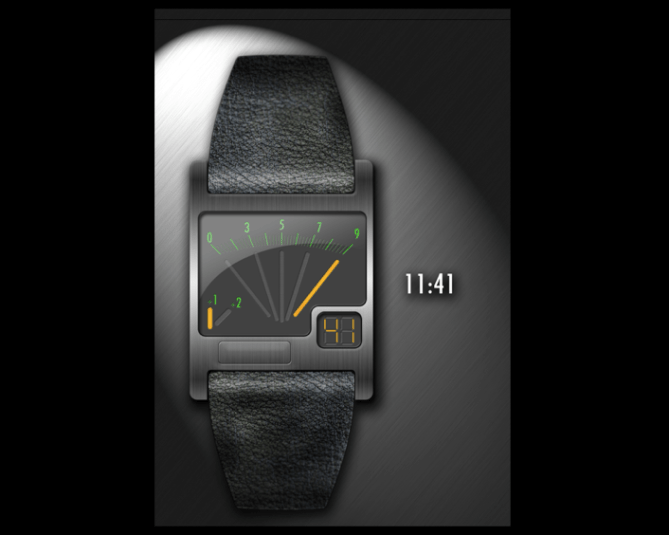
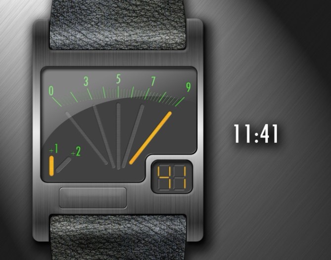
This concept watch design is inspired by the look of voltmeter. It shows hours 3, 5, 7 and 9 with the dial in the center, and +1, +2 exact hours with the dial in left bottom corner. Minutes are shown simply by small digital display in right bottom corner. When the button on the front of the case is pushed, a brief animation illuminates the display before the time is shown.
Despite the claims of the page title, the watch doesn’t really measure any electric charge, it just looks like it could.
Interesting thought though, how many people would actually be interested in knowing the static charge they build up during the day?
ポーランドのMaciej Mandryszさんの作品。
電圧計にインスパイアされたコンセプトデザイン。大きいメーターの部分で、0、3、5、7、9時を表示し、左下の小さいメーターに表示された数値をたす事で現在時間を表示する。また、分の表示は右下の小窓にデジタルで表示される。フロントの時刻表示ボタンを押すと、短いアニメーションと共に時刻が表示されます。


design feels a bit cluttered to me, even though it isn’t at all.
not sure about this one. perhaps it’s the +1/+2 indicator that’s really bothering me.
otherwise good design.
oh, by the way, the “11:41” example is actually “10:41”, isn’t it?
LikeLike
Hi werwolf, Yes you actually right, it is 10:41, for some reason i forgot to change at the end. Apologise for that. Anyway it shows us that it is easy to read the time after all :). Thanks everyone for positive feedback. I will try harder next time. If tokyoflash will let mi i will send another designs, i have two more ideas in my head.
Maciej
LikeLike
Hey Maciej, You are always welcome to send in your designs. Seems like your designs are getting progressively better as well. Here are some hints on what people seem to be liking or judging high and wanting.
1) Easy to tell the time, but looks very complicated.
2) Has a theme. Maybe Si Fi, or minimal or a pattern
3) Case shape, texture and color work well together.
I think the above design has many of these points, so you are on the right track. The people will be the one ones deciding, so keep an eye on those comments and ratings and keep up the great work!
LikeLike
Werwolf, you r right, there is a mistake, and 11:41 example is actually 10 41 :).
I like this design, it looks very interesting. The minutes design is too simple. Maybe a different font, or maybe different colour ? Otherwise the case is interesting, and modern. I think the square on the surface is actually the main button ?
LikeLike
That’s nice. When you see the mistake, then this watch is easy to read, wich is definitely a good point. The design is simple. I personally like slightly rounded rectangles 🙂 The time reading is simple and not intrusive at all. The tachometer look is quite something for speedy people, tehehe. The digital minutes display fits in this design.
The only flaw I see is just a matter of taste: There is a main rectanlge wich isn’t fully filled by the indicators, since it’s fan shape. So the lower left corner is filled with another indicator and the lower right corner it “bitten off” by another rectangle. It looks a little to puzzled to me. But as I said: thats taste.
LikeLike
Great design. I like how it’s easy to see the time, has some numbers and the small glass window for the minutes. I think the bottom of the big minute indicators would maybe look better if they were arranged so they followed the same curve as the top. Maybe the 1 and 2 hour marker could be arranged a bit better too, but think that would be easy to figure out by playing with some different layout options and deciding what looks best for everyone. The case and strap look nice and clean. I think many people like it.
LikeLike
Yeah, this one is simple to read once you understand it and looks fascinating at first glance. I kind of know what werwolf means about it being cluttered, I wonder how it would look if the +1 and +2 hours were incorporated into the main “gauge”. On the other hand, it wouldn’t look so balanced with a space in the bottom right. Love the case and strap, there’s definitely something here.
LikeLike
This watch design just needs a little bit of tweaking.
The display in Green & Yellow with the dial effect looks awesome! & the window with digits is a nice touch too. I love this & would definitely wear it, but it just needs a couple of changes.
• Keep those Green markers, but have it 1-12
• Remove the +1/+2 – instead have an am/pm
• As someone else mentioned, clean up the bottom of the yellow bars, so they fit in with the top curve.
Perfect then, keep everything else the same.
LikeLike
This retro style is really what I like!! And with this car design style it is really interesting.
My only worry is that it could have be even a bit more simple to indicate the hours a regular way maybe.
LikeLike
You do realize that 11 means = 9+2, not 9+1.
I think the first image and second image display time of 10:41 instead of 11:41
LikeLike
Yeah, looks like this was a small mistake – the designer apologizes above.
LikeLike
The hour & minute light could be 2 different color. It would be nice if the hour go 0-12. The 0 would lid at midnight & the 12 at noon. I would definitely buy it if you make no change. ( if you change to 12 hours mark & am/pm light, keep the 0 not the 12 ) I like the fact that the buton is in front.
LikeLike