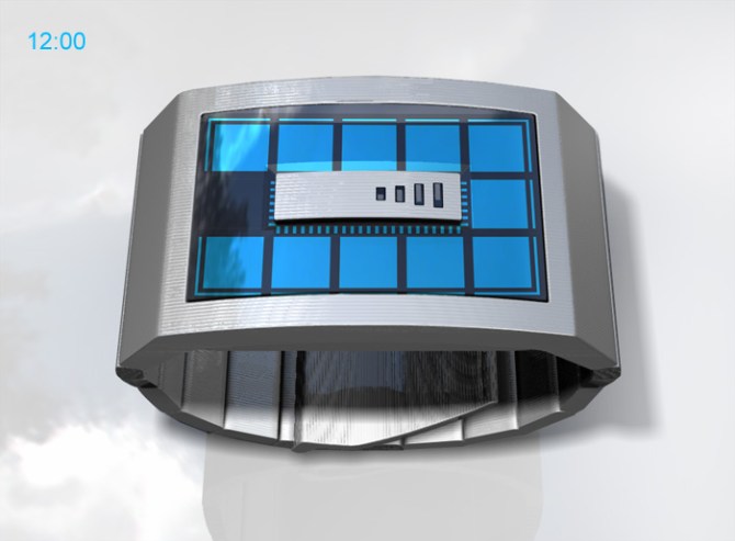
The focal point of this concept is the center of the glass lens which is chamfered at a 45 degree angle around the central block of metal. The overall shape of the watch is simple, featuring sharp lines and delicate grooves. The user-selectable multi-colored LCD interface is crisp, clean and simple; hours are shown in square blocks and five minute groups are shown as lines outside the square blocks, in the same position as hours and minutes as a clock face. Single minutes 1-4 and seconds are shown in the central zone. The time can be read instantly because of the always on LCD screen.
フェイスのセンターエリアに配置されたメタル装飾パネルが印象的なシンプルでスタイリッシュなデザイン。ブロックをテーマにしたインターフェイスは時刻を簡単に読むことができ、またマルチカラーLEDバックライトで、自由にインターフェイスのカラーを設定できます。時間は正方形のブロックで表示され、5分単位はそれらの外側のラインで表示します。また、1分単位と秒の表示は中心のエリアでおこなわれます。常に時刻を表示するLCDディスプレイタイプなので、ボタンを押さなくても、すぐに時刻を確かめることが可能です。
Despite the cryptic looking blocks concealing the true nature of this device, it is as easy to read the time as any regular clock. Just look at the position of the black square, thats the hour. In the image below its at the 10 o’clock position.
Around the large blocks are slim lines, again the position of the black one replaces the minute hand. Below thats in the 5 minutes-past position. Then those small dots in the center add up to give exact minutes (5 mins + 4 mins) = 9


Maybe the 5 minutes indicator can make it a bit bigger, is much more easy to see. Will love to have it.
LikeLike
Hmm Not bad. A bit simple for my liking, but good for people who like simple designs.
LikeLike
I love it and I want it !!
Very beautiful. If you propose a good choice of colors I take one.
LikeLike
If you release this in IP black, I will buy it so hard…
Also, if the different sections of indicators were able to be different colours, t’would be so cash.
LikeLike
Wow, old school and futuristic in the same time. Great concept.
LikeLike
Nice design. Usually I don’t like big and heavy watches but because of intriguing “block of metal” I could have one.
Some advices – nobody care about seconds. Date mode is also not necessary.
5 minute indicator could be bigger. Or change it with hours indicator. IMO I more often want to check minutes not hours.
Great job anyway.
LikeLike
very slick.. sign me up!
LikeLike
A little boxy though I like it.
LikeLike
Nice concept. It is simple, but between the date mode (which SHOULD be kept, sorry Copypaste), the always on display, and the elegant design, its pretty great.
I’m going to have to disagree with Copypaste again and say that the seconds are nice. However, the empty corners are kinda weird. Second should “flow” continuously. Maybe round off the edges; make the seconds into an squarish-oval to contrast with the rectangle centerpiece.
Speaking of the centerpiece, why not make it into a button (or split it in half and make two)? You could get rid of the larger button on the side, which I assume is for changing the colors, to make it more streamlined. Or at least make the center button change the colors, the larger button switch to date mode (which there would be an indicator for (on the centerpiece?)), and the smaller button change the time.
Actually, I’m very confused about what buttons do what now. There are two buttons, but 3 specified functions. This has confused me in some past designs too, so could someone explain?
LikeLike
Thanks for your detailed and useful feedback FuzzyGoodle. Sometimes the buttons have multiple functions. Usually the upper button is pushed to display the time, the lower button is an inset button which is used for setting the time. The cap on the left side of this design is intended to be a USB recharging port. As with the Tokyoflash Negative watch, it could be that holding both buttons together for a short time allows you to enter color setting mode and pushing the upper button twice shows the date.
LikeLike
Thanks! That makes sense now.
And I thought that was a USB port in the very first image, but I couldn’t see it in any of the other images.
LikeLike
Excellent design again. I want them all 🙂
I love the metal case, and the tiny lines on the surface.
Also, the centerpiece wich is in metal, you can make it as a button as FuzzyGoodle’ idea. It is a great ideea. I am not shore that I want the seconds in circle. Maybe the entire concept can suffer and the ideea of block metals can be alterred.
The ideea with seconds moving continuously is great, because it gives a very dinamyc look to the concept. Maybe also for the centerpiece, if the watch can be charge with USB, the 4 led can show the level of the battery. 4 leds for full, of course. 😀
Speaking about the strap, maybe you can improve it, and transforme it. The point is if the strap can have for every singe link the same metal blocks as the metal case, the entire concept is then perfecty integrated. Like in Cubic Equation, another great concept.
I love this one ! I want it BADLY !!!
LikeLike
I like the simplicity of this design, it seems uncomplicated and clean. I think seconds may add a little more activity to the display so i’d like them to stay. Not my favorite concept but still very cool. Keep up the good work TF, looking forward to buying my next watch soon!
LikeLike
love this one, sometimes simplicity is better.
having said that, i’d probably prefer the five minute groups indicators being reversed. i think it would look a lot cleaner if only the 1 of the 5 minute group lines was ever lit.
another idea, the single minute indicators on the central block only take up the lower half, i would mirror them onto the top half, but use the mirrored indicators to display the batter power, maybe they could cycle rapidly when the usb is connected to indicate charging.
the lcd colours are user-selectable, but out of how many colours? if it’s just 8 – 16 colours, leave it as is. if it’s millions of possible colours/shades, then i’d like to have the option to leave it permanently cycling through every shade, maybe being able to change the cycle speed so it can take anything from 1 minute to a whole day to go through a complete cycle
LikeLike
Can I have to prototype?? Gimme gimme this one!
Especially with the green lights in it, fantastic. Keep the userselectable colours. To keep it simple, 8 colours is enough i believe. Why is the USB-port? To charge your watch? Than it’s useful to see the batterypower on the screen or in de metal middle block. Keep the structure of the metal casing the way it is. I think really retro, just like the early metal lighters. Titanium blackis also a nice colour for the watch in my opinion.
LikeLike
I like how the design looks like a computer chip. I have only one problem with the watch. I prefer the watches that start out looking blank and fill up as time goes on instead of having all the lights on except the one that indicates the current time. The watch that I’ve bought from this site was one of the ones that fills up (Nekura Scramble) and I find that that style looks a bit fancier and easier to tell the time.
LikeLike
I like this watch. It is original and finally one with a day/date feature and seconds indicator. This is the way to go. I like a lot the multicolour and always on LCD.
LikeLike
Hmmm yes! I like the metalic look, the biiig display and the square/rectangle time indicators. I like the negative display (off means yes) so the whole display is used and not only a fraction. The exploitation of the case for the time display is pretty good. The color options are nice. Wise idea to show them 🙂 This watch would sell itself, I’m pretty sure.
LikeLike
The outer line ( 5 minute segment ) should be 2-3 time thicker. I agree with Copypaste about the idea to use the outer line for the hour. Since the battery is being charge by USB, there should be a power reserve indicator, maybe 4-5 bars under the single minute that would be the same length as the last single minute. The seconds indicator is very nice, even if it’s not really useful. Perhaps you could make 1 model where the lid light is the one that count for the people who prefer that.
LikeLike