

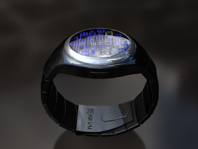
The silver ring around the face of this concept contrasts against the black case and strap to enhance the fact that the lens is raised above the case. A deep acrylic lens covers the interface, and beneath there is what appears to be a maze of digits. Blue LEDs ignite the display when the button is touched and three flashing digits present the current time.
数字を3Dにした独特のインターフェイスが特徴。一見複雑に組み合わされた数字だが、アナログ時計のように数字が配置されているので直感的に時間を読む事ができる。サイドのボタンを押すとブルーのLEDによってライトアップされ、現在時刻の部分が点滅する。


So it’s Friday, and we have a new concept. Oh Yeah !!!
The design is interesting. I like the classic shape, but maybe an octagonal shape could be more interesting.
I will change the shining circular metal frame, or maybe I will make the glass material in opaque mode. Like polished glass. in this way, the digits will looks like they are captured in ice. Glowing in the ice.
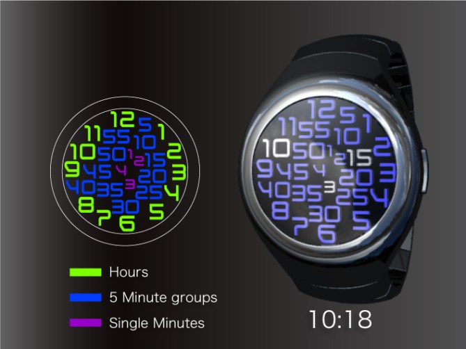
It is simple read the time with this model, because all the digits are placed like classic watches.
Maybe the color for the minutes should be made with a different color. Also the size of the minutes should be smaller than hours.
The button for activation looks excellent. I like it because is parallel with the glass frame.
LikeLike
I’m not sure I like it that much. All the digits make it seem busy and overcrowded. I don’t think it has as much of the same impact as other previous watches.
I do like the case and the strap though; very smooth and streamlined with a nice colour.
LikeLike
Oh, this is glorious. I like the designs that don’t look too over-the-top, so this one is perfect. Love the large case.
Yeah, as GabrielBB says, it’s simple to read — but doesn’t look like it.
I like the idea of deep glass like in a previous design. It is a bit like the Infinity design that someone posted a photo of on the Tokyoflash Facebook page: http://www.facebook.com/tokyoflashjapan
LikeLike
I like this one a lot. The idea of having lots of digits on the face is a very simple yet very powerfully original concept. This has the result of an incredibly different looking face and yet easy to read. I like the case and strap too. I also like the different colours for the hours and minutes etc. I also like the effect of the digits being suspended in te glass. I would include a day/date feature as well.
LikeLike
Hi i like this design but for color-blind people like me there are no differences between five minutes group and singles minutes.
LikeLike
The design isnt color coordinated the Example was just to show you where the groups are located
LikeLike
I love this watch and it needs to be made and as soon as its made I will by this watch. The color is great the design is great and the number font, size, and local is perfect. Make it exactly as show please!!!!!!!!
LikeLike
Hi TF,
LOOOOVE this one!!
this should be made asap.
LikeLike
This design is not my thing but can understand why people like it. I love many of the other designs better.
LikeLike
This watch is nice, I will love to get it for one of my collection. When can I get it?
LikeLike
I love this one.
Maybe an optionnal multi-color LED design could be interesting in order to differenciate the different groups more easily.
Would it be possible that the glass plays the role of button for activation ? I would find it cool.
Whatever the final design, I already love it.
LikeLike
Pretty watch! it’s good idea – janfi2004@yahoo.fr says:Would it be possible that the glass plays the role of button for activation ?
i like the colors – blue and white!
LikeLike