

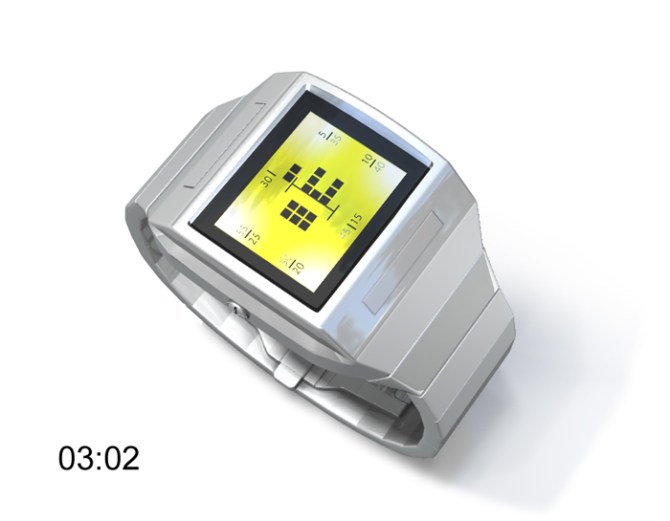
A concept with an always on LCD display and user selectable LED backlighting. The hour is shown in digits in negative space in the center of the display, minutes are shown by the ring of blocks surrounding the digits. The first rotation of minutes in positive blocks to 30 minutes, then the second rotation in negative blocks to 60. There are markings to help indicate the current position. The simple, tough looking case has large buttons above and below the face to initiate the LED backlighting.
ケース上面にボタンが配置されたシンプル&タフな形状。表示部分にはLCDディスプレイを使用しており、バックライトの色を自由に設定することが可能。センター部分で反転表示されたデジタル数字が時間を表示。その数字の周りに配置されているブロックで分を表示。分表示は一周で30分となっており、ブロックの外側に表示された数字を確認することで、現在の分を簡単に知ることができる。


Minimalist!!! I Like!!!!
LikeLike
I like it too!!! But i’d like to have one in black whit blue led like on the 1 st picture!!!!
LikeLike
Excelent design again !!!!! The bracelet is great also. I like it because is wider near the clock frame, and then becomes thiner.
The silver colour goes excellent on this modell.
It is difficult to read the hour, because when is 03:02.(picture no 3) is difficult, Maybe could be a thiny line betwhen the hours and the minutes. In this way, the hour is clear.
how it looks when the time is 08:55 ? I can’t figure how it works when the minutes decrease again until next hour.
LikeLike
If I’m reading correctly, 8:55 would look the same as 7:25 does in that picture, except that there would be an 8 in the center (obviously) and instead of the lights up to 25 being lit, they would be unlit, while the unlit minute lights in the 7:25 image would be lit.
In other words, the minutes build up around the circle. After going around once, they go around again (still clockwise), this time “eating” the original minutes. So 25 and 55 look the same, just with the lit and unlit lights switched.
LikeLike
I love it !!!
Wanna buy it as soon as it will be released.
LikeLike
If it comes in chrome, it’s a definite buy for me. I like it how the way to read it isn’t immediately obvious. When I first saw it, I had no clue how to read it then when I read the explanation it seemed so obvious. I really like that.
I also liked the increasing/decreasing thing of the minutes. I just wist there was some way of knowing whether you’re in the first or second half of the hour with the minutes (that is apart from taking note of whether the minutes are increasing or decreasing) Perhaps another indicator? – If your worried about how cluttered it is, I don’t think removing the number would be a huge loss.
To do with the shape, I thinks it couldn’t be better for this kind of design as it fits so well with the display. It kind of denotes science and precision. Great design overall!
Just wondering, is the bolt on the side a usb cable socket or something like that?
LikeLike
I am not too sure about this one, although I appreciate many have liked it. I think the case and strap are a bit ordinary looking, although I do like the button positions. I like the always on idea. I like the displaying the time in negative concept. However for this to really work, there should be an outline of some sort around all the digit shape, i.e. in the illustration above, the zero at first is difficult to read because some of its outline is not there due to the current minutes. I think this could be resolved by having an extra increasing/decreasing square nearer the edges of the case that represent the minutes. To do this, perhaps the hours would need to be reduced in size slightly. Just an idea…
LikeLike
Nice and simple. Not too over the top like some of the other designs. Kind of reminds me of a Casio watch case with a Tokyoflash twist. Nice.
LikeLike