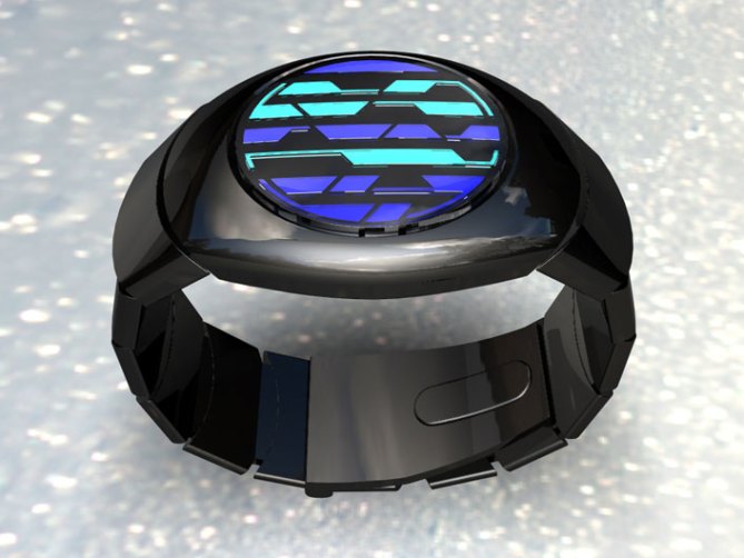
The organically shaped case blends perfectly into the strap of this design to create a single motion concept.
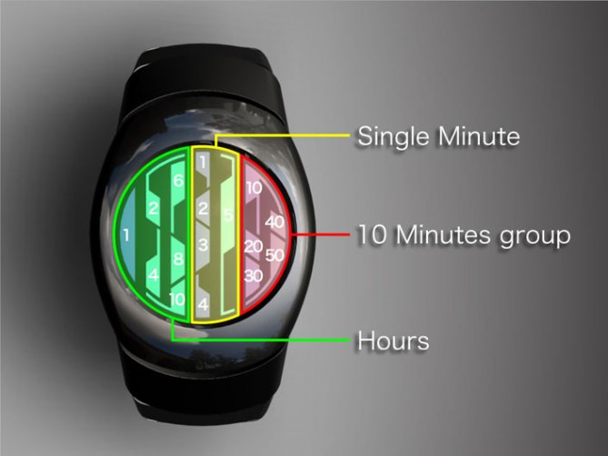
Shades of blue and green make up the display, each of the segments indicating a unit of time. Hours on the left, groups of 10 minutes on the right and single minutes in the center.
The line pattern that makes up the interface runs in the same direction as the strap. A natural look with an unusual display..


I like this one. Maybe the case could be less oval-shaped and more circular as the display.
LikeLike
I like it. Would buy it as long as the price is 135.00 or less. The oled display is a nice touch
LikeLike
PS, would like to see it easier to read at a glance.
LikeLike
I really like the shape, proportions, and style on this one, but I’m not so sure about the colour scheme for the LEDs… Maybe in real life it would look better, but I would be interested to see how other sets of colours would work here. Otherwise, great design!
LikeLike
I love the display! The strap also is cool, but the case is a bit well not Tokyoflash, maybe play around with the case. This display may look good in a square case.
LikeLike
For this watch (as with some of the other new designs) I don’t think that the way the time units are displayed is very intuitive. The shapes seem a bit too random which makes them difficult to count. In my opinion, there should be some uniformity between each marker of a certain time unit. The case and strap look nice, it kind of reminds me of a round Keisan.
LikeLike
The round shape of the watch is very classy indeed! However it’s a bit tough to read. I think the shapes need more continuity between them. I do like the color palette though! A very refreshing design!
LikeLike
I like this watch. I like the round shape (it’s nice to have variety – square, rectangular, round etc). I like the strap and colours used for the time. I like the shaping of the various time sectors, giving an overall interesting look when switched on. Unfortunately I have to agree with the comment that it may be difficult to read the time on this one. One solution would be to have an option on the watch to have the numbers appearing (or not) on the various sectors. This would make it easier to read for those that find readability difficult and it would also satisfy those who do not want to see the numbers.
LikeLike
I like this one alot. I am not a big fan of the color Cyan, but i guess if that is the color scheme you’ve chosen then those of us who love the watch will just have to live with it. I think that neon colors in this watch would be cool. bright blue’s and greens would really set the watch of in contrast to the dark band.
LikeLike
Thank you for all your comments. We will work on making the time more uniformed and the colours as well. It would be hard to get this colour like it is in the renderings anyways. Would you prefer to have this design in bright LED or LCD with backlight? With the LCD you would not have to press the button to see the time, but at night when you push the button it could have a nice bright colour. Many people have stated they want a watch they can see the time quickly on, but then they also want bright lights. Can’t have both. Thanks again!
LikeLike
As much as I like being able to tell the time without using the LEDs on my Rogue, I think this watch would look best with LEDs behind the markers. Having the markers raised from the face of the watch under the glass (see the side-profile picture above) gives the watch a greater appearance of depth, texture, and character that I think would be lost if the whole thing was flattened into a LCD display like the Rogue.
LikeLike
I agree with squirrelKing, I feel that the LED lights will give it more Life.
LikeLike
Thanks Noted
LikeLike
Color Blue is My thing, Just Like I Said about the Neon Encapsulated Watch Cocept, Its Perfect. (well for me)
LikeLike
OK, thanks. Blue is a popular colour.
LikeLike