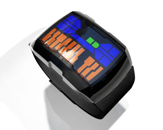
Attractive curved glass with offset sides gives this concept its unusual appearance. The stainless steel case is combined with a leather wrist band to provide a comfortable feel and contrasting look.
The interface has three different LED colors. Blue to indicate hours on the right, red to indicate the progression of minutes in groups of 5 on the left and green blocks on the right to indicate minutes 1-4.
A strong look with a video-game style display makes this concept stand out.


Very cool design, it would be really sick if you could replace the orange and maybe the green with yellow, because blue and yellow are a combo full of energy and life and in the same time funky, or if you really want to keep the orange change the blue with red and green minutes with orange. This could look really cool….or maybe not, but in this developing stage it can be worth trying.
LikeLike
You even can go for white and cyan and maybe green, for a cleaner look.
LikeLike
White might be nice. Would give it a more of a design feel to it
LikeLike
I like a lot the LED shapes and colours and if these would be animated as they appear (i.e. not appearing instantly all at once) in some interesting manner, I think it would be very interesting. I am not sure about the outer edges of the case though. However I do like the curved glass. I would also suggest a day and date feature.
LikeLike
I like the design but I agree that the orange looks a bit out of place. The markers for the hours and single minutes look good, but the ten minute markers look a bit random…it may be better if all of them are the same shape.
LikeLike
not feeling the orange here, go with a cool color it will make it a lot better
LikeLike
I think the 5-minute markers are perfect as-is. The difference in shape of the 15/30/45 markers is important for quickly getting a read of the minutes. I agree that the orange looks a bit off though. Maybe it would be better with red for a red-green-blue primary colours feel or a purple to keep things cool?
Overall, I love the shape of the watch itself and the way the LEDs continue the theme. Though I wonder if it might benefit from flipping the two columns (so that the hours are on the left and the minutes on the right) so you could read it more intuitively left-to-right?
Finally, I feel compelled to ask for some kind of animation – this design has a lot of potential here.
LikeLike
I love this watch. I would change the green with the red, or orange or whatever color that is. I think that the green next to the blue would make the watch even more perfect than it is now. I am not a leather band kinda guy, but i love this watch enough that i would wear the leather band. It would be even more amazing if it had a titanium band to go with it, but aside from that you’ve done an amazing job on the watch.
LikeLike
This watch doesn’t get me going in any way. Sorry.
LikeLike