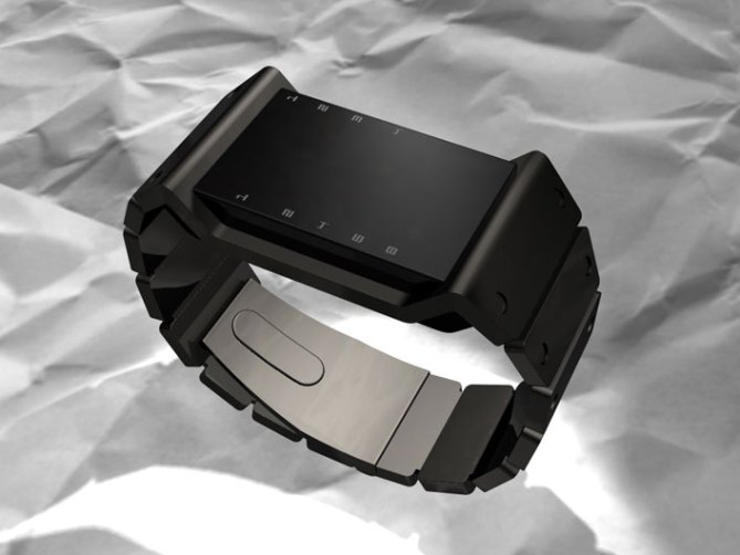
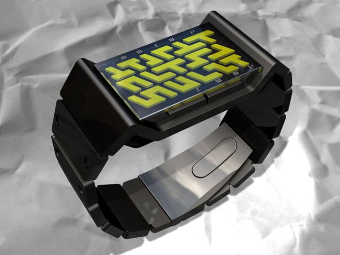
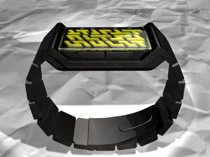
Like something from the Caterpillar factory, the heavy steel frame of this design bends in beneath the interface to create the case and bends out again to form the strap.
The width of the frame protects the strong looking interface, which is set deep beneath the raised edges of the strap.
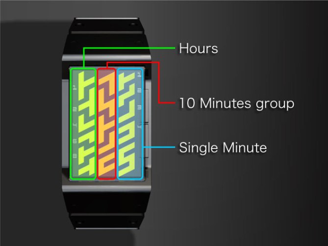
The LED display is like a rugged tire track, the maze of shapes illuminate to display units of time in three distinct groups. Hours, groups of 10 minutes and single minutes move in the same direction.


Wonderful form. Look at different backlighting, and the name of the product suggests an automotive background. The sturdy look is accomplished, but the graphics representing the numbers may need a little work to resemble the treads of a tire.
LikeLike
I love these cryptic symbols layout in this sturdy case ! Make it happen 😉 I wonder if it could also display the date.
LikeLike
The strap looks like a tank track and the overall design gives a solid and masculine feeling. Again a great design.
LikeLike
and nice again.
And again, please take of the numbers.
LikeLike
This one is NICE!
LikeLike
Another one that can be hard to read, but a cool design.
LikeLike
And again, you have to be able to read time with ease, not to look like your watch just came from Mars and you can’t understand martian, if you look like your watch just came from Mars and you can read the time on it with the ease you are reading a normal watch, that’s success.
LikeLike
I love the design of this watch, but the diagonal lines are really strange. Everything else is fantastic.
LikeLike
I love the casing-flat on top, very sleak. I wouldnt buy it because it doesnt look easy to tell the time, and I hate the yellow. You should put multiple LED colors into more of your watches.
LikeLike
Great feedback guys!
LikeLike
Great design no question.
Personally I m not much into the rugged tire led display and the yellow – something more subtle, less obscure or flow type shapes are closer to my taste.
If you keep the rugged tire, you may go for some ‘military’ color options (dark green leds, or dark green casing/strap with with lighter green leds).
Anyway, one of my favorites among the new designs!
LikeLike
Great idea about the ‘military’ theme, that could really hit a certain group of customers.
LikeLike
I would defiantely be in line for this if and when it’s produced! I think the yellowish color for the LED’s provides a stark contrast to the case and band, as well as being unique to the lineup in that we haven’t seen yellow before as a main color. I agree with one of the previous posts about taking off the numbers. They’re distracting from the overall design when the LED’s aren’t active.
Have animations been thought of at all? I think an obvious animation would be the LED’s illuminating in alternate row succession down the length of the interface to simulate tire treads moving. Keep up the good work!!
LikeLike
great design for this one! nice case and yeah military theme’s a good idea and yes the strap really looks like a tank track! maybe it does not need numbers, because the left display led-column includes hours, the centre 10 minutes groups and in the right column there are single minutes; i think that’s enough to be able to read time.
LikeLike
I think this is a brilliant design. I like the the slightly recessed face. I like the LED shapes and I agree with other comments that some animation may be nice. The numbers may be necessary for readability. However, rather than printing them on the case, they could remain in the current shown position and instead light up when the button is pressed to show the time. So numbers and LED shapes would appear together. This would result in the numbers not being visible when the LEDs switch off. Perhaps also use different colours for different parts of the time, e.g. red for hours, yellow for minutes etc. I would also include a day and date feature.
LikeLike
Nice concept but needs some work with the way the time is displayed. The yellow shapes seem a bit random and would be better if they were a repeating pattern, maybe a bit more like Jlr7?
/_
_/
/_
_/
/_
LikeLike
I like this design, Layout reminds me of the Tetris like game i played.
LikeLike
First of all, I love this design. A solid appearance is achieved. A military theme is the first thing that comes to my mind. I think the handband really looks like the tracks of military tanks. I think a digital como. handband and a “night vision goggle green” LEDs will also be nice for people who likes the “high tech. military theme”. Size factor is also a concern to me baceuse I have small wrist. Finally, I think something can be done to make this watch to be easier to read. For example, change the LEDs for the hour groups to look like numbers; I say this because I noticed the last LED in the single minute group really looks like “5”.
LikeLike
btw, how do you put a profile picture.
LikeLike
hey vincent199122, you can now add a profile pic on your account page.
LikeLike