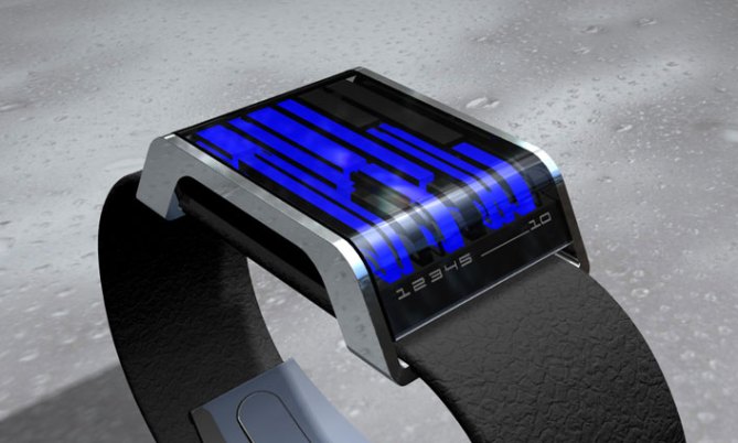
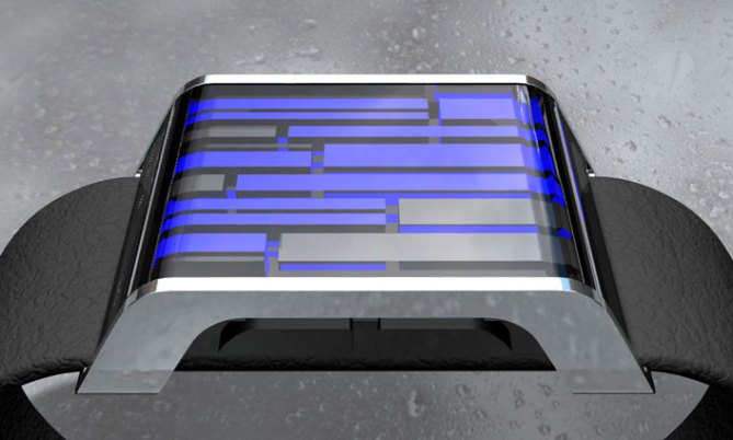
Like streams of water, the electric blue subsurface LEDs beneath diffuse light to create stunning overlapping lines of time.
The display is set into a polished stainless steel frame and the rubber strap is fed neatly beneath the chassis of the watch.
Sharp, sleek and ultra modern, the curve at the front stands out to make this design different.
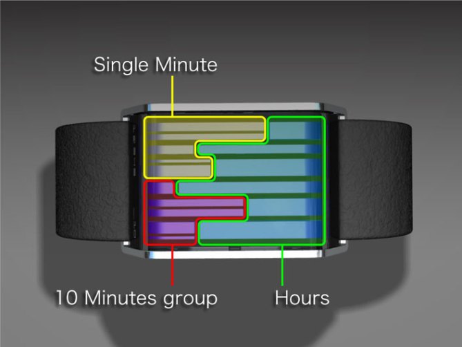
Hours are displayed at the front so easy to see at a glance, groups of ten minutes 10-50 and single minutes at the back..


This looks pretty awesome. Even better if there were some other colours or mixed colours like the bottom picture.
LikeLike
The three dimensional figures within the capsule is very interesting. This is a simple modern design, however, the wrist strap doesn’t seem to quite compliment the beauty of the capsule. I would suggest the ID designer to explore different materials, textures, or even designs for the strap.
LikeLike
I like the depth that the 3 design brings to the unique way of telling Tokyo flash time. The colour scheme is good as it is and feel that adding other colours would cheapen what appears to be a very classic design.
LikeLike
The watch design is really cool except the strap. To be able to make comperison I would like to see it with a thick metal strap which would make it look more masculine.
LikeLike
This design has potential but something is missing. I’ll need to think about what and post again when I can.
LikeLike
Let us know when you got it!
LikeLike
It’s very stylish, but the time display is quite oblique (even by TokyoFlash standards). I’m not sure there’s enough differentiation to quickly distinguish hours from minutes.
LikeLike
Maybe we could add some subtle lines on the face to separate the hours and minutes? A good point. Cheers.
LikeLike
This is one of the best designs ever, except for one thing…it needs a metal wrist strap, the one shown cheapens the design. I’ll be first in line to buy it.
LikeLike
Too hard to tell time and I don’t like the wristband.
LikeLike
Noted. Not much to like about the wristband. I think the image we were going for was more a belt image with the strap going through the case. Might not work with this design. Hmmm
LikeLike
As what Scottyokc mentioned, I do not like the wristband too. It is like adding a furturistc watch face to a old fashioned wristband and might bring down the quality feel of the watch.
One suggestion is that if the streams of water effect is needed, how about adding an inactive animation to it just like those found on barcode or kisai?
LikeLike
definitely a favorite!
I agree with the several comments on the belt. I would vote for some metallic bracelet. Inactive ‘screen saver’ animation would look good also.
LikeLike
I like the design
Not taken on the belt idea, I also worry about how thick the watch looks in the designs, i prefer the more sleek designs which i find fit more comfortably on the wrist, the Tokyoflash Fire is the max thickness i have ever had for a watch and i believe this should be the max as it has taken me a long time to get used to
but it is one of my clear favourites 🙂
LikeLike
Gorgeous design, however I think it would benefit a lot from having a different strap. I think brushed chrome or black nickel/iron pewter metal strap would really make the watch look even more special. Wouldn’t hurt to offer it in a few different colour schemes also – green LEDs please! 😛
LikeLike
I think its confirmed that the Belt isn’t working, so that’s a definite no go. I’ll ask the designer to revise this design and post a new version shortly. Thanks for all your great input!
LikeLike
This design has fostered many opinions. I like the watch a lot and I like the concept of the colours streaming like water. I do think though that it may be difficult to tell the exact time with only one colour. I like the curvature of the case very much. Perhaps two versions could be made, one with a leather/rubber strap and another with a metal strap. I personally have nothing against a leather/rubber strap, perhaps it’s just the design of the rubber that could be enhanced, such as having some interesting texture, to go with the case and streaming water effect. I would also suggest a day and date feature.
LikeLike
I like very much excep the strap,one in steel would be better
LikeLike
also have an option for Mix color Led Lights to tell the time more smoothly for Beginners, if going with non-Metal strap, do what you did with the infection watch, Have the Strap print Similar as the Face of the watch. I like how the Face of the watch actually look like streams of water.
LikeLike
I actually like the look of the case and strap together a lot. But that is if the strap was made of leather. Rubber is a big No-No for me.
With a leatherstrap I would consider to buy it.
LikeLike
sorry, im not agree with the commentaries about the belt. i like on this material, and love the design. Also electric blue is perfect for this watch! Good work :-)!
LikeLike
I am and have always been partial to the steel straps, but that’s just me. Aside from the non-steal strap, it’s a nice looking watch. think that it will be a little harder to read then the other watches, but it will make up for that by being a helluva conversation starter. I like the 3d design as in the shadowed looking lines, and the way they come up from the bottom. It’s a brillient design, just think it will be a little harder to read then the rest. might consider leaving the led’s on a little longer on that watch.
LikeLike