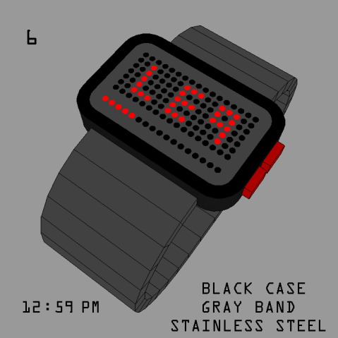
Design submitted by Matt from Canada.
Matt says: I present “AIRPORT”, named like this because the time looks like airport acronyms.
I had the idea while seeing Andy “rainbow spectrum” concept on this blog.

Design submitted by Matt from Canada.
Matt says: I present “AIRPORT”, named like this because the time looks like airport acronyms.
I had the idea while seeing Andy “rainbow spectrum” concept on this blog.
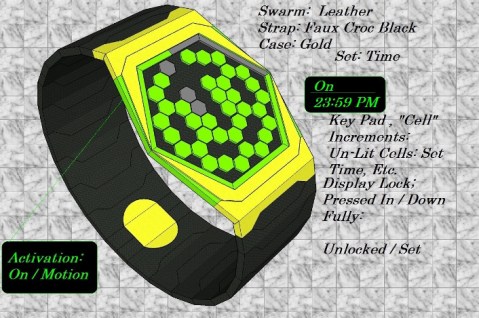
Design submitted by Andrew from the UK.
Andrew says: The following wrist watch concept is a 23-11-4 LED analogue / binary LED display. That uses 38 Hexagonal “Cell” Key Pad Increments. Constructed in both metal watch cases / bracelets or Leather Straps with a multiple Color LED selector. The user can change how this watch animates by pressing the screen lock at one of three positions. See examples provided.

Design submitted by Peter from the UK.
Peter says: For a while now I have thought about creating a watch using Topography as an inspiration. “Topography is a field of geoscience and planetary science comprising the study of surface shape and features of the Earth” This is often shown using curved lines to show the shape and lie of the land at it’s various altitudes.
It was only when I did an internet search I found that someone had beat me to it. The existing design uses the Topographic element as a decoration on an analogue watch face. So I decided to make a digital design using the Topographic element as the time telling.

Design submitted by Valentin from the USA.
Valentin says: I was going through my many designs that haven’t submitted and found this one I designed a while ago. I came up with this one when I was more into vintage video games and stuff. don’t really know what to call it. I though maybe something like “arcade” “perspective” or “emulator”? I don’t know since it really just is all that at once.

Design submitted by Peter from the UK.
Peter says: I was doing some sketching and scribbled a simple 12/5/9 display layout made up of three ellipses. This simple layout had a slightly alien look to it that could interpreted as some kind of unidentified flying object, or some yet undiscovered creature from the deepest and darkest parts of the oceans. Hence the name “Batiodea” (Batoidea is a superorder of cartilaginous fish commonly known as rays)
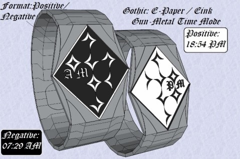
Design submitted by Andrew from the UK.
Andrew says: I decided to create a watch that uses old fashion / calligraphy styled digits.
This lead to the “Gothic” wristwatch design. Which uses a: LED, LCD or E-paper / E-ink to display the time Display. Constructed in either: IP black, Gun-Metal or Stainless Steel This watch has three display modes: Alarm, Date & Time (Default).
Design submitted by Jacques from The Netherlands.
Jacques says: The watch is a redesign of the watch I posted earlier. Although the watch looks quite different from the first one, the principle actually is the same. A minimalistic watch with a completely blank front and time reading functionality on the side, which creates a surprising effect compared to the many watches with frontal displays and numerous clocks/pointers etc.
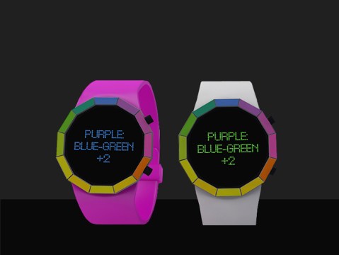
Design submitted by Andy from the Ukraine.
Andy says: My idea is based on popular watch Kisai Kaidoku. I decided to use text time message, but to use unconventional text style, to use color spectrum
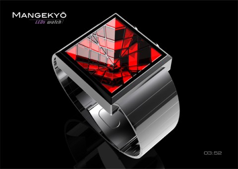
Design submitted by Patrick from France.
Patrick says: An enigmatic watch inspired by my “Mangekyo-Watch-LCD“, like the latter, inspired by my “Hiding-Watch“.
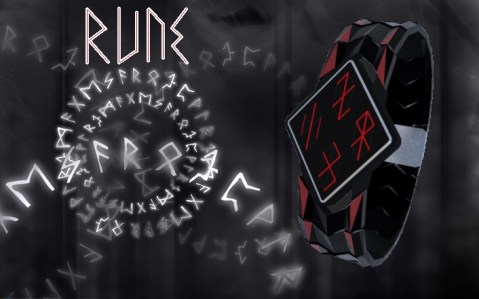
Design submitted by Justin from the UK.
Justin says: I’ve always had a fondness for the pagan, witchcraft side of humanity and have always wanted to see a watch with a similar style/look. So…I made one!
I give you Rune.
