Design submitted by Nev from the UK.
Nev says: As a child, I used to love watching the rain and seeing ripples on water resulting from raindrops. This formed the inspiration for ‘Ripples’.
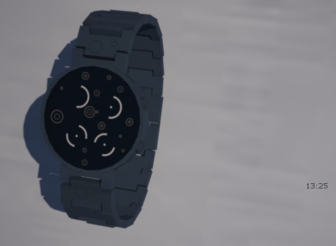
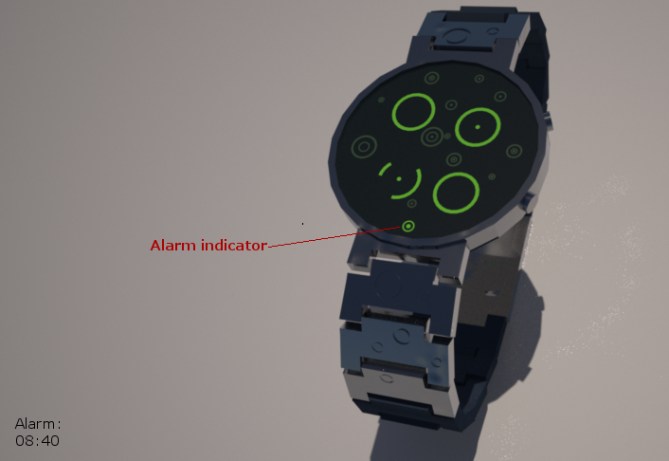
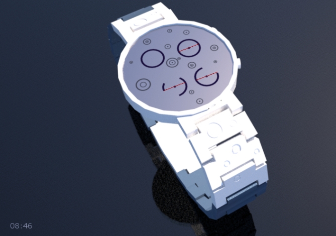
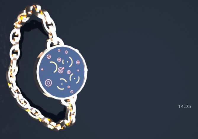
Shown here in 3 forms: normal strap, chain strap and pocket (including one where the chain can be attached top or bottom, depending on wearers needs).
‘Ripples’ is a digital watch (12 or 24 hour), with time, date and alarm modes. It could also be a stopwatch.
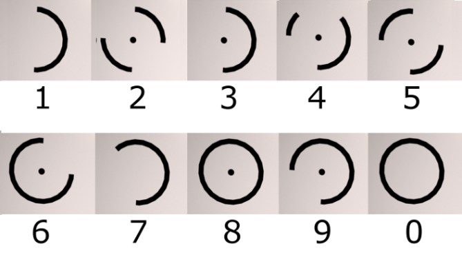
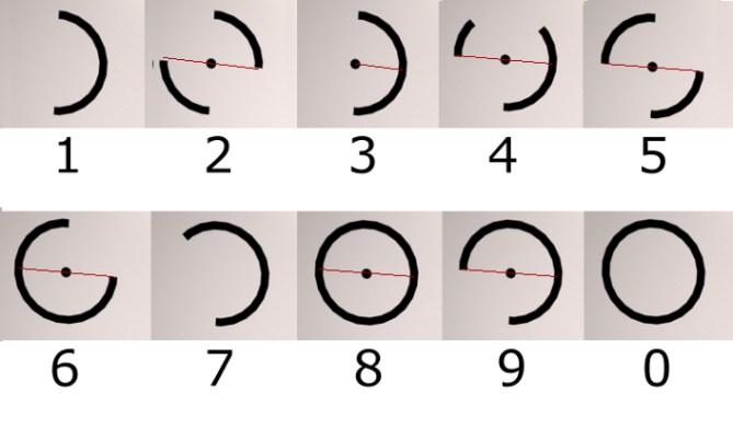
The round numbers are formed from the largest ripples, with the horizontal line replaced by a central dot. Hours / months displayed above minutes / days (depending on mode).
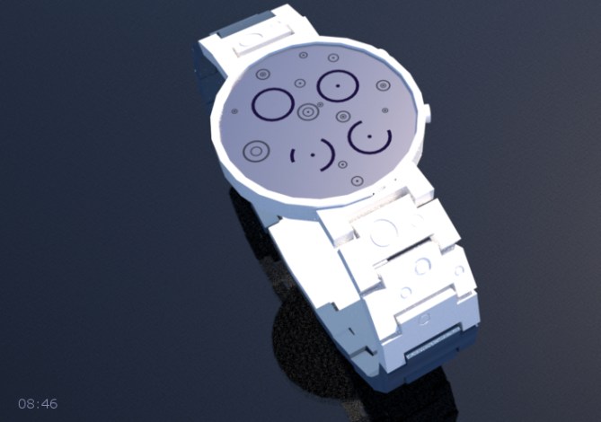
The different versions will appeal to different people. The design will appeal to men or women who like rounded forms / numbers (no squares, hexagons or any sharp corners on this display) and the animation should appeal to those who like watching ripples on water.
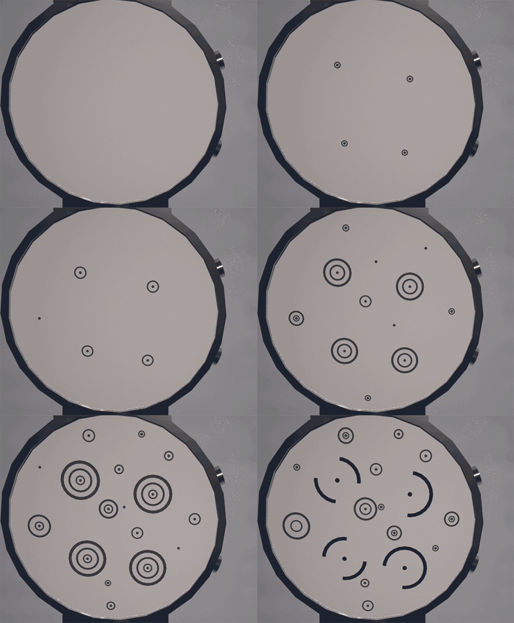
The natural form of ripples on water makes an interesting watch design, which gives an opportunity for great animation. Tokyoflash would create a better animation than mine, maybe showing the drop hitting as well as the resulting ripples.

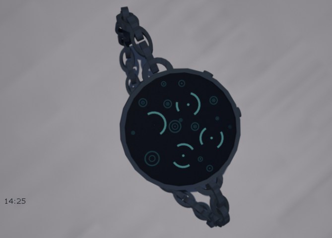
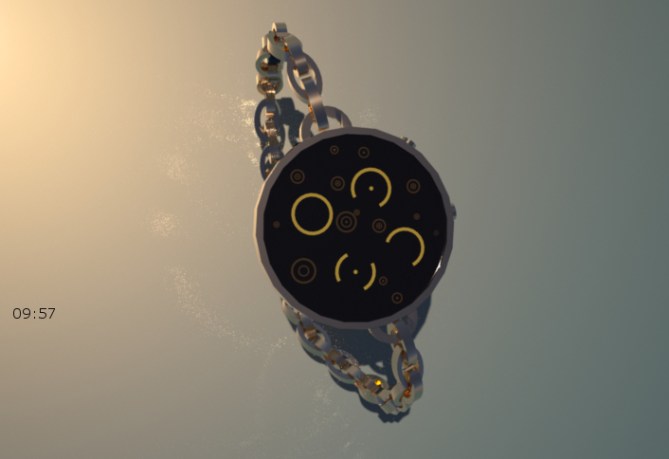


UPDATE: I think the chain strap version of the watch may be too large for some, so I’ve added a smaller version. The original watch case was 40mm in diameter, whereas this would be 31mm. Having two sizes, would be similar to some other brands (e.g. Nava). This may not appeal to Tokyoflash, but thought I’d put it out there.
Not all people could see the numbers, as they couldn’t visualise the horizontal lines represented by the central dot, so I’ve produced a version of the numbers image with a red line showing the horizontal line over the top of each relevant number. Also shown in copies of the first two watches. Hope these help.



Excellent idea! I really love this concept. I think it would be nice to have those relaxing rain drops animating all the time when you glance down, quite hypnotic.
The ripples continue onto the strap too 🙂
Its quite a simple concept but works exceptionally well with a naturally inspired theme. I am all for it, good job Nev.
LikeLike
Thanks for posting and the enthusiastic comments! Glad you like it.
I have liked images extending into the strap since I first saw Stencil, so had to copy that idea here.
Constant animation (a configurable option, as in Quasar) would certainly work here.
Hope everyone else likes this too.
LikeLike
This is amazing! It shames even my concept, the infinity watch. I hope you get it made in real life! You deserve it.
LikeLike
Thanks, Josh. Glad you like it.
Looking forward to seeing your revised version – I wouldn’t be able to create a watch design showing infinity mirrors with my limited skills, so good luck with the software.
LikeLike
I’m interested to see what people think of the strap/pocket watch ideas as well as the watch face. This is the first time I’ve put any effort into the “holder” (you may say “not enough”, but it’s more than last time), so, thoughts?
LikeLike
Hi Nev, your idea is poetic and I love it, plus it works great for a watch.
I have designed a pocket watch, although I prefer the wrist watches.
5 * / Yes, very good idea.
LikeLike
Glad you like it, Patrick. Thanks for the support.
I too prefer wrist watches, but thought I’d show different styles as well this time.
LikeLike
Love this watch! It’s a great idea. Makes me want to keep looking at the rippling effect. I like the strap and chain designs so if it is made available to buy, maybe I’ll have to get one of each.
5*/ Yes
LikeLike
Glad you like it, Dawn. Interesting that you like both styles. Hope you get to buy them. Thanks for the support.
LikeLike
Hi Nev, Nice design my friend. I like the natural inspiration and agree with Toky that the raindrop animation should be constant. The time could be on or off for the majority of the time as per the users preference.
I cant get over how similar this looks to my latest design “Geoglyph” (or how similar my design looks to this) Spooky! Especially when they have totally different inspirations and time telling. GMTA and all that 🙂
5/Y Best of luck 🙂
LikeLike
I’m happy with the idea of the animation being constant, but think it should be a configurable option. Time on or off, if the animation is constant, just takes that one step further. Yep, nice idea.
I only saw ‘Geoglyph’ on your face and design pages yesterday, 6 days after I submitted this design, so any similarity is, as you say, GMTA. I look forward to seeing it here (and understanding how to read it 🙂 ).
Glad you like it – thanks for the support and luck.
LikeLike
I have only just submitted Geoglyph and added to fb, so please don’t think I was suggesting anything untoward. Just saying it was spooky, I had to take a double take when I saw your design on TF lol
LikeLike
I didn’t think you were, Pete. Hope this doesn’t indicate we’re running out of totally unique design ideas.
LikeLike
To be honest I don’t think there are any totally unique ideas left unfortunately. Unless you invent a new type of display tech. Then it would be totally unique and totally unfeasible. The best we can do is an new slant or take on things or use inspiration from a different context. 🙂
LikeLike
Great design Nev, I see a vast improvement in your renders and designs!! Nice work. My fav has to be the top picture, there’s something about the dark screen with the bright ripples that seems to mimic a puddle in the road at night during a rainstorm.
The raindrop animation is awesome and although some will like it on all the time, I would prefer it if the aesthetic ripples were to indicate the ticking seconds, maybe have one tiny ripple “activate” on each second to give the effect of a light shower or drizzle. Maybe even a setting where you could alter the frequency and speed of the ripples. One tiny ripple every 0.5 of a second would be a nice constant visual!
Great work, excellent idea and smashing visual designs. Keep it up!!
I’ve not submitted anything for a while so I may have to pull my finger out!
LikeLike
Thanks for the support and the ideas. Having seconds displayed as you describe sounds interesting.
Thanks also for your help with the software. I used both the materials available in IR, modified some to get closer to the colours I wanted and created some. Still can’t get everything I want, but improving.
Cheers.
LikeLike
No troubles bubbles. There are loads of materials for use in IR! Mainly aluminum, gold, chrome, silver etc. just many variations of those and maybe a few others. I think there are some shiny plastic and glass effects in there too. If you need help finding these and tweaking them I can always email you again and send big pictures with arrows and stuff lol.
Best of luck with this!
LikeLike
I didn’t mean “both of the IR materials”, implying they only had two! I was going to say both theirs and my creations, but then added the extra text about modifying theirs, changing the context for the “both”. Rushed typing!
LikeLike
The numbers seem similar to Sam’s Suujimaru, but the watch looks unique this way, too.
LikeLike
Wow, yes, the numbers are the same basic shape. I thought I’d come up with something new – shows how wrong you can be. Only difference is that my numbers are slightly askew, as I thought that might make them slightly harder to read (didn’t want to make them too easy 🙂 ).
I guess, as Pete points out, that there are no new ideas (or very few), so it comes down to how you put it together.
Hopefully I haven’t made Sam think I’m copying his (cos I wasn’t looking at the blog back in 2012 when Suujimaru was posted). Sorry, Sam – a case of GMTA or, more that this was the only way to use the parts of the raindrop / ripple to present the numbers, so they are right for this design.
Glad you think the watch is unique enough.
LikeLike
Nice job, Nev. Can I have one?
5y
LikeLike
Glad you like it. All I can give you is images at the moment, but if we’re lucky you might be able to get a one – all up to TF. Thanks for the support.
LikeLike
A nice clean minimalist display: digits Mode indicators that all in keeping with the Ripple Theme. The Bracelet / pocket chain is very elegant & would be well suit for the feminine watch market.
LikeLike
Thanks for the thoughtful comments, Andrew.
After submitting to Tokyoflash, I have concluded that the chain bracelet watch probably needs a smaller watch case to make it more attractive to women that want that style of watch. I have another image that shows this, but have not sent to TF as yet – waiting to see if anyone asks for other changes that I can make first.
LikeLike
Love this design!! Really like the ripple effect – very relaxing and if the animation was constant i could see this being quite hypnotic! Like the different strap options too. Think my favourite is the chain strap.
Hope it gets made! Would definitely buy one!
5/y!
LikeLike
Thanks for the support, Kath. Glad you like it.
I wasn’t sure about the chain strap, but thought it a logical extension from the idea of a pocket watch version. After submitting, I thought it would be good to produce a smaller version of the case with this strap for women who might like a smaller watch than those typically produced by TF. I might send this in as an update. If they could produce 2 sizes (like some of the Nava watches), it would be cool.
LikeLike
Thanks for posting the update, TF.
The first two images do not change the design, but show how the it represents the numbers, so people do not need to read the text.
The last image is a reduction in the size of the case, which I think looks better with the chain bracelet and might appeal more to women looking for a smaller watch, but still like them to be cryptic.
LikeLike
Great concept, very well developed and exposed.
Great job with great potential. 5 / Y 🙂
LikeLike
Thanks for the support and vote, Jose. I don’t think my images are up to your standard, but glad you like it.
LikeLike
Great design! I’ll have one with a normal strap and my girlfriend will have one with a chain strap.
The smaller case looks good for girls wanting smaller watches, but the standard size would be fine too. Pocket watch attached at the bottom may work for nurses, if it could have seconds as well – once they have worked out how to read quickly!
I read the text, so could read the numbers before getting down to the extra images added at the end – I guess some people just look at the pictures!
When can I buy?
LikeLike
Glad you like it. Don’t know if you will get the chance to buy those 2 watches, but I hope you do! 🙂
Not really thought much about easy to read seconds. Might make the watch too busy, but if they could be added without doing this, it would be cool.
Thanks for the support.
LikeLike
The size of watch I choose depends on the occasion. This design is very attractive (and the display quite hypnotic, as mentioned before). I think I’d go for both sizes of chain watch.
LikeLike
Glad you like it, Zoe. Your comments are interesting. Looks like there is a market for smaller watches for TF, as well as the normal size. Thanks for the comments and support.
LikeLike
I like the digits & that they are not aligned. I can imagine the “showing the drop hitting as well as the resulting ripples” effect. It would be good to be able to manually change the quantity of the decorative ripples.
I prefer the pocket watch version.
LikeLike
Configurable ripple quantity – that could definitely work here, enabling easy (very little) to hard (densely packed) reading. Nice idea.
Sold – one pocket watch. Seriously – glad you like it, Matt, and thanks for the suggestion.
LikeLike
Great design Nev! I really like the last photo in the update with the smaller watch face and chain. I also like how you carried the colours through from the chain to the animation on the watch face. The concept appeals as it very attractive and the suggestion by Justin for constant animation as seconds would be a relaxing visual! 5 / Y 🙂
LikeLike
Glad you like it, Hels.
The smaller watch with the chain bracelet does seem to work and has had some positive comments. Maybe this means TF need to make some smaller watches (some FB comments seem to indicate that too). TF may not choose to make the same watch in two sizes, as other brands have, but maybe….
The constant animation as seconds is an interesting idea. Maybe there could be a choice of animation options with this as one and the one I’ve shown as another.
Thanks for the support.
LikeLike
Time’s up for votes and comments on this one. Thanks to TF for posting it and thanks to all who voted and left comments – really appreciated.
LikeLike