Design submitted by Justin from the UK.
Justin says: This is a redesign of a previous submission of mine under the same name.
Although it was liked by many, some deemed the analogue mode a little on the rough side and I really wanted this to be realised for its full potential and I simply couldnt rest until I had made things right.
I hope you guys like the new and improved Duo.
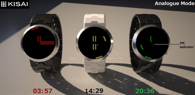
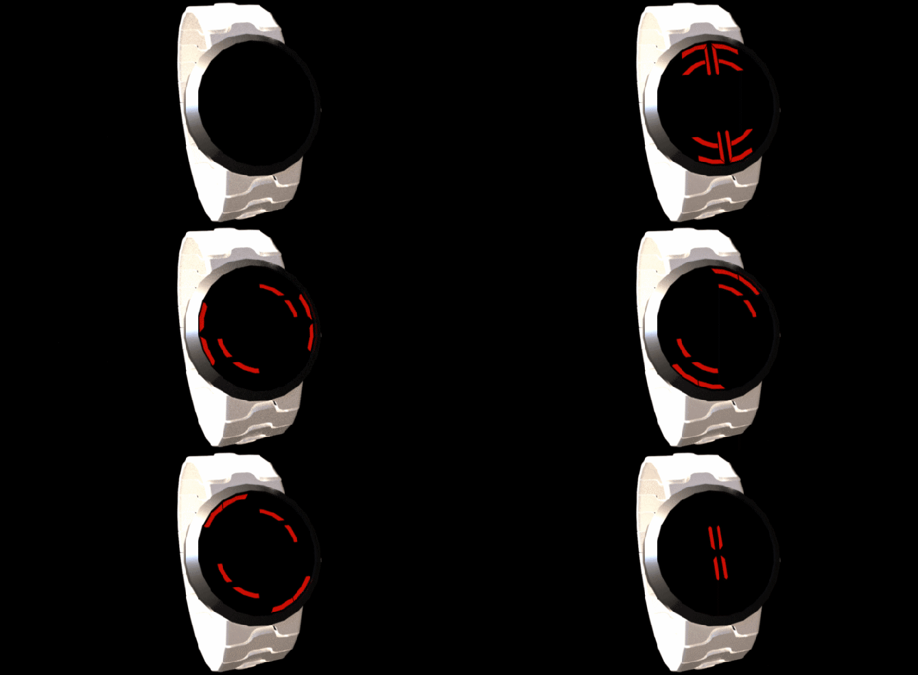
Duo has 2 modes for time telling, a simple digital mode (Hours at the top & Mins at the bottom), this really needs no explanation as it is pretty straightforward.
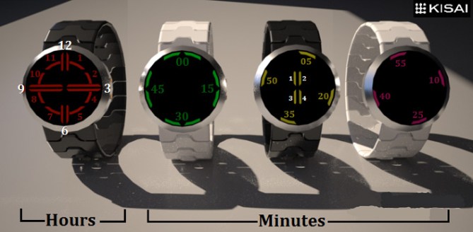
The analogue mode has had a revamp and I have done away with the awkward, lined, segmented 00-55 LED readout and instead opted for a more traditional method.
In keeping with true analogue tradition, the hour “hand” is set closer to the center of the watch face and the 00-55 Minute “hand” is furthest away adjacent to the edge of the display. Both hands are displayed as slightly curved LED’s, with the exception of the 12-3-6-9 hours, these are displayed as straight lines, utilising the LED readout to its fullest. Single minutes are located in the middle as 4 small straight LED’s.

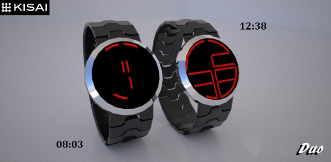
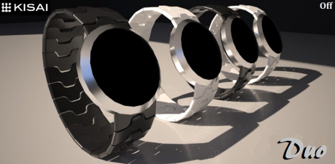
Duo’s unisex design should have a market for both men & women. Its bright and bold LED’s would befit anyones wrist and coupled with the choice of easy & cryptic time telling, there is something there for true Tokyoflash fans who like a challenge and those who simply like to glance downwards for an easy tell.
Duo not only includes 2 ways to tell the time (both have the abilty for 12/24Hr), it also has the ability to tell the date, an alarm function complete with audible & silent alarm notifications (Silent alarm displays an animation) it also has a stopwatch which can count all the way up to 1 hour!

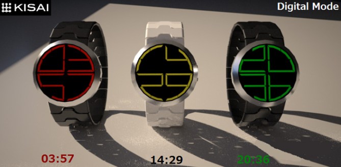
Tiny LED indicators help to keep track of whatever function you may be using. These unobtrusive quarter circle markers are located close to the center of the display. Reading from the top left number (going in a clockwise direction) these are…Date – Alarm – PM – StopWatch…or D.A.P.S for an easier way of remembering them.
Hope you like the improvements.



Great upgrade to the original version. The analogue is much easier for me.
Really like the animation, that would be great as a silent alarm too!
Everything feels a lot more consolidated in this update, its nice to see how subtle refinements can strengthen the concept.
LikeLike
Love the improvements! I saw this on the blog yesterday, and was a bit iffy on the analog mode. You’ve done a fantastic job of tweaking it nearly to perfection. I would totally buy this watch now given the chance! Brilliant!
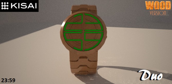
Personally a bit tired of the wood fetish from TokyoFlash lately, but great forethought in including that in your design already.
LikeLike
Thank you for your awesome comment!! I’ll box one up right now and get my courier to….(I wish lol)
Glad you appreciate the updates, this is exactly the reason why I wanted the improvements on this design. People were never too keen on the previous analogue mode LED configuration and I’m glad people are honest and tell me how it is…without them I never would have changed it.
Some watches look great with the wood straps, others not so much. I personally wouldn’t mind owning one for its unique qualities. I think people may prefer brand new releases rather than previous designs wooded-up.
Either way…thanks for your support and hopefully one day you’ll be able to buy Duo for yourself!!
LikeLike
Dude I appreciate you taking interest in the wood version idea I asked you about on the Orig. thread! 😛
LikeLike
You’re more than welcome buddy!! Thank YOU for taking an interest in my design. I’ve never rendered a wood watch before so it was a good little experiment for me. Might make it a permanent fixture for future submissions…it adds a nice range of options for voters.
Thanks for commenting Malachi. Hope you like the improvements.
LikeLike
Thanks for posting the improved submission, I’m very grateful to be able to show Duo as it was truly intended.
So happy that you feel like it’s a more complete watch…I couldn’t stop tweaking it until everything had a real world purpose and that it was easy enough for anybody to read at a glance.
I added the date, stopwatch and indicators etc to broaden it’s appeal as it’s seems to be the norm with many of your watches….well, maybe not the stopwatch part but alarm and 12/24 & pm indicators especially.
Glad you like the animation, there are many more possibilities with this configuration, the one above is my favorite.
Fingers crossed.
LikeLike
This an awesome design!! I want to buy it now! Love the digital mode, nice and easy yet stylish to boot ❤
Please make this one!
LikeLike
Thanks for your comment debbie, always nice to get the female vote.
LikeLike
Hey, Justin. I was going to compliment you on your anime pic, but I assume you are not the artist (found it 95 times on the web)? Unless you made it awhile ago that is. As far as the watch design, I think I prefer ‘1’s to be vertical rather than curved along the perimeter. I just think it reads better. Would you consider splitting the horizontal elements so that the shorter hour hand would resemble a more traditional one when viewing analog? I do like the LED colors you chose.
LikeLike
Hi xian, I used to draw anime but haven’t done for a while so anything drawn by my hand lately would probably look more like a stickman lol.
I see what you mean about the shorter hour hands, that would be more in tune with the whole analogue theme. If it ever goes all the way then I would be happy for them to be segmented a little more to suit this method.
Re: the 1’s…do you mean the single minutes?
Glad you like the colours, I have to say that white/red is my favorite with black/red a close second.
Thanks for commenting!!
LikeLike
Ive just released that you mean the number 1 and not single minutes…silly me. I find the curved number one to be a very easy thing to read, theres no mistaking it for anything else and its quite easy to see. To me it just seems to fit with the rounded shape of the whole watch and at the same time adds a slight crypticness.
LikeLike
I’m sure if need be there could be an alternative 1 option…those things are easily added.
LikeLike
Wow check this out!!
http://www.chimpsatplay.com/watch-out-there-are-some-amazing-timepieces-about/
A gaming website has decided to write an article on Duo!!
LikeLike
Definitely an improvement on the original version, not that there was much wrong with the original version! 5/Y Best of luck sir! 😀
LikeLike
Cheers buddy, there’s wasn’t much wrong with the original Duo but the analogue certainly needed tweaking somewhat. I had a twinge of ODC so had to fix it. Plus I added the spinny animation with you in mind lol
LikeLike
Looks impressive, Justin.
If I hadn’t seen the original, I’d rave about it, but I prefer the original minutes. I may be on my own, but this seem too toned down for me, having seen that design. If the original design could be an option (“extremely hard” mode?), I’d be more excited.
Still worth 5*, though, for such a good looking design.
LikeLike
Cheers Nev buddy!! Given that the LED configuration from the original Duo is still present on this revamp then the 00-55 indications you speak of could still be a possibility. I like the idea of the extra difficulty mode. Thanks for the input.
Plus…how’s your strap designs going on sketch up? If you want I can email you one of mine for reference or simply to just use on your designs, I don’t mind.
Thanks for the vote!!
LikeLike
Thanks Justin.
Had to put designs on hold for a while due to pressure of work, but would definitely appreciate some help. I’ll send you my email address on FB.
LikeLike
Look at this:
https://blog.tokyoflash.com/2013/03/quadrats-lcd-watch-with-cryptic-circular-digits/#more-19755
or this: https://blog.tokyoflash.com/2013/06/r2d2-inspired-lcd-watch-with-robotic-alarm/#more-21367
It is very similar.
LikeLike
I think if the single 4 minutes would be placed like an X, it would avoid the little confusion with the hour hands and the concept has reached its climax. The rest is working very fine. Great animation!! Cute manga girl 😉 5*/YES and good luck
LikeLike
Cheers for the feedback Sam, the only problem with having the 1x mins as an X is that it would mean having another 4 extra LEDs packed onto the module and im not sure if that would be technically feasible as there are so many already. Given that the 1xmin LEDs have a second function with the digital mode i think that they are ok the way they are.
i hate to refuse your suggestions because it was due to your previous feedback which made me perfect this design but on this occasion i think that if i were to add even more LEDs then i would be shooting myself in the foot.
Thanks for the comments on the manga girl and animation, wasnt sure about using the girl pic at first because trimming the actual watch was a pain but it looked ok in the end.
As for the animation, i just wish i couldve included more of them but didnt want to use up all the Mb allocation. I guess a little imagination could be used as for what is possible.
LikeLike
This an excellent update to “Duo” Justin I especially like the Digital Mode / word indication displays: Alarm, Date & Stop simple yet effective. Plus the varieties of materials used for the bracelets shown.
LikeLike
Cheers Andrew, glad you like the wording with the LEDs, i was hoping someone would notice that heehee.
All my designs are made possible with Sketchup and indigo renderer, if you go to the “extension warehouse” with sketchup and look for indigo renderer, its an easy program to use and produces amazing results. I urge you to have a ganders buddy.
LikeLike
I prefer the original analog for not having a cross-over effect (OUT > IN instead of Middle > Out > center). The same could be applied here!
I don’t like using 2 LED’s at 00-15-30-45 & they are used for the other 5min. I like the way 2 lines are used for the 3-6-9-12. The single minute are good.
What I’d do is invert the H & 5 M. The hours position would be rotated a little bit counter-clockwise (vs a traditional analog). Since I like the motif, I’d do a 1 segment off. (using an always on tech would be much nicer!)
The digital addition isn’t good enough (too plain/boring).
LikeLike
The 2 LEDs at 00-15-40-45 are easily discernible from the 05-20-35-50 markers so that shouldn’t really be too confusing. Changing those LEDs would mean changing a whole lot more and tbh it’s a case of “if it ain’t broke…”
Always on tech would mean either E-paper or LCD and I don’t think that Duo would have the same character using those methods. There’s just something cool about LEDs that other technologies cannot accomplish.
Switching over the hours/minutes analogue markers would go against the true tradition of any analogue watch, besides, the layout of the LEDs would make this problematic.
As for the digital addition, I personally think the work involved in bringing this mode into fruition and the time spent designing/rendering and head scratching over to make this work alongside the analogue mode deserves a little more than simply “not good enough” & “too boring”.
I can understand that it may not be to everyone’s liking as the world is a diverse and picky place especially in a market like this and I am accepting for most forms of constructive criticism.
LikeLike
It’s not about confusion but about harmony (always using 1 LED vs 1 or 2 & 1 LED = 1 number).
& because the hour dual-lines are horizontal or vertical, it’s not an issue. Beside, no lines are used for other numbers!
Having 1 LED (Or 2) per line OFF would show the nice “Celtic cross” layout/motif. (using always on would show it… always)
“Switching over the hours/minutes analogue markers would go against the true tradition of any analogue watch”.
????.
1) The original concept go against the true tradition of any analogue watch. ( For being out > in )
2) On a TRADITIONAL 3-hands analog, the HOUR is SHORT, the MINUTE is LONG & the SECOND is the SAME LENGTH as THE MINUTE, but less wide & faster. ( = in > out & not cross over. Other than rare watches that has a tiny central seconds hand to make it look like it go fast. It’s OK for seconds, not for +1 to +4 minutes! )
On a 2-hands, the hour is always shorter!
“the [proposed] layout of the LEDs would make this problematic.”. You mean rotation of the hour? Yes/No. Yes for being new/unusual. No because the thin part between 2 LED’s are aligned with the traditional position of the digits markers. ( I mean: When digits are “glued” on the dial. )
About the digital: it’s a good thing that it’s an addition because if it was a stand alone, it would have receive three strikes: 1 for already being submitted ( https://blog.tokyoflash.com/2013/03/quadrats-lcd-watch-with-cryptic-circular-digits/#more-19755 ), 1 because the Quadrats is better & 1 for not being a “conversation starter” watch.
LikeLike
Well, a lot to consider there. Feel free to have a go yourself seeing as so many changes need to be made. It’d be interesting to see your version.
As for the previous similar entry, I do not check every post as I haven’t the time for that, this is one of those GMTA moments, thankfully I switched it up enough to stand out and be submitted.
LikeLike
Here it is: https://www.facebook.com/media/set/?set=a.754927841230315.1073741875.316409365082167&type=3&uploaded=4
The only change to be made are Electronic signals ( which lights are OFF instead of ON. 1 ON per line is also possible ), not layout of LED’s / size of … anything.
Another BTW: I don’t like wooden watches & acetate wristband!
LikeLike
I like the fact that is pointed out by the name … the dual character of the display, able to tell the time by digital numbers and in a cryptic analog mode. I also prefer the ‘1’ displayed on the outer perimeter than the classic upright version “Quadrats” is/was using. it simply looks smoother, rounder 😉
but for the analog minutes I would use always two segments (like “Polygon” is doing it for the hours). it is the clearer system and gives the eye an additional guide to distinguish between hour and minute info.
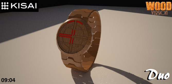
BTW: I would say in picture #4 the time is wrong. I read 7:03, not 8:03.
LikeLike
Thanks for the comment obelix, I was hoping that would go unnoticed as i only spotted that after it had been posted lol…but yeah you are right and top marks for observation
LikeLike
I agree about the digital 1 being better! 1/2 circle at 11 ( any 2 x 1 ) & full circle at 11:11.
The digits could be used to show the date/setup the alarm & stopwatch, since reading/setting those with the analog might be a bit too hard.
Setting LED watches are my biggest problem with that tech. ( just like some can’t read binary )
LikeLike