Design submitted by Sam from Germany.
Sam says: I thought about what is possible with the idea I had for the Invasion LED watch concept and made some changes. This is how the Ion was born.

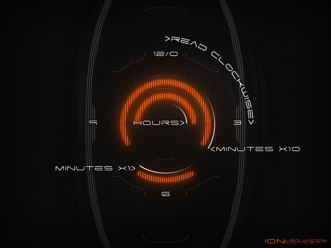
The reading rules are the same. You have to find the clockwise end of the circle segments. Those represent a number position in an analog watch display. The inner circle shows the hour, the middle circle shows ten minute increments and the outer circle shows the remaining single minutes. So it’s a radial digital 12-5-9 watch. The opposite end of the circle segments is, again, just for decoration. The symmetry is the clue for the cryptic and sci-fish look. Then the 12th or 6th hour ought to be shown, or if a minute is 0 or 6, the circle segment is so small, is becomes a dot.


There are subtle indicators at the 12h and 6h position dividing the three circle segment lanes for a better determination needed due to the LED monochromy. The outer area of the display is divided in 12 parts that have to be seen as the 12 numbers of an analog watch display.
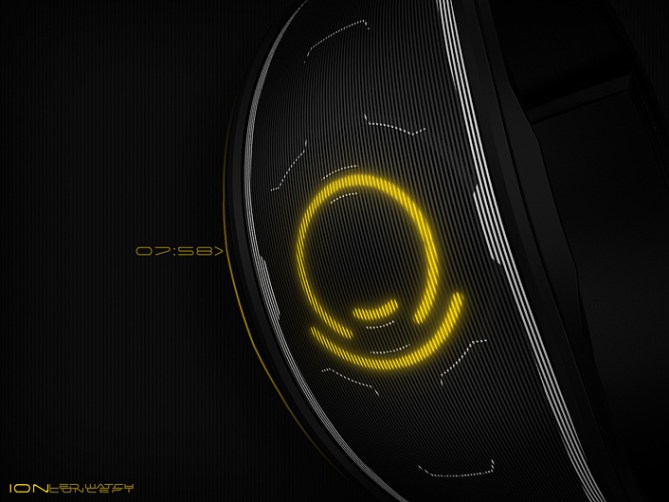
I created a bracelet style watch and tried a stripy display this time, bringing the perforated look of the Invasion to another level. The geometry of the Invasion would work too.
The alien overlords are happy with this gadget. Now the humans have to be convinced.


Yep, you’ve sold me on this concept for sure!
With Invasion I had slight reservation about the time reading (because it was new to me), but now when I see this concept I have no trouble at all.
The groove diffusion, bracelet style & the target-like details make this a sci-fi dream watch.
Hard to pick a favourite colour.. purple looks awesome & would be something different so i think I’d go with that one.
LikeLike
That’s great! Just convince the rest of the company 😉 So the initial hurdle has bee taken, now reading seems to work fine. An unsymmetrical display mode for learners might help those who love the style but need the time a little faster. That mode would look nice too I think. The white drawings on the bracelet took a while until they looked like this. That was a tough part. I’m glad it turned out cool for you guys because in the end I couldn’t have a neutral perspective anymore. Thank you for the nice comment Toky!!
LikeLike
This watch screams 2001. Great stuff.
LikeLiked by 1 person
…5y
LikeLike
Oh really? Thanks!
LikeLike
Wow Sam, save some awesome for the rest of us! This looks very cool, I’d have a difficult time deciding between this or Invasion but would happily wear either. Love the texture lens, really adds another dimension to an otherwise relatively simple design. 5/Y best of luck sir! 😀
LikeLike
Oooh, described very wisely. Yes, then the watch is simple, one is allowed to have some fun in certain areas without making the watch overloaded. Sounds like I know what I’m doing *cough* but I try out things and then I see what happens. Thanks alot for coming by and commenting, Pete 🙂
LikeLike
Hi Sam, I already loved “Invasion”, this model is an equally attractive alternative.
I also love reading the time.
5 stars and a big Yes, very nice work!
LikeLike
Thank you Monsieur!!! I appreciate it 🙂
LikeLike
Hi Sam. At first I found it difficult to read, but got it after a short while, although I have to put my head to it to not confuse the circles every time. I really like the idea that the display is always symmetric at any given time. Not totally my kind of watch as I’m more into the “classical” or traditional watch casings, but 5 stars for another great design!
LikeLike
Thanks for giving it some time – getting over the first hurdle is always the hard part with all tokyoflash watches and those posted in the blog. Nice, you appreciate it although it’s not your type of watches. It’s cool to look at the designs with an open mind 🙂 I would like the Invasion case here, but I had to give you guys another watch design because nothing’s more boring than repetition on the internet. Unless it’s grumpy cat 😀 Thank you for the comment and the support!
LikeLike
One word : Waouh!
I love your designs Sam. I prefer this one, especially the shape, as Invasion.
Great work as always. 5y of course 🙂
LikeLike
Merci bien Delphine. Yeah the Ion is the minimalistic version of Invasion
I(nvasi)on 😀
LikeLike
The Ion is a superb concept strange, unique, futuristic & alien. 5 Stars, Sam.
LikeLike
Thank you Andrew! Love the adjectives ❤
LikeLike
Amazing images, as always Sam.
Ion is a stunning design, but for me, overshadowed by Invasion. The styling on the latter just has the edge. With Ion you have overcome the problem on Invasion with 12:00 and 06:30 (you didn’t create gaps, but totally removed the vertical lines) – if this feature was to be applied to Invasion, I’d buy a monochrome version of that without any hesitation. Of course, if Ion gets produced instead of Invasion, then I’d buy it :).
In some images, it is hard to tell which way the watch would be worn – if it wasn’t for the 10s chosen (and the text you have inserted), I wouldn’t know which way round to read the green and purple ones. This may be due to the darkness of the images hiding some external features on the watch, or you may be further increasing the cryptic nature of the watch ;).
Has to be 5y (but I wish I could increaser my Invasion score to 10yyy)
LikeLike
Oh I would love an Invasion case and an Ion display too. The horizontally placed watches are indeed tricky to read. I might be careful on the future when it comes to placing the watches. Just wanted to make them look more alien hehe. An alternative mode with Invasion lines… ok that would work too!
Thanks alot for the big comment Nev!!!
LikeLike
Ah yes, the 10s are always on the upper half of the display. But still tricky at first glance 🙂
LikeLike
Another AWESOME design Sam!! I love both, Invasion & ION… hard to choose!!
(hopefully we all get that choice, whatever it may be!)
As far as colors… perhaps the LEDs can be selectable by the user, that way you get ALL the colors!
Best of luck!
Regards,
ALinCAL
LikeLike
Hi AL thank you for the nice comment!!
Color selection would be really cool, so people can make color combinations = more fun.
LikeLike
Lovely looking watch, i always have a hard time making a unique strap/case and with this one it looks amazing.
As for the time telling, it is a little confusing at first, might need an easy mode until i get used to it. 5/Y
LikeLike
Agreed to the easy mode for the first time. This would level up the concept. Thanks for the compliment and the support Justin. I find case-and-straps-watches harder to do than everything-made-of-one-piece-watches. The latter ones are easily unique while the more traditional ones often look like seen before. It’s fun to find a little gap of never-see-before.
LikeLike
Oh sweet you made a new design similar to the alien one. The time reading makes sense to me this time around. Very sleek 5*
LikeLike
I love it.
Nothing new I can add except to say good luck master Sam 🙂
LikeLike
I like the same things that I liked on the Invasion. I’m a bit divided on which one I prefer: I prefer the 3 colors LED’s of the Invasion but prefer the overall look of this one. (It make me think about Tron/this type of movie)
I would have given 5*, but was late, & I would buy.
LikeLike