Design submitted by Peter from the UK.
Peter says: I am as many blog regulars will know a little obsessed by all things automotive. So just for a change I have done a design inspired by automotive products, in this case motorcycle fairings and headlights.
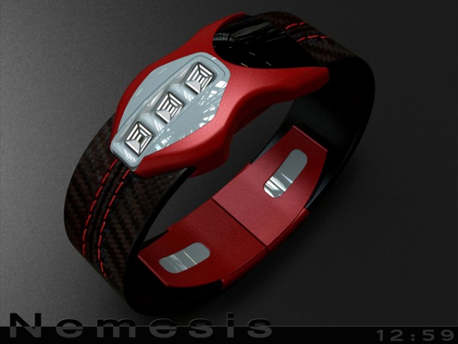

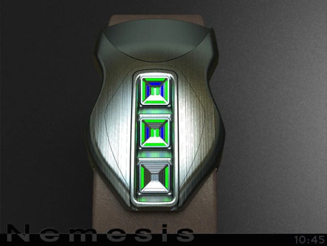
The time telling element in this design is in a stacked “headlight” like arrangement. There are three units which display the time in a 12/5/9 format. The three units could be divided in several ways. For my examples I have 4 hour segments per unit around the outside of each, the 10 minute groups are shown (in twos) the centre of each unit (the spare segment could be an AM/PM indicator) and the single minutes are displayed by three segments per unit between the hours and 10 minute segments.

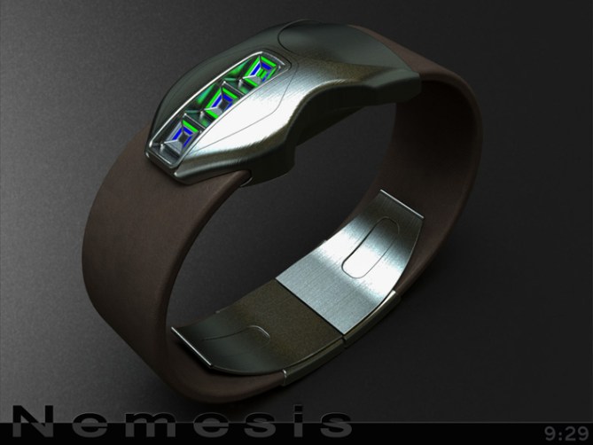
This design has a automotive feel that should appeal to other petrol and gear heads but is slick enough in the right materials to appeal to the more conservative.
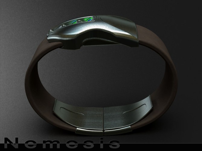
The time telling method is simple enough for the average non-geek and the size and profile would allow all wrist sizes to wear it.
The striking shape and bold looks combined with the headlight inspired time telling seperate it from other designs.



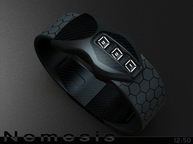


An extremely unusual looking watch & very alluring. I particularly like the red version & how the strap mimics a tyre. The hex strap is super cool too.
I am not totally convinced by the time telling though. Not that there is anything wrong with it, it’s actually a nice 12-5-9 layout ~ but my feeling is that it seems a little too fussy or compact in relation to the rest of the watch.
My personal opinion is with such a dramatic & original case the time telling could afford to be bold & simple. 7-segment digits would probably be fine & i think would also reflect digital type speedo.
Don’t take that too negatively, its just my preference & overall the watch is a stunner!
LikeLike
Cheers for posting and the feedback Toky!
This is one of those concepts that will probably divide opinion, some will like and some will dislike. I assumed it would be the shape that would be the the issue for most not the time telling lol.
Goes to show you just can predict these things. I don’t dislike the idea if a digital display, it could be tied in with the theme easily. The question is do you keep the stacked block headlight shape and either squeeze one more in or make the digits fit into the existing three displays. Or do you start the time telling element from scratch? I will have have a play around when I get five. Cheers again! 😀
LikeLike
U know I love this one, great organic shape 5y
LikeLike
Thanks a lot Gordon! What is your preference with the time telling. 12/5/9 or a digital variant?
LikeLike
Even a non-petrol-head like me would be tempted to buy this! 5y
LikeLike
Crikey praise indeed! Fingers crossed that is the consensus! Cheers DZ! 😀
LikeLike
Hi Pete, still a great job and you know that I also like beautiful car bodies.
Playback does not bother me, for me, it would just increase the size of the headlights without distorting the whole (not easy to do?). This is a detail.
How? 5 and Yes, why this question?
Obviously!
LikeLike
Im glad you likey sir! The headlights could be increased in size if needed, I dont think it would spoil the look. Cheers for the feedback and vote sir! 😀
LikeLike
Nemesis is an awesome design concept & the enemy of plain / oridinary binary wristwatches. However I feel that the third alternative layout would be easier read in the long run.
LikeLike
Cheers for the comment Andrew! Your probably right about the layouts, the third one is definately the easiest out of my proposals 🙂
LikeLike
Another great design, Pete. I am not into bikes, but that does not stop me wanting this beast.
Larger headlights would probably be a good idea, especially for those of us with less than perfect sight.
I wouldn’t want digital numbers. Your alternatives are all great and it’s hard to choose the best:
The first looks the best, but is least intuitive (read inwards from hour to 10 minutes then back out for 0-9).
The last is definitely the easiest, and therefore will probably have the widest appeal, but some may think too easy
The middle is easier than the first while keeping the same basic style, but may not look as good with the 10 min sections always looking incomplete.
If these can be 3 options, the wearer can make the choice.
Hoping that I get than challenge, good luck and 5y.
LikeLike
‘that challenge’ not ‘than …’
LikeLike
I’m glad you likey sir! Larger headlights shouldn’t be an issue (depending on how much bigger they needed to be of course) It would be cool if the buyer could pick the time telling. Maybe if the LEDs could stay in the same place and you just changed the “lenses” to make the various versions. Cheers for the epic feedback Nev!
LikeLike
Pete, tell me the 3 displays second as the buttons..please 🙂
LikeLike
Yeah the displays should definitely double as buttons, that would be uber cool! 😀
LikeLike
Clever design work Pete, I think it works. But I agree with TF that the shape of the display could do with some refinement. I’d be tempted to try one or two seven-segment digits made up of flowing lines (akin to the headlights on a McLaren P1) and perhaps a pair of round ‘lights’ with mirrored digits in them (to make them symmetrical). Might look a bit too much like a ducati 999 though…=)
Anyways, just an idea. Btw, the hex strap is killer! =)
LikeLike
The current display was a little inspired by the headlights of the Benelli Tornado (excuse spelling) which were square and stacked. They could as easily be round (I like the round mirror layout suggestion btw) or more organic digits that would follow the “number board” maybe a MKII version is a future project 😀 Cheers for the fine feedback sir! 😀
LikeLike
Ah, I see. I’m not very familiar with that particular iron horse…=)
I think a rounder (though not necessarily round) shape to the display would harmonise better with the rest of the case, but that’s a matter of taste of course.
You’re very welcome! =)
LikeLike
Woah the carbon version with white LEDs looks so wantable. I like the time telling method in combination with the watch design. One thing though, the area of the case behind the display looks like ending to abruptly, like being cut off to early. The case has a cool organic shape but suddenly a straight cut. Aside from this detail, wow 5*/YES
LikeLike
Cheers for liking and the feedback Sam, I understand what you mean regarding the flat back. It could as easy be more curved to soften it and make it relate more to the rest of the shape. Cheers for the wise words sir! 😀
LikeLike
Yes master Yes.
Nothing new I can add except to say good luck master Pete 🙂
LikeLike
Thank you very much Jose! 😀
LikeLike
The time reading was confusing. I don’t like the original reading order, because of the offside>pass over middle>center>middle.
I prefer the 3rd reading option. (at 1st, I thought it was that by intuition) The PM could take all the space at the bottom part of the 9m.
The 2nd reading order is ok.
I like TF suggestion to use 7-segments digits! Anyway, the bike headlight look doesn’t appeal to me.
LikeLike
Thank you for your in depth feedback and suggestions! Maybe this one is re-visited in the future with the suggested modifications. Cheers very much! 😀
LikeLike
Time runs out for this concept soon so all that’s left to do is thank TF for posting it here and everyone who took the time to comment, vote, share and like! Cheers everyone!
Pete from the UK 😀
LikeLike