Design submitted by Peter from the UK.
Peter says: I wanted to come up with a simple LED watch that could display digits using as few LEDs as possible. I wanted the design to have a detailed industrial look, which would suit various finishes, materials and colours. I then decided with a couple of tweaks that a second time telling method was also possible.


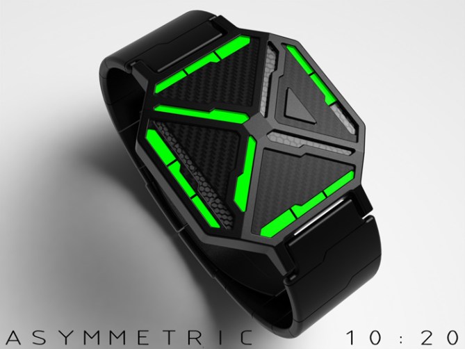
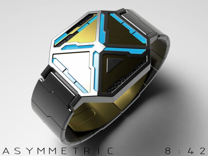
The time is told by the asymmetric array of LEDs in two different styles. The first is purely digital showing the time in four phased digits. The second is a reverse of the time telling used on NightVision. The hours in this case are displayed by digits and the minutes in 5 min groups in the analogue positions along with four single minutes in a vertical column on the left hand side.


This design is industrial in its nature so might appeal mostly to the chaps. That said with the right combination of materials/finishes it could also suit a ladies wrist.
The design has a sci-fi look which might appeal to film buffs and gamers.
The asymmetric layout in combination with LEDs and industrial materials and colours sets this design apart from others.


UPDATE: Image showing multi-colour LED & animation of phased light up.


wow, there’s a lot going on here! Where to start…
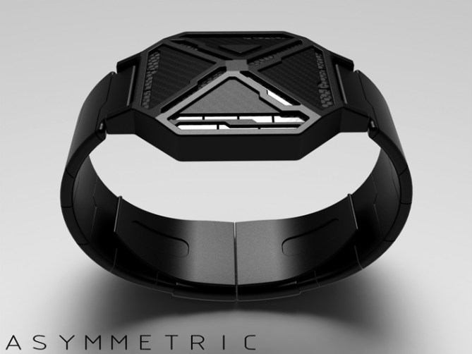
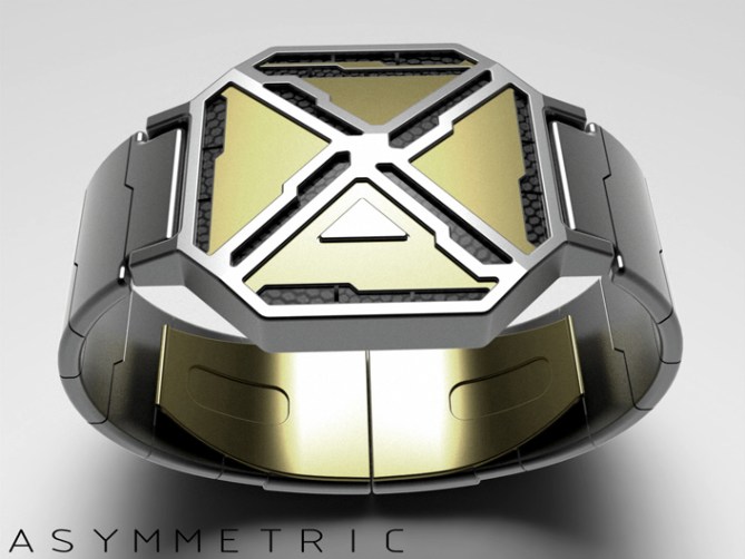
The detail applied to the case structure, textures & the arrangement of lights is exceptional. It all comes together beautifully. It’s one of those objects you can just sit & admire the lines & angles – especially evident on those last couple of images.
The time telling is absorbing. At first I was confused (as intended ;-)) but now I can really appreciate the minimum lights approach & it really works! A very good balance of simplicity hidden in the, apparently, ultra-cryptic.
I think this would be perfect using multi-colour LED tube as seen in ‘Adjust’. The user can set their own colour choice for the lights &… ~ as a minor suggested tweak ~ it means the minute marker could be shown with a slight colour change.
So, if the LED is set to RED, the minute marker showing 30 could be orange.
That means that for 8:30 the 8 can be a complete digit with the 30 mins mark being a different shade. I think it would help your eye to clearly define both the hour & minute without disrupting the overall appearance.
LikeLike
Thanks a lot for posting and leaving such epic feedback Toky! I like the way you see the concept and describe it (a lot better than I did lol) great suggestion about the multi coloured LEDs, they would suit the concept beautifully and like you say allow the digits to stay complete and display the minutes at the same time. I also love the added customisation, have your watch your way! Thanks again! 😀
LikeLike
Hi Toky, I followed your advice and created a new image with multi-colour LEDs. Like your suggestion this allows for the digits to remain complete and still be able to see the minutes clearly 🙂
LikeLike
This looks absolutely fantastic! 5y
LikeLike
You are very kind sir! Cheers! 😀
LikeLike
“wow, there’s a lot going on here” is definitely a good sign. if this lot is wrapped up so nicely, coooool. Very nice work with all these little details you put effort in. Definitely a purchase for Sam 5*/YES
LikeLike
Thanks a lot Sam! Fingers crossed that is a good sign hehe
Sometimes more can be more, im glad you likey sir! Cheers for the support! 😀
LikeLike
Hi Pete, nice work, very nice finish, modern and elegant. I love all the materials used and especially Black and Green version very beautiful!
5 / Y, superb!
LikeLike
Thanks a lot Patrick! Im glad you have a favourite, thats a good sign! Hopefully that combo will be available one day! 😀
LikeLike
Really cool techy look you’ve got there Pete, I like the balance between the simple individual shapes and the detail they create when combined.
The time telling as is does burn my brain a little too much, though. Like TF I appreciate the minimalist approach, but I think I’d struggle to recognise the numbers quickly. The suggestion to have the 5-minute group marker a different colour rather than on/off would help me a great deal. =)
Having said that I’m not a huge fan of 12-12-4 to begin with (I find 12-5-9 much more intuitive and it doesn’t require mental arithmetic and is thus quicker), so you’re working against a little bit of a handicap…
Even so, this is a fine-looking piece of tech. Well done, and best of luck! =)
LikeLike
The 12/11/4 format was born out of the analogue-esc layout. I too are a bit of a 12/5/9 fanboy as half my concepts will tell you but it didnt seem apropiate for this one. Hopfully the looks will tempt you to the dark side on this occaision, once there you will fully learn the power of the dark side lol!
Rise Lord Anders! 😀
LikeLike
I love this design and would definitely buy one of these, if made. Black / green please.
Couple of questions though:
I read the text about the two styles, but can only see the second one in the images. That’s fine, as I would want this style, but what does the other look like?
Why do you have multiple versions of some of the numbers? I think the image showing 10:20 would have worked with either 10.
Just curious about these, not concerns.
Anyway, it has to be 5y as the voting system doesn’t allow me to score higher. Really hope this is made.
LikeLike
Hi Nev,
I figured (rightly or wrongly) that the phased digit mode would be self expainatory enough not to show. It would look very similar to the digit and analogue mode minus the analogue light being off, flashing or an alternate colour. It would simple animate thru the four digits that make up the time. Like Neutron does but with a different style of animation.
The alternative digits are just to show what is possible with this LED layout, I figured if I just showed one version of each digit someone would point out that another version may be possible etc. I just decided to cover those bases in advance 🙂 Hope this helps and cheers for the feedback sir! 😀
LikeLike
I was happy with the watch as is, but thought that if the phased digit mode was shown it would attract additional voters who don’t like watches to be cryptic – maybe an animation. They may also find the alternative 10 a bit fconfusing (looks like 01), so best to use standard in that mode.
I wouldn’t use this mode, but do want this watch to get made, so anything that helps….
LikeLike
Yeah a little animation would be the best way to show the phased time mode, if I get five mins to night I’ll knock something together. It would be possible to have a three and four phase versions (and even two phase at certain times). The three phase would best suit 12hr and the four phase 24hr, any preference?
LikeLike
I would have thought the less phases the better, but I don’t go for this style so I may be wrong. Most are used to, and happy with, 12 hour watches, so that would also support the three phase. Those of us using the other option will be happy with 12 hour :). Others may have a different opinion, of course. I think that a three phase / 12 hour version would demonstrate the mode effectively.
LikeLike
Phased digits animation 🙂
LikeLike
Shows the concept well. Hope this helps get more voters. 🙂
LikeLike
Me likey…very funky stuff Pete. Definitely one for me!! I love all the futuristic stuff and this ticks so many boxes. Cryptic…check…Easy…check…feel like staring at my wrist every 2 mins…check check check!!
LikeLike
I’m glad you likey sir, that’s a good sign as you like your sci-fi stuff 🙂 Fingers crossed it could be on your wrist one day! Cheers 😀
LikeLike
Words don’t seem to do this awesome design justice Pete. Very futuristic & Cool.
LikeLike
The ones you have chosen seem pretty good to me sir, I thank thee! 😀
LikeLike
Very unique and cryptic, I’ll take the black one with green lights!5y
LikeLike
Thanks a lot Gordon! Pre-order confirmed 😉 cheers for the support sir! 😀
LikeLike
Hey, Pete. I find the blue LED with the gold/silver combo interesting. Have you experimented with rose gold?
LikeLike
I haven’t really tried rose gold I must admit. Here is a Photoshop’d copy of the standard gold one. I dunno if it looks more copperish than rose?
LikeLike
Nice!
LikeLike
I like the overall look & the honeycomb grid over the lights. Sadly the hour/minute at the same time seem too confusing, because of the overlap on the square. The 4 phases is nice! About the digits with various options, my preference are: 0-9 = top versions, 10 = bottom version. Another option, for the 4 & 9 & based on the bottom version, is to horizontally switch the light that is on on the ^ under to get a Y with the bottom like /.
LikeLike
Cheers for the feedback Makko! There are quite a few number styles possible with this LED arrangement, your suggestion of the switched diagonal is nice! Fingers crossed TF see the potential and pick the best numbers or find away of choosing the number style 🙂 cheers! 😀
LikeLike
This one ends soon so thanks to TF for posting it here and everyone who voted, commented, liked and shared! Cheers everyone!
Pete from the UK 🙂
LikeLike