Design submitted by Gordon from the USA.
Gordon says: I wanted to make a watch inspired by modern custom interiors. I was hoping to come up with a unique method of time telling but more importantly i was hoping it would compliment the overall design.
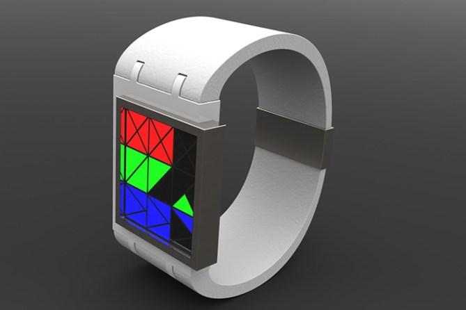
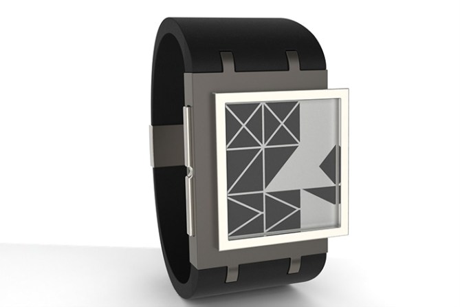
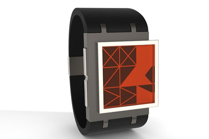
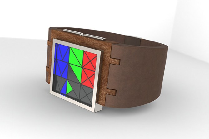
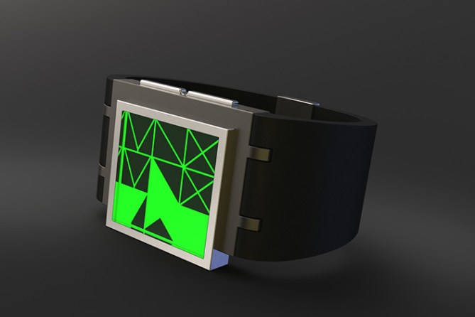
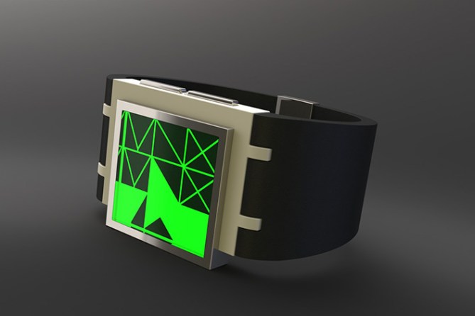
Time telling is pretty straight forward, notice that the date can also be told as illustrated.In one image i tried to show what it might look like in e-ink, another image with tinted glass over that. The rest of the colored ones would be led.
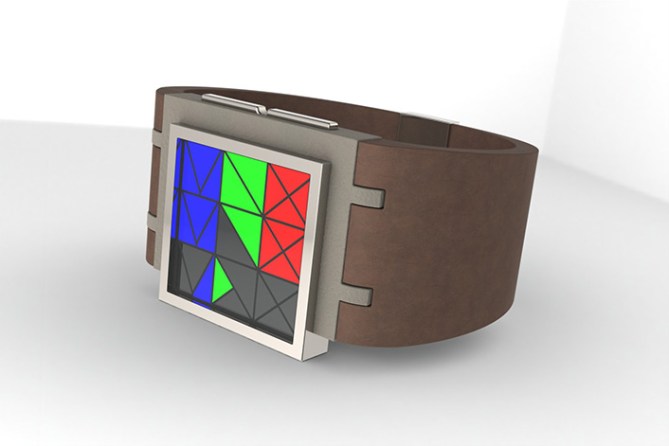
I would like like to see anyone with a wrist wearing my watch.
I think the choice of materials may put this design apart from previous watches as well as being another way to use e-ink
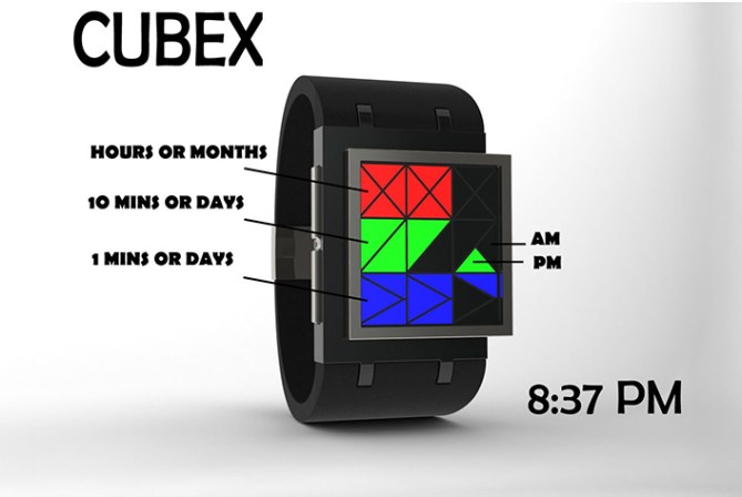
UPDATE: wood version


Nice to see you back with a new design Gordon!
I think this is appealing to anyone who likes an artistic approach to their time telling. Simple lines, geometric shapes, yet still very easy to read. The off-set case is a nice touch & follows the architectural theme; as we have a deck or balcony surrounding the living space.
The colour version makes it intuitive to read, but the monochrome version is more complimentary to the mood.
Perhaps there is a middle ground to give subtle tints. Still, both versions look great when considered alone.
LikeLike
Thanks for the feedback, glad to be back on the page.
LikeLike
more flavors here http://www.coroflot.com/GordonLardi/CUBEX-WATCH
LikeLike
Looks ver nice Gordon! (Nice to see your work back on the blog sir) I love the asymmetric case and the telling looks very nice too. I could imagine there being a more adventurous time telling version using the geometric shapes too. The 12/5/9 is very initiative especially in RGB. 5/Y best of luck sir! 😀
LikeLike
Cool style with the asymmetric placement of the case. I like the stone version on your page! The display is nice, almost like a little artwork. I would prefer the monochrome version – more elegant. The Good luck Gordon!!
LikeLike
Hi Gordon, the watch is beautiful stylized, modern and elegant, easy to read.
5 / Y, very classy!
LikeLike
Yeah, the stone version looks great! 5y
LikeLike
Glad it was well received by each of you, your opinion matters to me. Thanks for your feedback
LikeLike
I love the geometric shapes, Gordon. I could read this very fast. I like the red/orange display, as well as the yellowist color in the last image via the link above.
LikeLike
Thanks Xian, I thought grouping the triangles in sets of 2,3,4 would speed up time telling once the user gets a hang of it
LikeLike
Very simple but very effective. The asymmetric case does add to the appeal. I prefer the monochrome versions, so tinted e-paper for me, please.
Good luck and 5*/Y.
LikeLike
thanks Nev
LikeLike
I like the overall look. I prefer the red/green/blue. I’d be tempted to use the am for alarm/date. I would have like to see more time example, or a legend, to know the reading order of every segment. (minor detail)
I would buy.
LikeLike
thanks Makkovik
LikeLike