Design submitted by Peter from the UK.
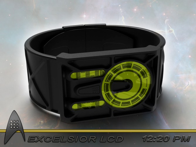
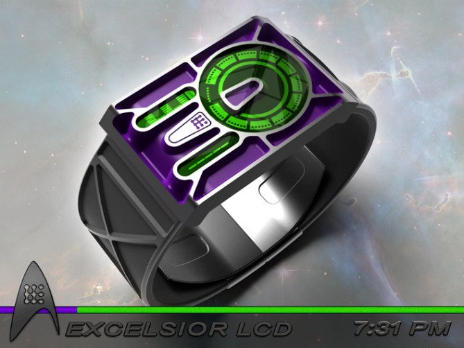
Peter says: I was thinking about a design based on a round dial for hours in an analogue format and two separate displays for mins. I quickly realised that this layout reminded me of certain iconic sci-fi imagery. Excelsior LCD was born.

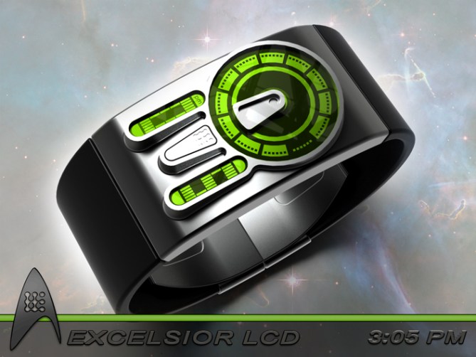
Excelsior LCD tells the time with a combination of analogue hours and digital minutes.
The hours are displayed in a round saucer like shape and the two digital displays below that look like engine nacells. The two nacelles also contain extra markers like am/pm, alarm, date etc. If seconds were deemed an important detail they could be displayed by the windows on the saucer section.


This design should appeal to sci-fi lovers due to its inspiration but is subtle enough to be suitable for the masses. The time telling is easy enough for the average Joe but different enough to be TF appropiate. The shape and constuction allow for a multitude of colour and finish combinations.
The sci-fi inspiration, easy time telling and ability to suit different materials and finishes helps this design to stand out from others.


UPDATE: Version without the bulkheads for those who prefer a more streamlined look.


It’s a watch, Pete ~ but not as we know it.
I seriously love the bulk-head type construction. The display fits so perfectly into the ship design too, nicely done.
The red, white & blue one is a bit too loud for me, but good that you have shown these variations for different tastes.
Both the blue/orange ones (First & last pics) are my favourites.
I have a slight concern about how CBS/Paramount would feel about this. There is no direct connection other than the theme due to the ship outline, so hopefully fine.
Overall its top marks from me.
For any Sci-Fi fan this would be a ‘must have’ ~ resistance would be futile. ;-p
LikeLike
Thanks for posting and the feedback Toky! Yeah the more colourful options are probably a step to far but I tried to cater for as many tastes as possible, after all aliens could come in all sorts of colours so it seemed appropriate. I would love to if the Star Trek maker would have issue with it. If no trademarked names or logo were used you would assume there wouldn’t be an issue, but I’m sure it’s never that simple. Fingers crossed there would be no issue and the replicators could be activated 😉 cheers again O•=
LikeLike
you would be the envy of every star trek fan wearing this baby
LikeLike
Hehe and there are quite a few, there is a good market with Trekkies alone. Cheers for the support sir! 😀
LikeLike
Other than possible rights issues, this looks like a winner.
Some of the colour combinations are a bit too much for me, but the (quieter) monochrome ones are excellent. Certainly something for everyone here. Not sure about the strap work, but overall this gets 5*/Y from me.
I notice 10:37 looks a lot like 10:26 (red on black) – is space/time distorting in some way?
LikeLike
Yeah the more colour full options wont be for everyone 🙂 I figured that the strap/bulkhead might not be for everyone so did a couple of simplified versions just in case (Im sur esome people will still want segmentation) see link below.
Yeah there must have been spacial distortion around those keys when I did the text lol. Cheers for the feedback and support sir! 😀
https://www.facebook.com/pages/PF-Design/159423137472755?ref=hl#!/photo.php?fbid=639055752842822&set=a.639055562842841.1073741891.159423137472755&type=1&theater
LikeLike
That more my style. and green / black combinations always work for me.
TF often have different straps with the watches now, not just different colours, like with Blade, so I’m sure I’d be able to choose one I liked. 🙂
LikeLike
We can only hope you have the burden of choice one day 🙂
LikeLike
This is really, really good-looking. Better than Zoolander.
LikeLike
hehe, nothings as good-looking as Zoolander but I’ll happily take a close second 🙂 Cheers
LikeLike
Maybe if there’s a ‘Magnum’ version in ‘Blue Steel’…?
LikeLike
I love this quote: “certain iconic sci-fi imagery”! The watch does look pretty great. It will certainly “clean me up” – or my bank balance, at least.
5y
LikeLike
haha yeah I was trying to avoid saying anthinng that might involve tradenames lol
Glad you likey, fingers crossed that TF relieve you of some gold pressed platinum in the future 😉
LikeLike
Yesssss veeooooshhhhbooom (warpy soundy, flying through the apartment with my wrist) bought. Warp5/Engage
LikeLike
Make it so number 1! I hope you were wearing some two tone bergandy and black pyjamas when you went into warp! lol
Cheers for the support sir! 😀
LikeLike
Hi Pete, wow what production.
I choose the Black version with edges polished.
5 * and Yes, do I have yet the say?
LikeLike
Thanks a lot Patrick, fingers crossed you can get one beamed onto your wrist one day! 😀
LikeLike
Pete Excelsior LCD is a great Star Trek inspired wristwatch with some very interesting color variations. However I still prefer the Analogue Disc version of Excelsior: https://blog.tokyoflash.com/2013/05/to-boldy-go-where-no-other-watch-has-gone-before/
LikeLike
I had a real soft spot for the analogue version, but as its been a while since it was on the blog I can only assume that it wasnt for TF. Hopefully the LCD version will fair better as it is more appropiate for TF’s strengths. Id be more than happy if either got made so fingers crossed one makes the cut! 😀
LikeLike
So does the guy wearing the red watch always die?
LikeLike
Probably lol but he died happy knowing the time in a Trekkie stylie 🙂
LikeLike
Rest, in timepiece.
LikeLike
The blue and red watch looks so superman…
LikeLike
Yeah that one does look a bit superman-esc, even superheroes like sci-fi shows 😀 cheers for the support! 😀
LikeLike
Well, what can I say? Great work as always, and the images are suitably stellar as well…
I’m drawn to the industrial look of the cast-and-milled case, but I get the feeling this is not the watch it would fit the best, if you see what I mean. That’s just an observation of taste and not meant as much of a criticism though…
It seems to be doing well, so hopefully any licensing issues won’t be a problem. Good luck mate!
LikeLike
In anticipation of not everyone liking the cast and milled look I did a couple of simpler versions. I like my Facebook album to Nev’s comment above. But I forget that not everyone is a Facebook user. If I remember I will ask TF to add the images as an update. Hopefully they will float your boat more, cheers for the feedback sir 😀
LikeLike
This is awesome dude.
to my knowledge you aren’t breaking any licensing laws. you can’t be done for repeating an outline shape unless its a logo. the only thing you’d have to watch out for is the name which again is easily reworked if necessary.
i like the cast/milled casing but i’d equally like a flat finish face just because i prefer that modern aesthetic.
Great work as usual! 😀
5Y
LikeLike
apologies! i missed the revision images of the new casing and strap!
now that is sexy.
a word never before used to describe Star trek based merch/tech.
LikeLike
The updated images are a new addition, so its no surprise you missed them. Im glad you did spot them and gave a reason for the second comment! Due to the censorship on the blog, we may never know what word you used to describe it but Im hoping its the one that rhymes with HEXY 🙂 Cheers for the support sir! 😀
LikeLike
I like combining analog & digital. It would be nice to use the dots around the hour for the seconds/minutes. I like that the alarm/date/pm use 4 half-circles over/under the digit instead of symbol inside the hour.
I prefer the original case but prefer the updated band. I prefer having the surrounding areas of the display in a different color than the rest. (like the 1st 2 pics) I prefer 1 color for both displays.
LikeLike
Cheers for the feedback and preferences Makko! Fingers crossed you get to make your colour combination choices one day! 😀
LikeLike
The space time continuum is soon no longer to continuum for this concept, so all that’s left to do is thank TF for posting it here and everyone who took the time to comment, vote and share!
Cheers everyone! 😀
Pete from the UK =-O
LikeLike