Design submitted by Andrew from the UK.
Andrew says: The following wristwatch concept is inspired by the awesome power of Lightning.
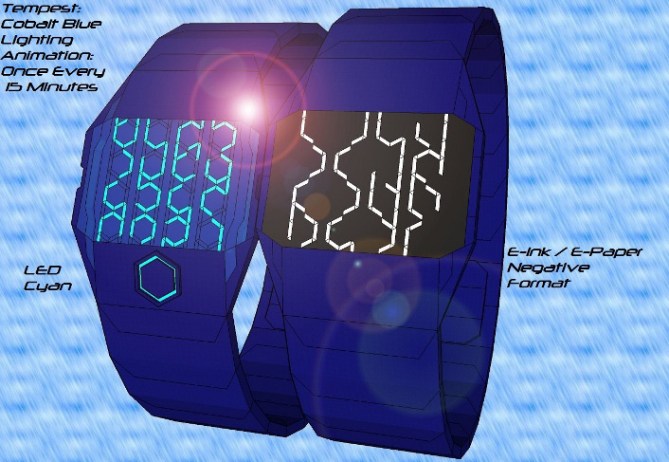
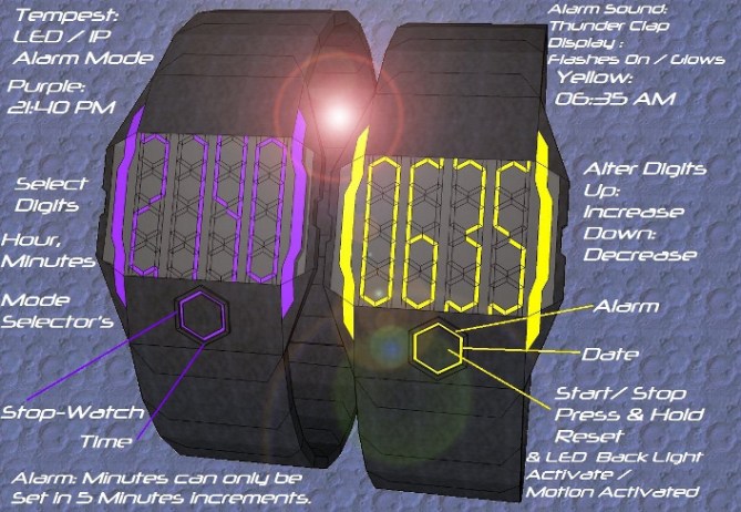
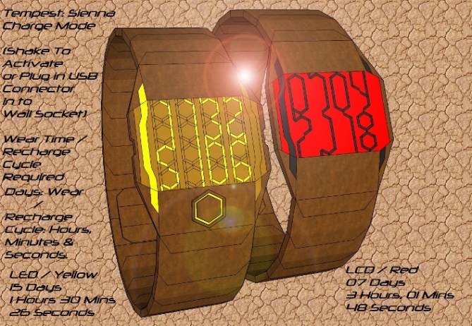
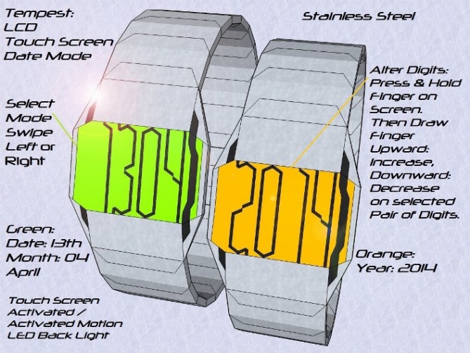
This design is constructed various Colors / Materials in three display types: LED, LCD: Touch Screen or E-ink / E-paper, each with their own separate Control interfaces (See Diagrams Provided). I have named this design: Tempest.

Each number is constructed from either a single / dual lighting bolt which discharge from the top of the screen (Sky) along the specially shaped Patterned Hexagons / Columns to the bottom (Ground). Amount of Digits display depends entirely on the currently selected Mode. The Lighting Bolt/s continue to strike /flash on screen whilst the display is activated: Button / Motion: LED

This wristwatch will appeal to anyone who is fascinated with the weather: Weather Forecaster, Storm Chasers.
This Wristwatch Concept is present in three different display types: Super Bright Retro LED push button: LED Only / motion Activated Display, Always-On Futuristic LCD with Touch Screen Back Light / Functions or even Triple Format E-ink / E-Paper display: Positive(black ink/white paper), Negative (white ink/black paper), or Auto: which switches form Positive: AM to Negative PM, Display Formats.


Good job Andrew. I like the lightning theme & the clever way the LCD segments can be used in many ways.
The blue watches show some exciting possibilities because it looks like the time could be ‘hidden’ within the electric pattern. That would be a good cryptic mode, but it’s nice that it can also have an easy mode (as shown on the stainless watches).
The backgrounds are a bit distracting & there’s a lot of text on the images – this makes it harder for me to get a good feeling for the watch as there is so much going on. I think it’s best to have a few images like you have done with good explanations …& also a few just showing one watch looking cool.
This is a interesting & original idea though – so well done!
LikeLike
Thanks for the positive input. I realize that perhaps I added a lot of text & some distracting background to this submission. The text add only reflects the complexity of this wrist watch design & the background I select I felt made each example more eye catching. I will try to keep text to a minimum & use plainer backgrounds in future.
Furthermore the E-ink Version of this concept could have a third display format, Auto: Auto where the display will switch automatically between Positive: Black Ink / White Paper: AM, & Negative: White Ink Black Paper: PM.
LikeLike
Hi Andrew, the ideas are there and what is essential.
5 * / Yes
LikeLike
Cheers for the 5 star Patrick, glad you approve of the concept.
LikeLike
I gotta agree with Toky on most points here. Very cool looking digits with bags of potential. Probably my favorite of your designs so far! Its nice to see both the cryptic and easy modes too. 5/Y Best of luck sir! 😀
LikeLike
Cheers Pete thanks for the positive feedback about the style / look of the digits & the potential of this design concept.
LikeLike
I like the look of the cobalt one.
LikeLike
Thanks dzign555 I created the Cobalt Blue material to make it standout from other Designs concepts.
LikeLike
I agree with TF and master Pete.
Best of luck Andrew. 5/y 🙂
LikeLike
Thanks for your adding your support & comment for the: Tempest,concept Jose
LikeLike