Design submitted by Peter from the UK.
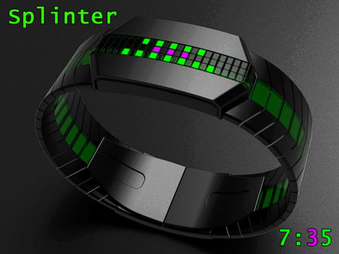
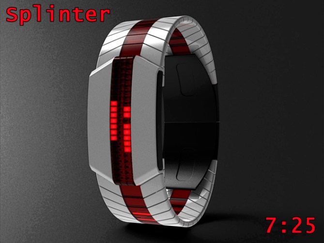
Peter says: This design is a back to basics LED (could be LCD) watch which features a narrow column of lights to describe the time. This narrow column of lights gives the watch a minimalistic – futuristic and mysterious look. Ideally this column would be semi transparent both front and back to show a hint of the internals and let light glow thru even when the display is off. The narrow dimension of the display allows for the material and finishes to do the talking.


The narrow array of lights would have the flexibility to describe the time in a variety of different styles, from vertical digits to 12/5/9 formats and many more inbetween.
I have shown the vertical digits and two 12/5/9 formats in my examples.
This arrangement would also allow for weird and wonderful animations.
The display could be all one colour or rows of different colour, ideally colour changing LEDs could be used so the wear could decide the combinations.


The simple time telling methods allows this watch to appeal to mass markets, the minimalistic and futuristic looks should keep the hard-core TF fans happy. The large un-cluttered surfaces give the watch a grown-up feel that should help it appeal to the more traditionalists.
The sci-fi looks, combined with expensive looking finishes and the minimalistic LED array allow this design to stand out in the crowd


The red/white one is my personal favourite, I think every x-wing pilot should have one of these!
The display is simple & yet versatile, being able to show both digits or dots (or both) & provide animations. Just using 3 columns of LED you can do a lot & create something outstanding.
LikeLike
Red leader standing by…..Simply red standing by….Red October standing by….(sorry I’m a bit of a Family Guy fan lol) I’m glad you like the red and white one, I usually struggle getting white to look good but it does seem to suit this concept. Yeah a narrow display can be pretty versatile, I dare say I could probably come up with a horizontal digit arrangement so the watch can be used as a travel clock too.
Cheers for posting and commenting Toky! 😀
LikeLike
Colour choices would be good, although the only thing I’d change on my favourite, the green / black one, would be the pink (to red, white or green), as I wouldn’t want to loose the effect of the green continuation on the bracelet.
The three display styles could, like colour choices, be included in the production watch as ‘easy’ (digits – very, very easy!), ‘normal’ (the green / black one) and ‘difficult’ (the red / white one – I find it hard to count the numbers!) – so options again.
So, great design and definitely one for TF to make.
Good luck and 5*/Y.
LikeLike
Yeah the contrasting colour on the green and black example could be anything really. White is probably the least clashy. Maybe they could be green but brighter or dimmer than the rest so it’s still nice and clear. Regards the difficulty levels there is probably a couple more digit styles possible with the display layout so a more cryptic mode may be possible. There seems to be plenty of scope for development so fingers crossed. Cheers for liking and the feedback sir! 😀
LikeLike
Also another thought regarding the time telling on the green and black examples. The 10min blocks could be staggered to other two rows which would allow them to be the same colour as the rest of the display but still clear. 😀
LikeLike
That Would work well. I think however this works out, there will be a variant or an option that I will want on my wrist 🙂
LikeLike
I think I just didn’t like the pink! I do like the idea of white as a contrasting colour and it always looks good on a black watch face. I am sure TF will come up with some good colour combinations, even if they don’t give the option of choosing in the watch menu.
LikeLike
Yeah TF seem to have a good handle on what combinations go and sell well, so im sure if this concept got that far they’d make the right decisions 😀
LikeLike
Added a couple of images the green and black example to my fb page, one shows the middle row of lights in green offset by one light (looks nice and cryptic) and the other shows the middle row in the original positions but in white:
LikeLike
They both look great, Pete.
Hard to choose between them, and I would be happy wearing either. Either would be relatively easy to read. The offset version looks real cool and the contrasting white is perfect with the green against the. Black. If forced to choose, I would have to go for the one with the white middle row.
If either get made, I’m buying one!
LikeLike
Thanks a lot Nev! fingers crossed TF give us the burden of having to choose a colour combo on the watches page one day x^^x
LikeLike
Hi Pete, even at Easter the continuous production, cheer!
I like carried out work.
5*/Yes, Happy Easter.
LikeLike
Hi Patrick, to be honest I have that many designs submitted I could take a break for a few months and you wouldn’t notice hehe. I’m glad you likey and happy Easter to you too! 😀
LikeLike
OK Pete, I suspected it a little, but that always given pleasure of receiving a compliment, especially at Easter, ah ah ah
LikeLike
Lookin’ good Pete! This is right up my street; stylish and just cryptic enough. The colour combos all work, although I’d agree with Nev that the black/green should be all green…=) If I bought this (which I well might) I’d go either for that or the red/white.
The only styling detail that doesn’t quite work for me is the slightly abrupt transition between the case and the strap, but that is really just a detail. Fingers crossed!
LikeLike
I’m glad you likey sir, cheers! I’m sure the transition between body and strap could be made more flowing if that was a deal breaker 😉 cheers for the support and feedback mate! 😀
LikeLike
really nice submission, I prefer the literal number font i think it works really well 5y
LikeLike
Cheers for the feedback and vote sir! 😀
LikeLike
This an excellent Binary / digital concept Pete the binary Version reminds me of my Storm MK 2 circuit binary wristwatch.
LikeLike
Hey Andrew, yeah it’s nice to have the option of different time telling modes. Umm nice comparison, I like the storm stuff (sorry Toky) so that’s a compliment for me, cheers 😀
LikeLike
Looks awesome, Pete, but I don’t think green and purple is a good colour scheme!
5y
LikeLike
Cheers DZ, Yeah the consensus seems to be that the pinky/purple isn’t to everyones taste.
Still if you dont try these things you dont find out. Cheers for the feedback and vote sir! 😀
LikeLike
Added a couple of images the green and black example to my fb page, one shows the middle row of lights in green offset by one light (looks nice and cryptic) and the other shows the middle row in the original positions but in white:
LikeLike
Very slick design!! 5Y!! Blue/gun metal for me tar. Your “red” comment cracked me up. Love that episode!
LikeLike
Fine colour choice sir! Yeah that episode is classic, I never get tired of seeing it. I almost enjoy it more that the original film lol 😀
LikeLike
I like the red and white one. Beautiful renderings, Pete.
LikeLike
Thanks a lot Xian, they are renderings plus a little photoshop filterage so they look slightly more graphicy (excuse the technical terms lol) Cheers for the support sir! 😀
LikeLike
Good that there are different time telling modes and a platform for cool animations. I like what you did to the straps, with these transparent parts! Nice simple and rather neutral general look – should go with many tastes – which is cool. I agree a bit with Anders’ case-strap-detail-comment. Could be a little more elegant. This picky part aside, it’s a solid design with a multifunctional display. Possible bluetooth conncetion not excluded I might add. Good luck Pete!
LikeLike
Thanks a lot Sam, Glad you likey sir! Cheers for the mighty fine feedback sir! 😀
LikeLike
I like the overall look. I like that the buttons could be full length on each side & totally hidden when viewed from the top. The inlays in the band is nice. I like the “curves” in it.
I like the proposed readings, but, for the digital, I would prefer if the 1 was using the central column.
The 12-5-9 remind me of the ‘Storm MK 2 circuit’ but the overall look is different enough. I have that idea in my draft book for a long time but was never able to make it stand out from the Storm & the few others already out.
I would buy.
LikeLike
Cheers for the likey and the feedback Makko. You make a fair point about the 1 in the digital mode, there is nothing stopping it being central or left or right biased. I don’t know which is the most intuitive, probably a subjective matter. I would propose that all the time telling methods are available as modes which should set it apart from existing designs. Cheers for the support sir! 😀
LikeLike
Far-right, like it is, is more intuitive. Central is more symmetrical.
Or it could be close to the text: 1st row = Top (or 2nd) & bottom ; 2nd row = all on ; 3rd row = bottom.
Multiples modes seem the best solution.
LikeLike
Great set.
I really like the multiple possibilities of reading time.
Very smart master Pete 🙂
5/Y
LikeLike
Most kind sir, I thank thee for thy support and votee 😀
LikeLike
Time is quickly running out for this concept so all that’s left to do is thank TF for posting it here and everyone who voted, commented and shared.
Cheers everyone!
Pete from the UK 😀
LikeLike