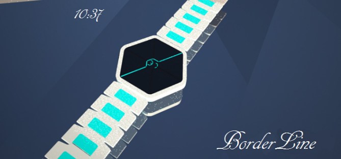
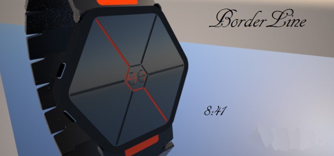
Design submitted by Justin from the UK.
Justin says: I wanted to strip away as much as possible when it came to designing this watch. Hexagons seem popular, so I began with that. Then I gradually took it down to the minimum amount of LED’s whilst still retaining that ever so crucial “ease of use”.


The hexagonal shape of the watch-face is perfect for the traditional analogue number positioning. 12-Top…3-Right corner…6-Bottom etc. Each hour number “rests” on a certain edge or corner of the hexagons border and this enables the lines of LED’s to mimic the shape or straight line which the hour sits on. See animations for a more in-depth explanation.


This is a design for both men and women. The simple yet elegant styling can fit any occasion. It has a very subtle yet sleek look about it yet still retains certain out-there characteristics found in all the TokyoFlash product range. It tries not to style itself into a corner and thus leave itself bound to a limited customer group.
Its simplicity will be what draws attention first, confusion at how so few lines can tell so much information. Beyond that, the sleek, minimalistic curves and bold LED’s will hopefully keep eyes fixated and hearts wanting.
BorderLine…on the edge.


Hi there folks…
A big thank you to TokyoFlash for posting BorderLine for me. I sincerely hope you like this watch and give it the little time it takes to master how to read it.
As always I welcome comments and chit chat, but for now ill open up the floor for you wonderful people…
LikeLike
Love the colours. May be a little too like the 3D Unlimited…but I might get one!
5y
LikeLike
Cheers for the support buddy. Everyone needs abit of colour in their life
LikeLike
Nice work. It took me a few moments to get my head around the display, but once I did it was fairly obvious…=)
One small comment I have is that the minute digits could probably be made a bit bigger. Mainly to improve readability, but it might be interesting to play around with the proportions (then again, I don’t know if you already have).
I imagine it’d be easy to make, TF already has a number of hex-shaped watches so getting this display into one of those cases should be a doddle. Best of luck!
LikeLike
Glad you gave it a chance and thanks for the support. I’m sure the numbers could be made slightly bigger if that makes the watch that little easier to read. I’ll have no qualms with those being adjusted abit.
I was actually considering just how easy it would be to make for TF, if it’s very easy and cost effective to put together then hopefully there’s more chance of it going all the way!
I’m not sure TF sell 3D anymore so maybe there’s an opening in the line up…fingers crossed.
LikeLike
No worries, I always try to make sure I understand the display before I comment. And ‘a few moments’ is far, far from my record…=) I spent about ten minutes on some submission a while back (can’t remember which one or who’d done it, sadly), so you’re well in the clear…=)
It’s probably a good thing to keep flexible about the details, after all they are ‘concepts’. Compared to how much some concept cars change when they go into production most changes TF makes seem to be peanuts…
LikeLike
Ahh thats good to know. I always try to make my designs easy to read but add a cryptic, bizarre twist to it. I dont think id be able to give a watch a full ten mins to figure out, imagine the hassle and ridicule off someone as you try to explain to them lol.
I guess a good thing about this design is that the “lines” and numbers’ proportions can be altered to suit the masses and still retain the main conceptual look.
Really hope this one goes all the way, it took me ages to get right lol
LikeLike
Hi Pelly, a reading not obvious at the beginning and with the explanation, it is simple.
I agree with Anders S, the minutes could be a bit larger.
5 * / Ye
LikeLike
Hi Patrick glad you like and happy that the animations were able to explain the time telling method easily. Cheers for the support. I’m sure the numbers could be larger without changing the overall aesthetic. Simple changes really.
LikeLike
There arent many points I can bring to the table that havent already been mentioned. Nice cryptic but very simple time telling which looks like it would be easy to make into reality! 5/Y Nice work sir! 😀
LikeLike
Cheers for the support buddy! I was hoping for the cryptic-yet-easy look…seems like it was accomplished
LikeLike
Cryptic enough to fit in the TF range but still easy to read. You even have the White Acetate version shown, so you’ve covered one of the variants TF like to produce too!
As already pointed out, should be easy to make, so can’t see any reason for it not to go all the way.
Good luck and 5*/Y.
LikeLike
Cheers for the support Nev, yeah ive tried to cover all bases when submitting this one, black versions…white acetate versions…numerous colours etc. It could even be a mono-colour E-paper to save on battery usage/energy saving if that sort of thing could be possible under the watch face! But I think nice bright LEDs would be the way to go with this one.
LikeLike
Very interesting way to tell the hours! The minutes could be like this too, but somehow separated from the hours to avoid confusion. That would make a weird looking display from the future 🙂 Maybe having the hours like this is not enough, I’m not sure. Good luck anyway!
LikeLike
Glad you like the hour technique Sam. It means a lot coming from someone who has such ingenious concepts as yours. Tbh the thought of displaying minutes had never occurred to me until now, you have sparked an interest in my previously creatively desolate mind….ta
I was going to go back into a couple of my previous designs and tweak and improve…this will be one of them for sure…watch this space…:)
LikeLike
Actually…there is another design I was working on which could be integrated nicely with this if parts are tampered with and chopped about….hmmm…the cogs are turning…
LikeLike
I think I’ve cracked it. .
LikeLike
I like the overall look. I like combining analog & digital. The hour telling was complex to figure out. For the odd hour, it’s simply checking where the arrow point to. I like the even hours. The minute could be bigger!
LikeLike
Reblogged this on justinthepel's Blog.
LikeLike