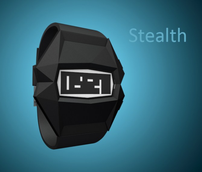
Design submitted by Daniyar from Kyrgyzstan.
Daniyar says: The design is inspired by F-117 stealth ground-attack aircraft.
It is assumed that the screen will be made with e-paper technology.
Maybe those, who like dynamic shapes, will like it. Shape of body differs this design from many others.


Nice design, the case is very intriguing. 5y
LikeLike
Like for thr stealth theme! Very nice design, 5* from me! 🙂
LikeLike
Deserves a higher grading! Great work! 5y!!
LikeLike
Thanks everybody for your comments and support, and thanks TokyoFlash for adding this work 🙂
LikeLike
Hi, Daniyar. I like the case and the border shape of the display (picturing Admiral Ozzel choking to death), they are fun. I do like the use of negative space, but I have an issue with the ‘1’ and the ‘7’. The one doesn’t particularly resemble said number, and in my mind should be represented by what you are calling the 7. To distinguish between them I would suggest splitting the 7’s negative space (think the negative space in the ‘8’ and move it to the lower left corner of the ‘7’). That way it would resemble the 7 with a line through the middle, and the negative space would have a unique position compared to that of the other digits. Just a thought. Good luck!
LikeLike
xian
Thank you for your comment and idea with ‘7’. As for me, it’s all ok with numbers. But I’ll definitely bear in mind this idea and maybe use in future.
LikeLike
Nice work Daniyar! 😉 It’s a bit angular looking for me personally but it looks great. Good luck with it.
LikeLike
Thank you very much, Mushy! 🙂
LikeLike
Looking at it, I’m surprised I haven’t seen it before…=) It’s such an elegant display, I really like the simplicity and crypticness(?). The shape of the case is interesting, and I think it works. As a graphic designer there’s one thing that slightly bothers me: the display is all horizontal and vertical lines, but the case is all angles and diagonals. As I said I think it works, but a few perpendicular lines in the case would probably tie into the display more effectively…
anyway, good luck!
LikeLike
Anders S
Thanks for your comment. Yes, I agree with you that there is some problem with display and case lines. But so far I have not found a solution how to fix it. I’ll try to once more… in future ))
LikeLike
I like the concept and I love the inspiration and the faceted look. The case looks a little chunky for my preference and a little like Kryton’s head out of Red Dwarf. If it could be slimmed down a touch that would be great. The display is cool if a little on the tricky side. A reveal mode for training would be useful. The display reminds me a little of Stencil but is different enough IMHO. 5/Y best of luck! 😀
LikeLike
It’s a nice design and very clever. Like it has been mentioned before, the case doesn’t quite match the number design but that’s only an aesthetic detail. As for the time telling, there are some demonstrations in your pics I can read, others I can’t. I think this is mainly down to certain numbers being too square. Aswell as an easy mode or a reveal, maybe a medium mode where by little notches could be included along the top and bottom of the display to indicate where each numbers edge was. This…for me at least would enable me to get used to the new digits and train my brain.
Nice design tho. 4* and a maybe pending little changes here and there.
LikeLike
Pete
Pelly
Thank you for support! Actually I’ve made some auxiliary markers, which help to see borders between numbers. But then I thought that it’s easy to see the time, and didn’t include version with markers to this submission. 🙂
So… here it is, on the behance.net (in the bottom)
https://www.behance.net/gallery/Stealth-watch-design/15077737
to all.
People, sorry for my english, if something wrong. But sometimes it is hard to write even with dictionary ).
LikeLike
The auxiliary markers make it a little easier to read. It would be better if the # where separated a little bit, like 1 mm, & still have 4 big/bold #.
LikeLike
That’s just what I had in mind. Don’t worry about your English, IM English and even I don’t understand myself sometimes lol
LikeLike