Design submitted by Peter from the UK.
Peter says: I was trying to think of a really simple and intuitive design with a sober look.
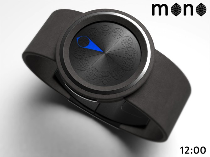
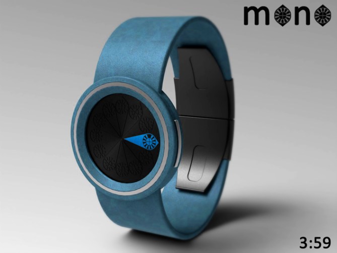
I came up with “mono” a back to basics, minimalistic LCD design based on a single hand style analogue format.
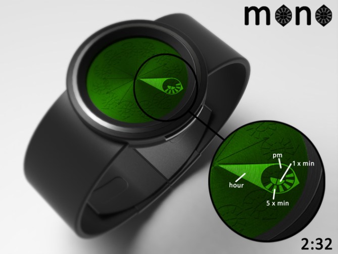
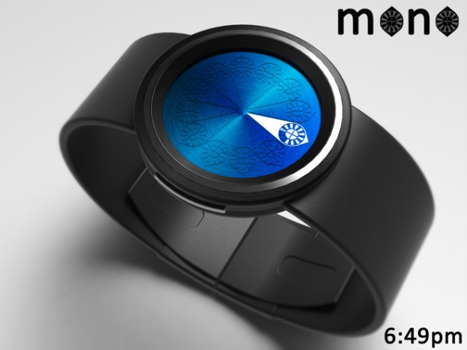
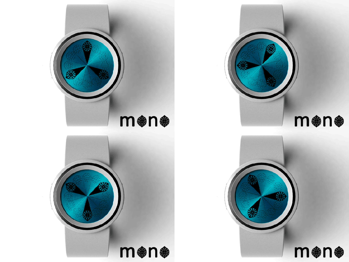
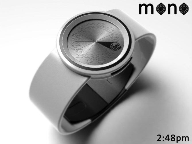
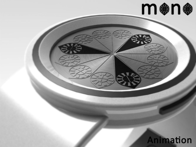
The time is told by a single hand style LCD marker. There are 12 positions for the marker as per the hour positions on an analogue clock face. Each of these 12 markers contains a smaller array of 12 segments that describe 5 min groups and a pm indicator. These segments are also arranged as per an analogue clock face. Inside of these segments are a further 4 for single minutes.
This design is very simple, clean and clutter free. It lends itself to many colours and finishes so should allow it to appeal to a wide audience of ages, gender and ability.
The simple intuitive time telling combined with colour and material versatility allows this design to stand out from others.




Great design there Pete! 5* and a “take my money” right there!
trying to decide wether or not id want the black strap/red face & red LED or black strap/blue LED….damn you and your efficiency for making multiple choices. ; )
LikeLike
Plus i think mono-colour E-paper would suit this design nicely.
LikeLike
Thanks for liking and thanks for commenting sir! E-paper would be cool but I think the layout of the display is that simple that LCD makes the most sense for this design. At least then it could be always on and frequently animated. Also the cost could be kept as minimal as possible. Regarding the colour combo choice, that’s one burden I’d be happy to landed with. The grey strap with blue display works for me. Cheers for the feedback and support Pelly! 😀
LikeLike
Thanks a lot TF for adding this design to the blog! 😀
LikeLike
Hi Pete, I see a flower, it reminds me of the psychedelic “Peace and Love” years.
Very original!
5 * / Yes.
LikeLike
hehe your showing your age now sir! Groovey baby! Yeah I did think in retrospect I should have done a version in negative where it shows all the “petals” other than the one telling the time. It should be an option. Cheers for the feedback and support sir! 😀
LikeLike
I hope that I am like the Whisky? (better with age)
LikeLike
I like it, Pete. Do I understand correctly that the LCD cells turn off during AM hours and on during PM?
LikeLike
Hi Xian, at the moment there is a hollow LCD block at the 12 O’clock position for highlighting pm. But a cool way of doing it would be positive (LCD block turn on to show time) for am, negative for pm (LCD blocks turn off to tell time) or vice versa. Cheers for the comment sir! 😀
LikeLike
Although this sort of idea has been done on here before it does look nice Pete! 5Y I wish TF made poetic/creative type watches. To me, they’re always a bit robotic and one-dimensional, but I guess that’s what the majority of fans want. 😦 I would have liked it a little more if you’d incorporated seconds. 😀 You know, just so it looks alive. Good luck with this one.
LikeLike
I know what you mean Lloyd, there are few things that haven’t been done in some fashion before. Regards the seconds they could be added but my original thought was that the display could be always on and animated like my animation (maybe showing the time at set intervals unless a button was pressed to show the time) the display would always be active in that case too. Maybe the animation could display the seconds somehow? Cheers for the honest review and the support sir! 😀
LikeLike
I have feeling that this design is Persian. I think this is a good addition to this blog. No comment on time telling. All fine. if possible, I wana order the complete white version.
Hmmmm…. why I suddenly imagine a beautiful Persian lady in silk dress posing with watch in front of ancient monument.
😉
5*/Y
LikeLike
I like the way you see the concept Fir, sounds much more exotic from your description than its humble origins.
Fingers crossed it gets made so that your vision can become the promotional imagery! 😉 Cheers for the feedback and the vote sir! 😀
LikeLike
Awesome! 5y
LikeLike
Most kind sir, I thank thee! 😀
LikeLike
This single handed analogue movement will appeal to anyone looking for a minimalist styled wristwatch. Excellent work as always.
LikeLike
Thanks a lot Andrew! I couldn’t have put it better myself! Cheers very much! 😀
LikeLike
Love this one Pete 🙂 5/Y
LikeLike
Sorry KV I didn’t spot your comment sir, cheers very much for liking and showing your support! 😀
LikeLike
Was worried initially that the 5-minutes would be hard to read as it is so small, but the analogue layout gets over that. The blue on black works best for me, but I think green or white on black would look good too.
I don’t particularly like the animation or when it looks like a flower, so I’d switch that off. I guess the late 60’s weren’t for me!
Good luck and 5*/Y, as usual.
LikeLike
Cheers for the feedback Nev, yeah flower power isnt for everyone! lol @u@
LikeLike
Oooh pink pink pink pink!! I love this!
LikeLike
Its always nice to hear a ladies opinion here on the blog! so cheers for the feedback and the support! 😀
LikeLike
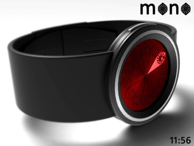
I like the overall look. I like the multiple-tone case. I like that it’s using 1 hand + blocks. Very easy to read. I like the “red wine” display on black band. (4th pic, including the animation) I like the animation. It would be nice to have it for, let say, 5-10 seconds every 15 minutes. I would buy. 5 * (or 10)
LikeLike
Im glad you like Makko, and if you would be willing to buy if it were made then I couldnt ask for a better endorsement! Cheers very much sir! 😀
LikeLike