Design submitted by Sam from Germny.
Sam says: I had the feeling that I achieved something cool with my previous Timeline concepts, so I gave the basic concept another round. This version is the 3rd Reality.

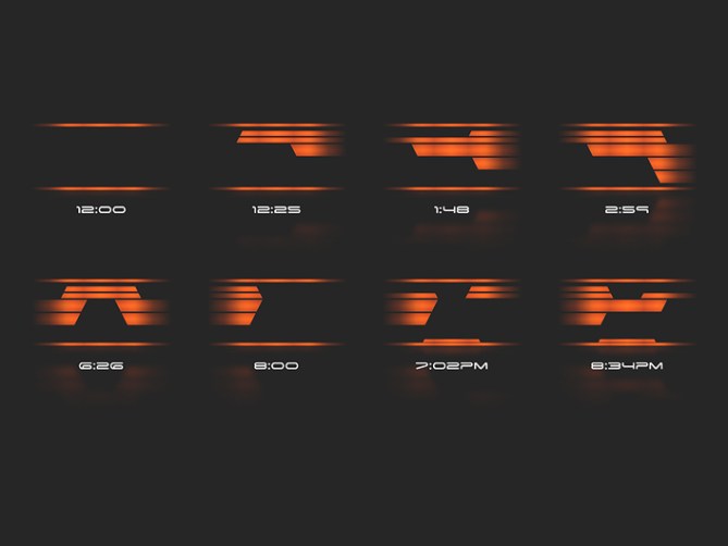
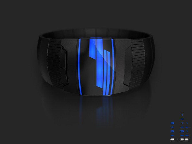
The time is told by thick and thin lines that run across the display from left to right. Thick lines mean 3, thin lines mean 1. When there are several lines at once, the number values have to be added. It’s a bit of work, but it’s all for the cool look. You have to concentrate on the very left edge of the display – that’s the hours, then there is the center of the display – that’s 10 minute groups up to five and finally the very right edge of the display – that’s up to nine additional minutes for precise time telling.
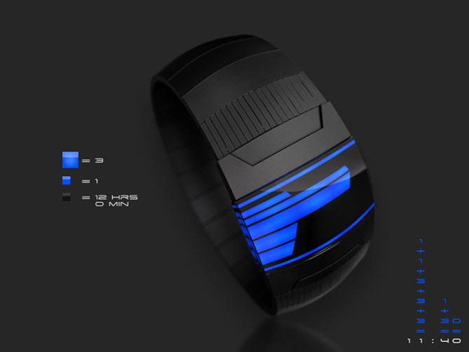
I left away vertical elements that connect the different lines. I work with horizontal overlapping which creates a stylish display layout. I’ve added two framing lines on the top and the bottom of the display. They show that the display is activatd at 12:00, which is an emtpy display. On the bottom line is an indicator for PM times. I kept the timelines plain for the sake of simplicity to not confuse even more and just because the graphic style looks nice.
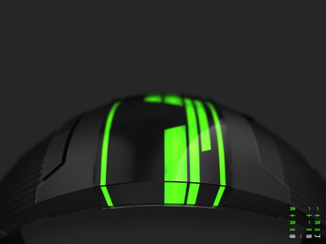
I gave the whole watch a more daring sci-fi look and let the timelines run around the lateral faces of the case – an idea I didn’t dare posting for the first and second concept. Actually the LEDs are already illuminated on their sides so why not using this?
So this is the Timeline 3rd Reality LED watch concept.


Hi Sam…this is a lovely looking watch…but…for the life of me i simply cannot figure out how to tell the time on it, which is a shame coz it looks so nice.
LikeLike
I agree with Pelly. You really have created a work of art but time telling is beyond me. Its always nice to see your work, it never ceases to be original.
LikeLike
Very cool look, as the previous commenters have said, I really like the cleanliness of it.
Like the others I also find it tricky to read. Thinking about it, I suspect the reason it veers into MindF territory (at least for me) is that there are few if any visual cues to the borders between left, right and middle. Adding 1’s and 3’s shouldn’t be a problem (plenty of other designs are more complicated in that regard), I think it’s just a matter of seeing which bar goes where. It’s difficult to say how it could be made clearer without screwing up the fantastic look, but maybe a subtle vertical staggering of the left, right and middle segments? I’m sure you’d come up with something better, just wanted to throw my $0.02 in there.
LikeLike
Another great design, Sam.
I found most of the examples & watch images easy to read. I think overlapping between the middle and the right or left numbers is probably causing any confusion, but it does look good. Perhaps reducing the overlap a bit?
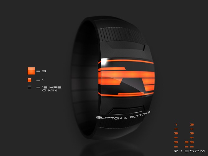
The only one I have a problem with is the last of the orange examples: looks like 8:31PM to me as I would expect the 3-bar to extend right across the display for the final number to be 4 whereas this looks the same as the 3-bar on the bottom blue watch which doesn’t count.
Anyway, if this gets made, I’d have difficulty choosing between the green and blue – both are great.
Hope it does get made. 5*/Y.
LikeLike
I get it…seems a fairly easy concept. However, working out the time each time you want to know the time would be incredibly time-consuming. I think I would end up barely wearing it, despite how cool it looks…
LikeLike
Hi Sam, I understood the operation, but I agree with the previous comments. The confusion might come from the two bars at the ends that blur the reading?
5 * / Yes, no reason to change?
LikeLike
Love the design. I think the design is both beautiful and cool, and at the moment I like the colors blue or orange the most. I really hope this will become reality because I really want to wear it! 🙂
This is everything I look for in a special watch; cool, mysterious and difficult for those who do not own it.
To those who think it is too hard; How long did it take for you to learn how to tell time on a normal clock?
Give this half the time you spent on that and I bet you will be able to tell time in only a couple of seconds 😉
Every new concept needs to be learned untill it becomes a conventional design.
5/Y
LikeLike
Im in the same camp as Anders on this one. I love the look but find the time telling on the challenging side. Which is fine when one isnt in a rush or half inebriated 😉 Maybe if there was a training or easy mode with more obvious dividing lines to make it easier to learn or when your in a rush. Much potential here sir, 5/Y best of luck! 😀
LikeLike
Hi everybody! Thanks for your comments. It’s so cool to get this feedback!
@ Pelly: Yep yep, you need a certain level of crazy mathdom to read it 😉 Thank you for the honest comment!
@ gordon: Thank you for the compliment! Made it too complificatious again hm… okidoki 🙂
@ Anders: Actually it is a matter which bare IS where. Maybe there should be some indicators, like the white explanation lines in the first green image. Some numbers will help. Just have to find a way to make the whole thing stay looking cool… Staggering sounds interesting. Thanks a lot for these two cents!!
@ Nev: Yes I must admit the overlapping, while giving the good look, causes the confusion. I thought that focusing on the specific areas would help. Reducing the overlap is a good tought. You’re good, it has to be 8:31pm. Yep, I got confused too. Too much overlapping 😀 Thank you very much for your insight!!
@ dzign: Oh what an irony, time-consuming time telling. I think after a week it works fine. Maybe it’s just me 😉
@Patrick: Ah I understand. Yes, the top and bottom bar might confuse too much. I made them to frame the whole display as a repeating display element… Thank you for the hint and your support!
@Tiwaz: Ok nice one! These were my thoughts too. It’s hard to find a balance between the own style and customers preferences. And since it’s hard, I just do what’s fun and sometimes meet up with taste and the brain of the nice people here hehe. Doesn’t mean I’m uber smart. I’m just like… when it looks good, I take the torture 😀 Thanks for your perspective. I’m glad I didn’t totally go nuts with this concept.
@ Pete: Hi Pete! Yeah, telling time in a rush is quite a thing one shouldn’t underestimate. Nyah, maybe next time 🙂 Potential sounds good to me sir. Thanks a bunch!!
LikeLike
Ha! I finally get it. It helps to actually READ what you wrote 🙂 I was thinking you breaking the time up into 2 pieces, when it’s actually three. Brilliant, Sam. I love it.
LikeLike
I think someone could take this in a literal direction and make each bar represent lanes of a post-apocolyptic freeway, the structure destroyed where you show black voids. Maybe have cars represent seconds, rear-ending each other and falling into the black…
LikeLike
Ow yeah, reading helps 😀 Cool that you like!!
Woof, the freeway analogy is pretty cool! Shame that LED and seconds don’t go well together due to the energy consumption. But still worth thinking about it.
LikeLike
Really, regarding energy consumption? That’s not good, my current design uses it 😦
LikeLike
Ah, don’t worry. Actually design knows no limits so bring it on ^^ Sometimes I try to keep it feasable and sometimes it say pfft 🙂 Often it’s a mix of both.
LikeLike
Yeah, don’t get disheartened. There are always work-arounds. Just so long as your watch isn’t supposed to scramble eggs…
LikeLike
I suffer hard to decipher the time syndrome. Or perhaps the time telling method is complicated to me. But the display looks simple, and very cool. The overall design is awesome. Hmmm…. I remember in some time in this blog people complained if the time telling so easy and unoriginal… sometimes now people complain if time telling is difficult. Maybe we should refer back the TF philosophy, change the way u think about time. Not sure if TF has different interpretation of that tagline, but what I wana say that is fine in the case of this design. Shut up Firdy, give it 5* already. Yes sir.
LikeLike
Thank you Firzy for these wise words! And for the support 🙂 It’s not more complicated that a Keisan except you have to remember thin is 1 and thick is 3. The math is the same. I’m happy to get these comments here. In the “real” world people are really serious about readability and don’t know any fun at all. Change the way you think about time… That’s a big area to have fun in. Sometimes you’re in the easy-to-read-corner, sometimes you play on the omg-where-is-the-time-square. Thanks for making me think ^^
LikeLike
It’s beautifully rendered Sam but I just can’t get excited about counting bars. Anyway, on a positive note, if I don’t like a watch, it’s highly likely that TF will make it. lol Btw, are you “Tiwaz”? 🙂
LikeLike
It is very eye-catching though. 😉
LikeLike
Please hate my designs lol. 😉
LikeLike
No. 😛 You’ve had way too many made already. 😀 Actually, so has Sam.
LikeLike
Anyway I don’t hate it Firdy. 😛 It’s just that it’s not my sort of thing. It’s probably cos it feels a bit too clinical for me.
LikeLike
No, I am not Sam:P
My name is Tom and I’m from Norway 🙂
LikeLike
Interesting question Lloyd 😛 That would mean I flatter myself but a) my time is too precious because of b) that won’t change the concept’s quality (or the lack of ~) 🙂 I completely see the point about the bars since I made similar comments before. After a while, actually right from the start, it’s not like you count them and then you calculate. It’s more like reading with obstacles. 8 is “3,6,7,8” and 4 is “3,4” – the number develops in your head. Counting would be reading a sentence letter by letter instead of word by word. Ok this won’t change your perspective, just opens up an alternative point of view. The main point is the look of it and finding a way to read it, that’s hidden at first but then just being primary school difficulty. Anyway, thanks for your opinion! If it’s honest and reasonable, it’s welcome just like the others ^^
LikeLike
5/Y for awesomeness 🙂
LikeLike
Merci Kraut ^^
LikeLike
Fantastic design. I would definitely buy this watch.
LikeLike
Thank you nick!
LikeLike
Interesting design and cool, futuristic style!
LikeLike
Cool you think it’s cool 😀
LikeLike
I like the overall look. The sides of the display are nice. I like the hidden buttons. I like the idea of having 2 horizontals lines lighting at 12:00 instead of having nothing & wondering if the battery still have power! I would buy.
LikeLike
This one & the original are my favorites.
LikeLike
Nice, thanks for appreciating. I thought I gave your comment on the previous Timeline concept a thought. Those two lines seem to confuse though. No concept is perfect hehe.
LikeLike
I like the void over the pm light at 12:59pm & that the 2 lines that equal 1 are both on top of the 3 3’s. ( I like the etched lines on the original )
If the top line of the 12:– time is confusing, it can be removed, but having 3 thickness is good. ( specially at a ratio of 1, 2 & 4 )
LikeLike