Design Submitted by Logan from the USA.
Logan says: The watch colors are inspired by the amber, green, and white monochrome monitors from the early days of personal computing. The strap is like gray ribbon cables. The square shape — a CPU. Overall, the design is meant to evoke nostalgia for the vintage computing experience. Even people who did not live through it have seen it in countless movies and TV shows, and associate that imagery with classic computer cool.


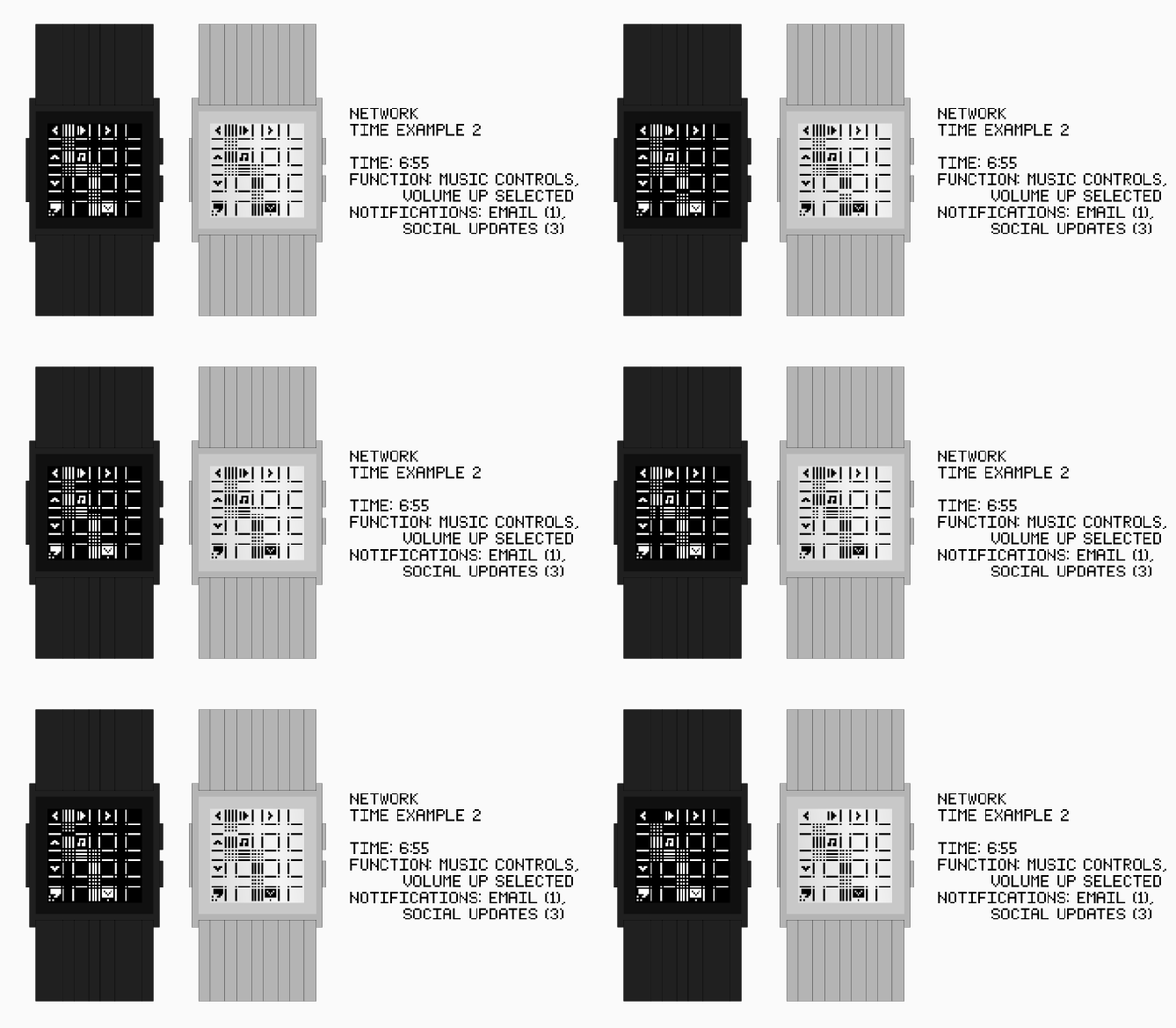
The time-telling method is based on the normal clock positions laid out around a square. Connecting the clock positions creates a grid, and a visual “signal” moves from the hour position to the (5-)minute position. Additional dots indicate +1-+4 extra minutes. This is one of the easiest non-numerical time-telling methods I have submitted, but it looks complicated.


The signal paths connecting the clock positions do not use all the space on the display, but leave square gaps. In these gaps are the icons for the watch’s Bluetooth functions (+ an alarm indicator).
Button A cycles through the 4 app functions — camera, check-in, find phone, music controls.


I have to say this is the very definition of retro chic! This really does take me back to my first computers and games.
The time telling is really simple and effective but would look totally random and cryptic to the un-initiated.
Loving the 8-bit smart function icons too. Sir Alan Sugar would be proud! 😉 5/Y Best of luck sir! 😀
LikeLike
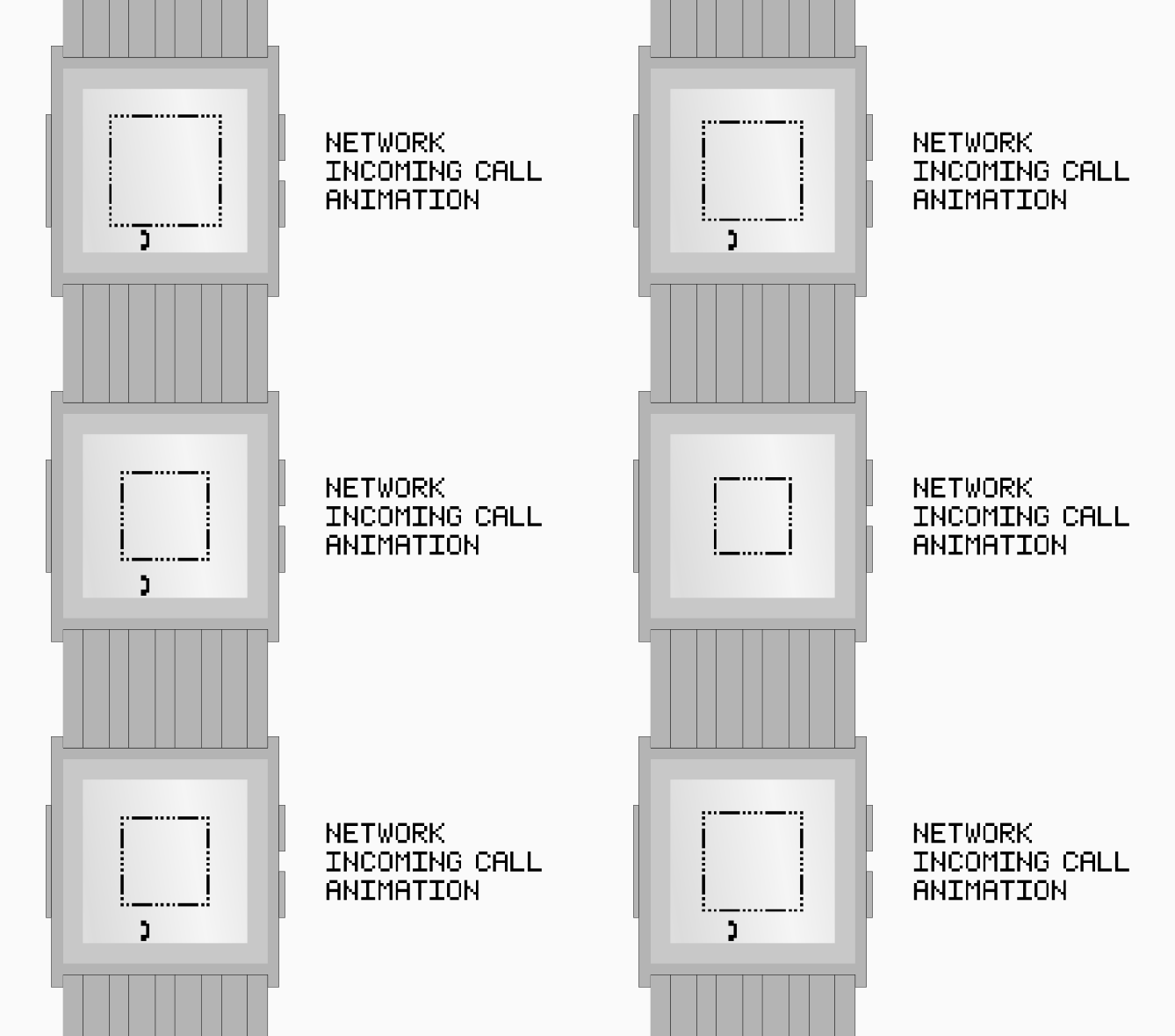
Hi Logan, I like the animations and playful side. The green model for me.
5 * / Yes.
LikeLike
awesome design for the core!
i would like to see that with a wooden case & strap, comparable to the first apple, which was also built in a wooden box.
want! WANT! W.A.N.T.! 🙂
LikeLike
Hi, Logan. It’s clear that you’ve been a lot of work into this! I think I’d have to go with the amber on black. Love the alarm display!
LikeLike
Put. Not ‘been’. ‘put’.
LikeLike
Thanks for the comments, everyone! Glad to see some fellow retro fans.
While this was designed as a smartwatch, I hope the time display is interesting enough that this could work even as a regular watch without the smart functions.
LikeLike
Very cool time telling method! I really like it. Have you tried an animation like this for the corners: _ | ? Nice little icons. I just wish the display wouldn’t look this ‘untidy’ with the network and the different icons places in the holes. Maybe a mere time telling watch would work too (what the bloggers tend to suggest for most of the smart watch concepts posted lately, and now I suggest it too). An continuous animated display.. and you know what, you could use one wire for the normal time and add 1,2,3,4 wires for additional minutes instead of the four additional dots. Aaaaanyway, this watch has some potential. As fo rthe smart part, maybe a separate display with the same width but 1/7 of the height of the main display would work here too. I like thinking about this concept and I hope Tokyoflash do too. 5*/YES
LikeLike
Due to the smartwatch, there’s too much info on the screen at once. Other than that, I like the overall look. I like the time-telling: offside>center & then center>offside. I have a hard time figuring the single minute.
LikeLike