Design submitted by Tom from Norway.
Tom says: I am currently at the second year of a Bachelordegree in Mediadesign. This idea came to me during a schoolproject in a class named “Informationdesign”, where we had to choose amongst different kind of topics in a mandatory exercise (we had to pass in order to get to take the exams). I chose one where we was supposed to make a new watchdial to tell time. I passed, but since the design had no other purpose that to show my teacher I thought it would be great to enter this contest with it.

Name: Coordination
Inspiration for telling time: Geographic coordinate system with latitudes and longitudes.

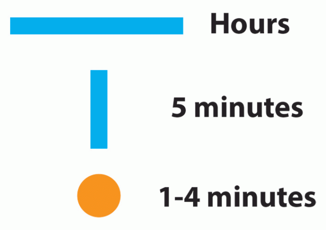
The idea is to “coordinate” time, where you use horizontal lines for hours, vertical lines for minutes (in fives) and a dot to pinpoint the exact minute. It will be better explained further down in this text.
This means the clock needs to be digital with a form of color display.

The time itself is represented in a span of 00:00 – 11:59 hours with the use of AM and PM for a 24-hour timespan.
Here is how the minutes work:

Minutes:
First of all (not in the image); if nothing shows, the clock is 00:00.
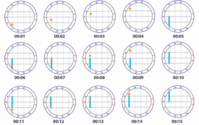
As you can see the orange dot starts down left. This is the position for the first minute (00:01). The next minute it moves one spot further up (00:02).
When the dot reaches the top position, it has moved 4 minutes (00:04).
Then at 00:05 a vertical line appears. And as you can see there is a stationary number “5” under the line to help the user to read the minutes correctly.
At 00:06 the the orange dot reappears to tell you that the minutes are “5+1” minute.
At 00:07 it moves up again just like before (00:01-00:04).
When the time is 00:10 the vertical line makes a jump up indicating the second 5-interval + it is between the stationary numbers “5” and “15” (which is 10).
And as you can see it keeps on moving like this.

But when the time is 00:16 the dot needs to move one spot to the right for it to begin counting again. Then it moves like this up to 00:19, and at 00:20 the vertical line appears again. This time in the second column, and keeps on counting as before.

From minutes to hours:
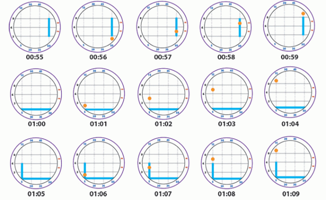
As you can see at 00:55 the vertical line is at the rightmost position, between what would be the indicators of “50” and “60”, however there is no point in showing “60” since that would be the next hour.
Anyways, the orange dot keeps counting as the time goes from 00:56 to 00:59,
and then the next thing will be a new hour; 01:00.
This is where the horizontal lines comes in. Now (01:00) you can see that there is a horizontal line at the down most of the clock. This is the position for the first hour. To help guide the user in hours there are some stationary numbers to the left (3, 6, 9).
And at 01:01, 01:02 etc you see that the clock moves just as it did when explained in the “minutes” section.

Above you can see how the hours move.
Below you can see two random times of the day.

Tho clock has both helplines for hours (unbroken grey line) and minutes (stippled grey line). In addition there are some helpful numbers on top, bottom and left to make it easier for the user. And at the right side “AM” and “PM” to make a full 24-hour watch.
Additional thoughts:
However there are no way to tell seconds on this clock, but if needed it could make use of the outer ring for seconds, where it slowly fills up as the seconds go from 00-59.
I also think the visible endings of the vertical lines would look better if they where rounded.
And I dont think the design is limited to the colors I have used.
I am not that good at drawing, so I only provided the watchdial. However I pasted it in place on an image which shows how I think it might be designed.
I have tested it on about 20 people and everyone understood the system + managed to tell the time when I presented them with a test.
Thank you! 🙂


I like the premise, I had a similar idea but it came from a totally different inspiration/direction but would have displayed the time in a similar method. My only issue is when the blue bars don’t meet the bezel that it makes it trickier to tell the time. I would be tempted to add markers/numbers to the face or glass for these instances. Im nit picking of course, 5/Y Best of luck and welcome to the blog! 😀
LikeLike
Thank you for the warm welcome 🙂
And thank you for great feedback! 😀 You have given me something to think about.
Although I would really like to keep the numbers to a minimum due to a clean and minimalistc look, if possible.
Tom
LikeLike
I think I misunderstood what you meant when you said it might be trickier to tell time when the blue bars don’t meet the bezel. I think I do now however 🙂
Here is an example of what might help: http://tiwaz.no/coordination/bluehelplines.png
By changing the colors of the “active” helpline to cyan/blue it will make it a lot easier I think (?)
I am not sure if it’s really necessary though, since the grey helplines are already there for exactly that purpose, and I think the average user will learn to use them quite fast 🙂
LikeLike
Hi Tom, for me it is a bit complicated, but the work is there.
5 * / Yes for the work.
LikeLike
Thank you! 🙂
-Tom-
LikeLike
Awesome! Love the clean white design. It kind of reminds me of the sun and the ocean. Good luck, Tom!
5/Y. I really hope they make it 😀
LikeLike
“It kind of reminds me of the sun and the ocean.”
That is exactly what I was thinking of when I picked the colors 😀
While trying out different colors (the form was made in greyscale) I suddenly found myself thinking that at some hours it looked like I was looking through a round boat window and out on the ocean with the sun in the sky. And since I thought water and sun would go well with the clean and minimalistic idea, combined with navigating at sea, it would be a perfect match 🙂
I didn’t say anything about it in the description solely because I want people to have the freedom to chose what they think it looks like. But I think it is cool that you noticed it too^^
And thank you for voting! 🙂
-Tom-
LikeLike
Cool! It’s probably a coinsidence, but the colours reminds me of the portal games:)
5/Y. I’m gonna buy it for sure:)
LikeLike
Wow, you are absolutely right 😀 I’ve played Portals 2 and can definitely see what you mean. As I said in an earlier comment; I want people to be free in their associations regarding this design, and I love your Portals association. If it makes you think of something you like, then I’m happy 🙂
-Tom-
LikeLike
Bra TC!
LikeLike
Tusen takk, Mr. R 🙂
LikeLike
5 stars and ofc I want to buy it 🙂
LikeLike
Thank you! I really hope you get to wear it someday 🙂
LikeLike
-Tom-
LikeLike
Wow, really cool idea, and great execution! Would wear! 5 stars from me 🙂
LikeLike
Thank you for the support, Leffi! 🙂
-Tom-
LikeLike
Want, want want! Tokyoflash, will you make it?
LikeLike
Hehe, I thank you for your entusiasm my friend:D Let’s cross our fingers together and hope for it to become a realization some day 🙂
-Tom-
LikeLike
Incase anyone wondered, here is what I meant by saying “I also think the visible endings of the vertical lines would look better if they where rounded”;
+ I have made a thin white space around the orange circle for when it overlaps the blue lines.
A couple of small changes that I think improves the usability and aesthetics 🙂
-Tom-
LikeLike
Beautiful, simply beautiful.
LikeLike
Thank you so much! I’m glad you like it 🙂
-Tom-
LikeLike
Awesome concept! 🙂
LikeLike
Awesome comment 😀 Thank you! 🙂
-Tom-
LikeLike
Finally a clock for geocachers! Infinite stars for you 😀 As an active geaocacher I have been looking for a watch with a theme like this for a long, long time. With 6 million geocachers worldwide I think you might hit a small jackpot if this gets realized 😉 5 stars and Yes from me (I would have given you 3 yeses if possible…one for each geocacher in the family).
LikeLike
Thank you so much for the support! I’m glad you like it 🙂 One can only hope your right about the geocaching community 😀
-Tom-
LikeLike
Stylish and cryptic, and yet so easy tell time. Well done.
5/Y
LikeLike
Thank you so much! 🙂
-Tom-
LikeLike
And this is how I imagine the final design might be made:
-Tom-
LikeLike
This should have been a reply on an earlier comment, but I guess it might have bugged since it still says “your comment is awaiting moderation” after several days ?
This is what I wrote originally:
So I have just made some adjustments to the colors of the display to show some more ways in how this might be made. I don’t know if it is difficult to make these with e-paper or a LCD-display, but I think they look really awesome myself 🙂
The first one is still with blue/orange/grey colors, but I have put some dark glow to it, and I have made the dot transparent:

The second design is in black/red/grey with a dark glow for a more evil kind of look:

What do you guys think?
-Tom-
LikeLike
Yes yes yes! I thought your original looked good, but this is even bether. And I really like how you made the new dots. For me the black watch is the coolest, but I would wear the white one in a heartbeat. Stunning.
LikeLike
Love the black one! The white was nice, but the black was awesome.
LikeLike
I love the black one!
LikeLike
LikeLike
Thank you for the great feedback, Makkovik 🙂 I have been doing some work today to accomodate your wishes. Hopefully they will get trough the moderation before the time for this contest ends.
-Tom-
LikeLike
Sorry but for me its too complicated and too confusing. I find myself needing to look at the key to figure out what the time is in your examples. Nice idea but not something I could wear im afraid. You might be limited the market by only providing for geocachers.
LikeLike
I like the idea. The overall look is nice. (I prefer ss band over acetate band) I like the am/pm placement. If the alarm and/or date would be added, it would be nice to have double letters “word” placed there. I would like if the 60 was written, even if it’s just for the symmetry. I would buy.
LikeLike
Since my comment wont have time to go trough the moderation prosess due to the limited time left on this concept, I will simply post my suggestions one by one regarding Makkoviks feedback.
First of all, here are the raw displays of the date and alarm function:
And as you can see, I have added the number “59” for the symmetry (since 59 is the last minute).
LikeLike
And here is how the buttons would work:
I also suggest that the alarm is sett on and off, while at the alarm-display, by holding the “backlight-button” for 3 seconds.
LikeLike
This is how the date-function works:
LikeLike
And this is how the alarm-function works:
Your wish is my command, Makkovik 🙂
The images are not perfect, but would something like that work?
-Tom-
LikeLike
59 instead of 60 would work. I didn’t realized that the digits where part of the screen. I though they where simply written on the bezel. A dot for the alarm would work.
LikeLike
I prefer the flat end lines!
LikeLike
Thank you for great feedback Makkovik!
I see what you mean about the number 60 for symmetry. But maybe it would be best to use the number 59 since that is the final shown minute? I have implemented it on the following examples…
And regarding the date and alarm part; Your wish is my command 🙂
Here are the raw displays for date and alarm:
This is how the buttons would work:
This is how the date-display works:
And this is how the alarm-display works:
The images are not perfect, but would something like that work? 🙂
-Tom-
LikeLike
It is now only one day left for this concept, so I would like to take the time to thank Tokyoflash for publishing my idea – thank you! 🙂 And a big thanks to all who have voted and commented! You have all inspired me into improving this concept these last 30 days, and I think most of you will agree that there have been some changes.
My latest and final changes (implementing date and alarm) are awaiting moderation from TF.
Thank you all, it’s been an honor!
-Tom-
LikeLike