Design submitted by William from Norway.
William says: When I started this project, I wanted to check if I could use the interesting visual effect of the EAN codes in an original time telling system.
I am very interested in concepts that allow to use different kind of graphic designs to reach different kind of groups of people. I think that my concept allows this in a very easy way.
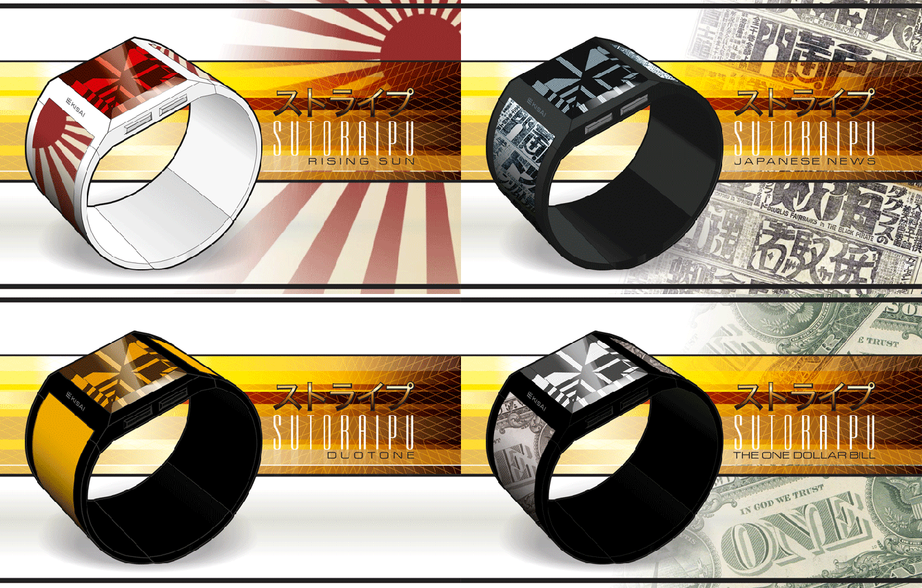
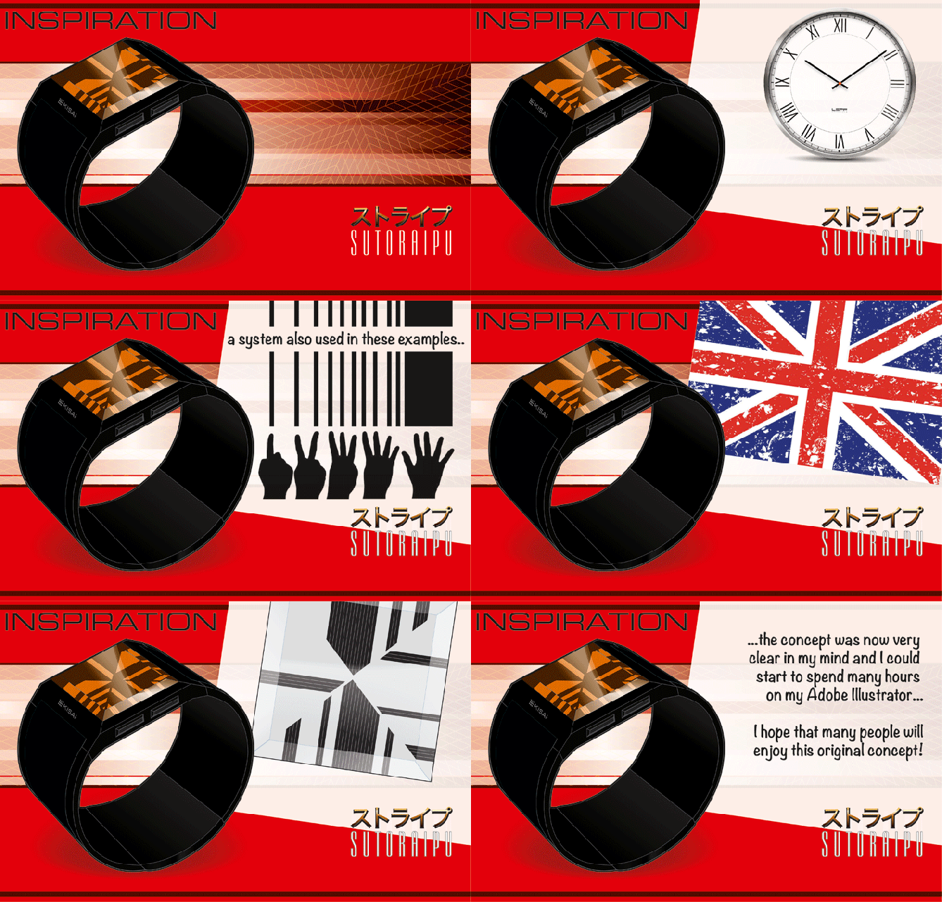
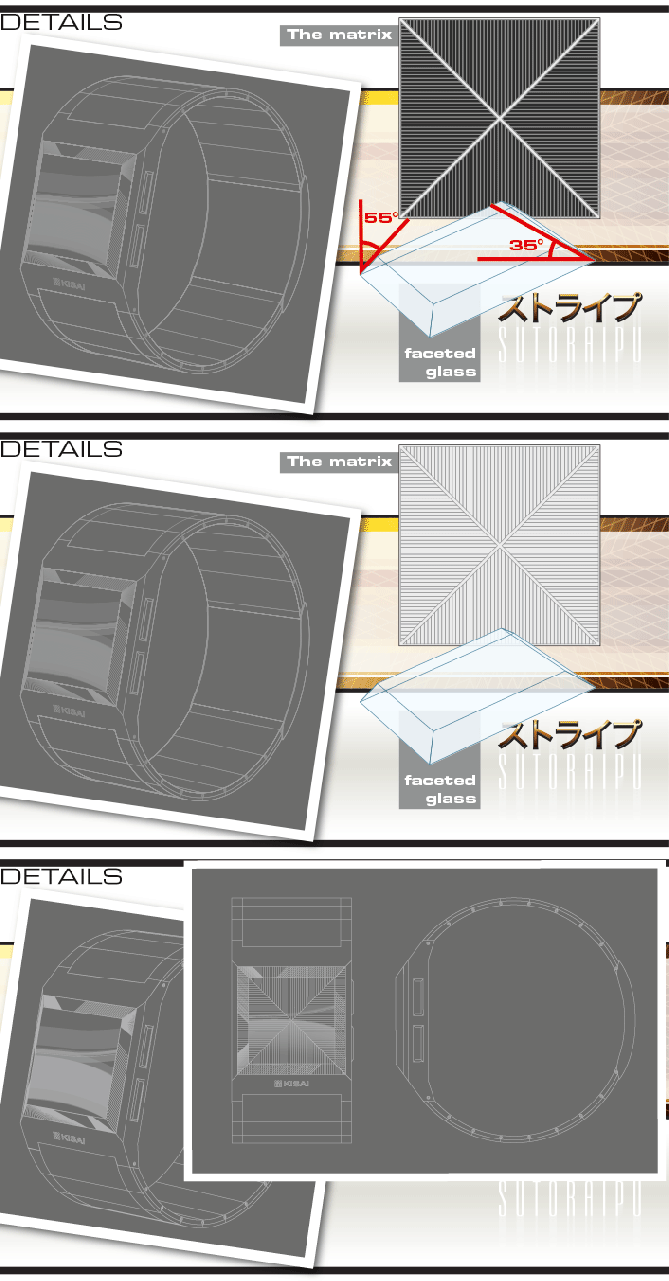
If ever, the battery is a weak point, then a rechargeable battery with an USB connection may be a solution to consider.
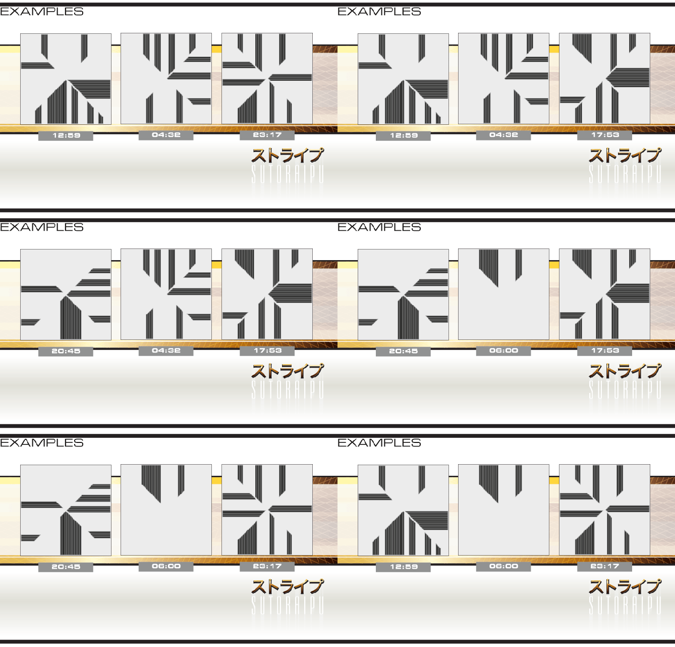
Concerning the time telling, the overall look of the screen display may appear overwhelming, but at once you know how to read the time (check the TUTORIAL animation), you understand that this actually extremely simple to read the time…
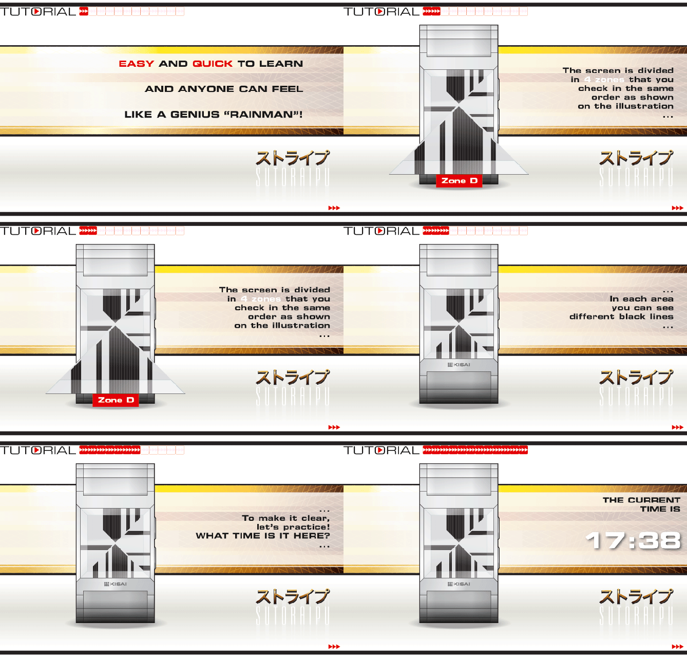
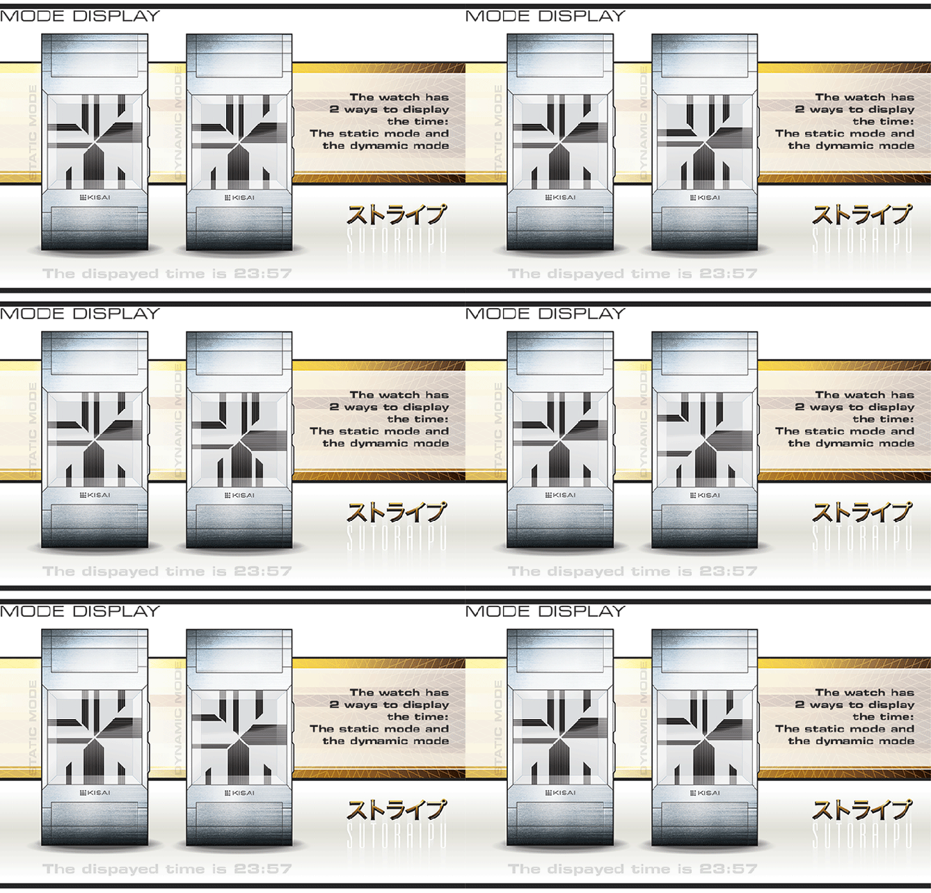
As I named it earlier, I come up with a concept as flexible as possible to allow different designs that may interess many different kind of people. (Check all the different animations).
By the way, the point of my presentation is to show different kind of designs, some may reach your taste while some other may not. When voting, it would be nice of you to express a vote approving the model(s) you like more than a vote against the model(s) you may like less. Thank you in advance. 🙂
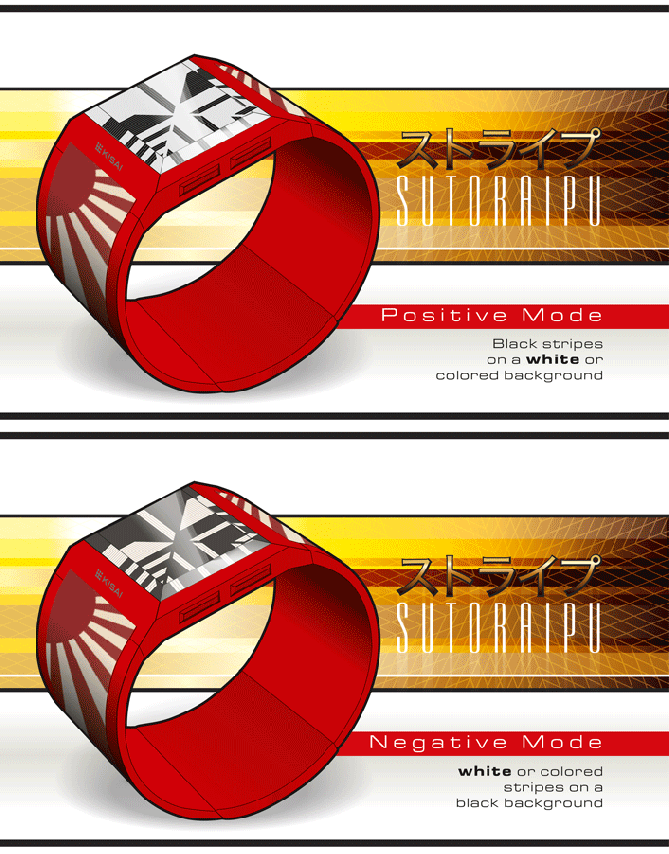
My design stands out from the others by the originality and the simplicity of the time telling that gives a very lively and nice graphical result on the screen.

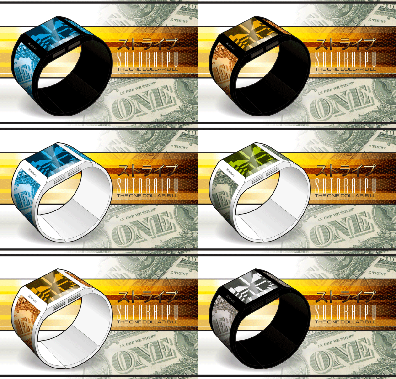
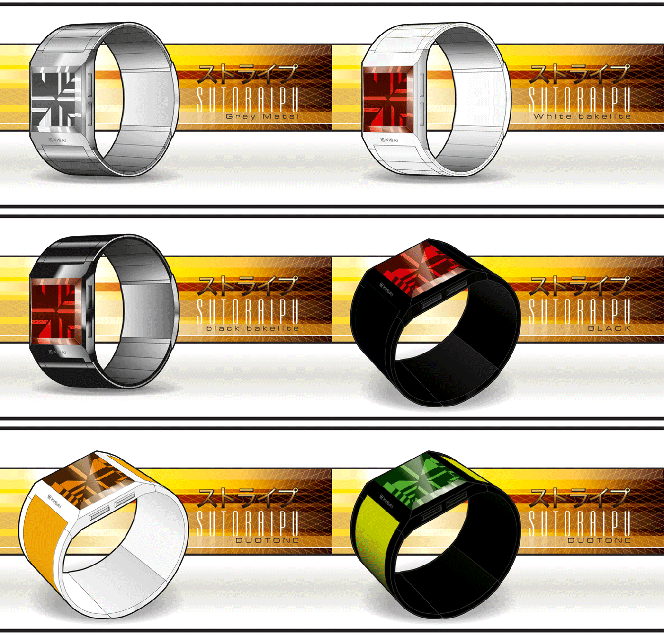


Another great presentation and great looking design William! Took me a little while to get the time telling because I was trying to see a column consisting of 5 lines, I then figured it was just a broad column and the number of lines is irrelevant. I presume this is to allow for flexibility and the animated mode. Very nice work sir! 5/Y 😀
LikeLike
Sono tokei wo hitotsu onegaishimasu!
🙂
5y
LikeLike
A lot of thought and effort has gone into this – impressive.
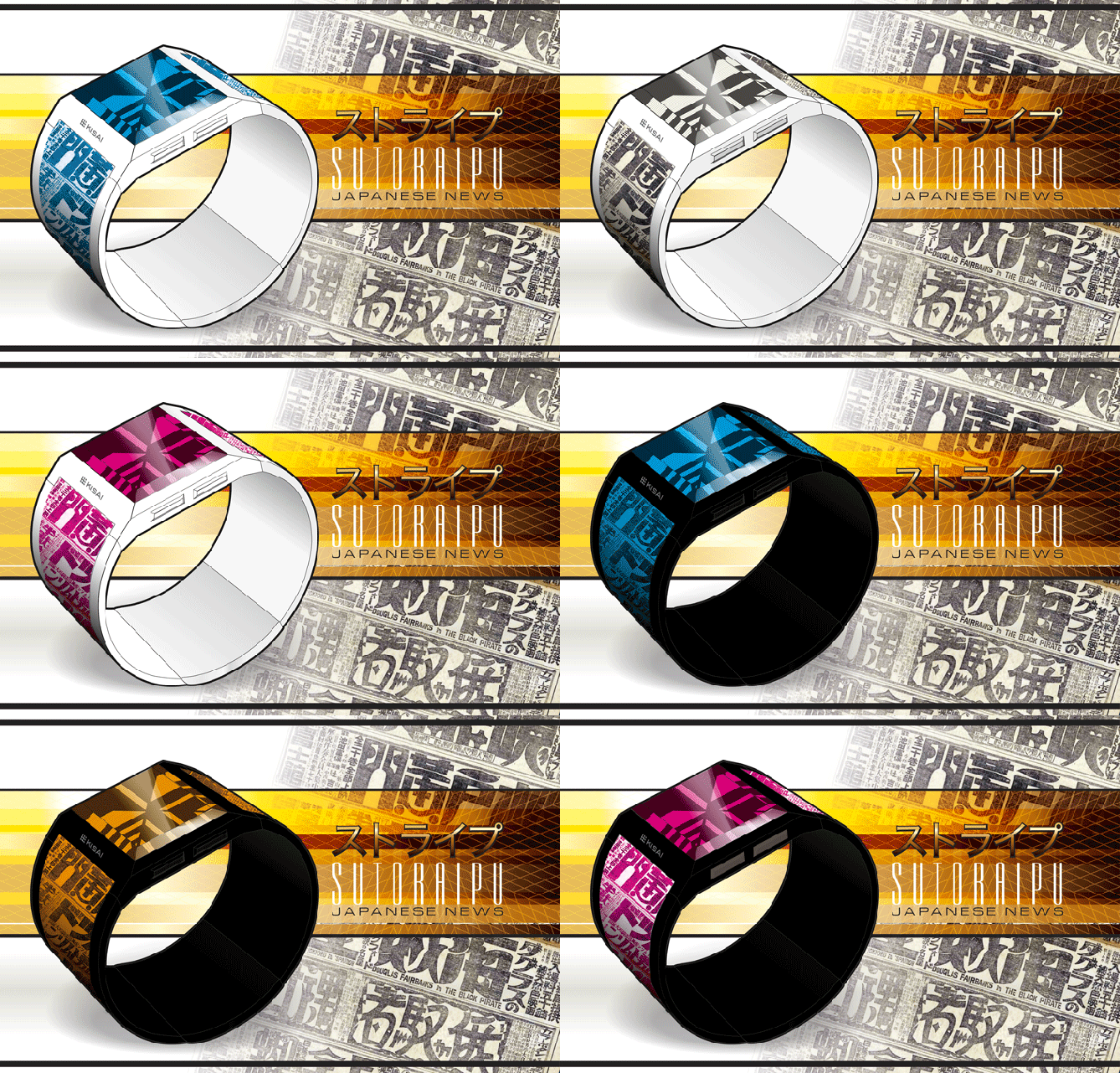
As an ex-EPOS developer, I like the idea of a barcode-based watch. For me, the display would have to be black on a white background, as that seems right for a barcode. Although having alternative strap designs is great, I find they distract from the watch face, so I would go for one of the single colour straps – black or, maybe, silver.
Good luck with this and 5*/Y.
LikeLike
very original and thats good
LikeLike
Very nice concept wrapped in a very nice presentation! I like this work. The time telling method is simple (once you know how it works) and the display looks cool. I think in the cross the barcode appearance goes away and a new style is born. The dynamic mode is wow. Good luck William, 5*/YES
LikeLike
Thanks a lot for the positive feedback.
I have some new ideas that I want to present soon but I do not know when, I do not have some much time for myself at the time being.
Cheers
LikeLike
Excelent presentation, and very interesting concept. Nice job William, 5* and good luck!
LikeLike
I like the display. I prefer the static mode. The “Japanese News” made me thing about city street map with buildings or architectural plans/blueprints! I like the faceted glass.
LikeLike