Design Submitted by Anders from Sweden.
Anders says: I wanted to try designing something a little more avant-garde and iconic than the smartwatches I’ve seen before. Specifically I aimed to find an interesting way to mix the time display and the Bluetooth indicators. In order to maximize the clarity of the design I’ve tried to keep everything as clean, uncluttered and legible as possible. What I’ve come up with is this; Nippon.
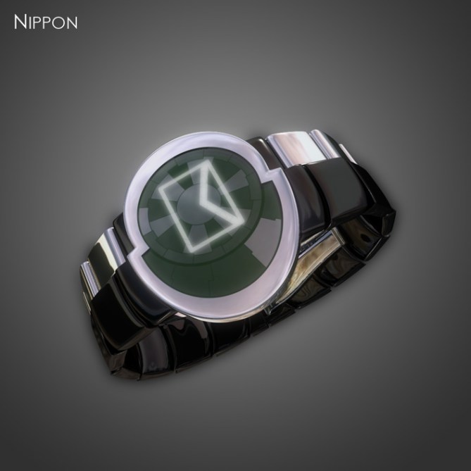
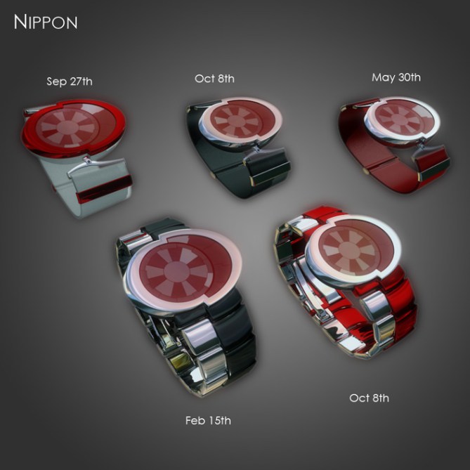
Basically, the time and the Bluetooth alerts are separated, with one display each; mirror LCD (preferably) for the time and LED for the BT functionality. The trick is that the displays are layered. The segmented LED display doubles as a backlight for the LCD. When there’s an incoming call or mail – or some other alert – the appropriate icon lights up and shines through the time indicators. Of course, all segments together can be used as a standard backlight in low ambient light conditions.
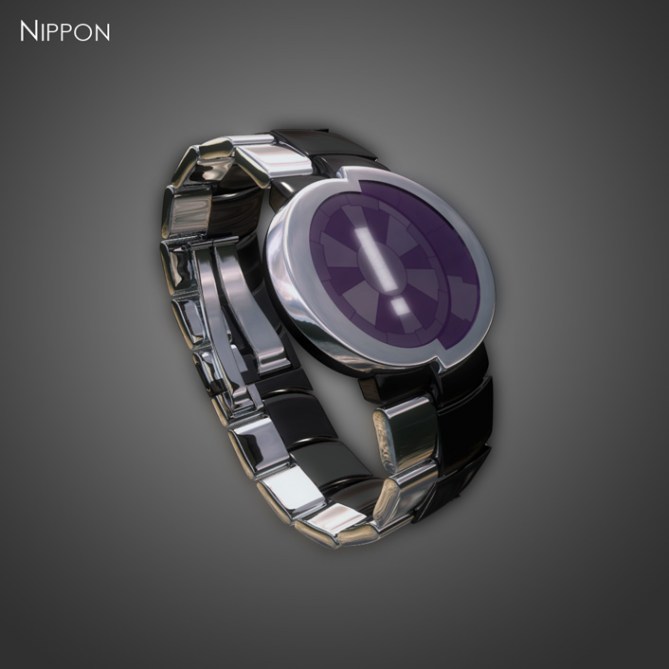
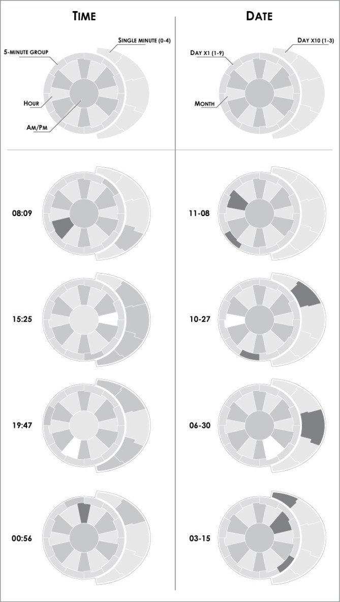
The time is displayed in 12-12-5 format, with an LCD arrangement subtly inspired by the Japanese naval ensign but with a jagged, futuristic flavour. The central circle acts as an AM/PM indicator, around which the twelve hour segments are arranged. They all have a notch on their outer sides, each notch pointing to that segment’s hour position. Twelve 5-minute indicators form a ring around the hours, and outside of them to the right the five single minute indicators continue the lines from the hour segments. To allow the backlight icons to shine through, the LCD segments are only partially shaded, at different levels between the groups in order to aid legibility and to show off the LCD segmentation. In order to maintain the sunburst pattern as much as possible the current segments are either shaded more or less, as required.
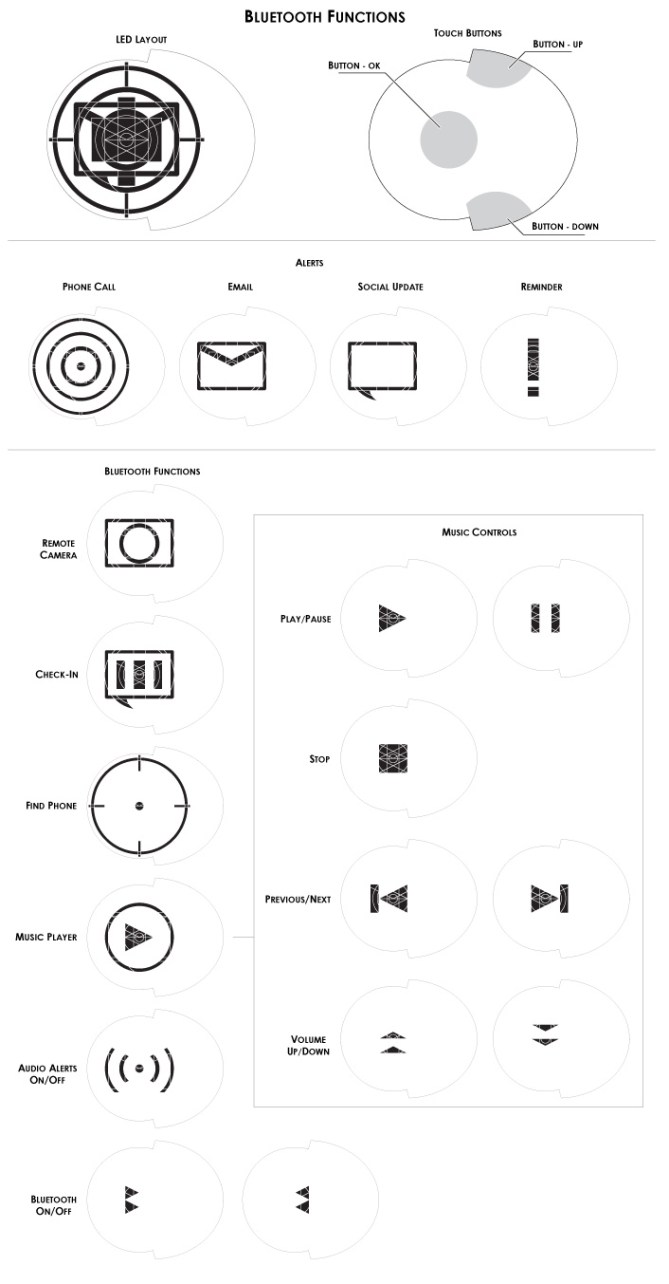
Controls for the watch consist of three touch buttons; up, down and select, the latter of which is in the center of the watch face. The directional buttons are used to step to the desired icon, and of course select is used to activate that icon. I feel this solution should me much speedier to navigate with a relatively small increase in complexity; the user being able to step through the choices in both directions rather than cycling through them unidirectionally.
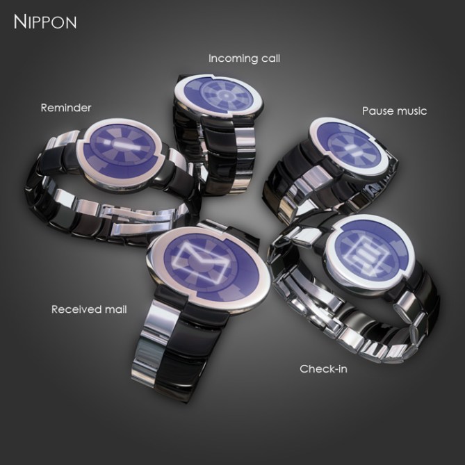
Access to the menu could be achieved by holding one or two of the buttons for a couple of seconds, to minimize the risk of accidental input. I imagine that the LEDs would flash in some suitable fashion to indicate that the menu is active.
The LED backlight is carefully segmented to allow it to display all necessary icons with as few segments as possible. To indicate unread messages, missed calls and alerts, the appropriate icon or icons will flash in turn, once, twice or three times depending on the number of alerts. The frequency of the flashes should depend on the elapsed time since the last alert. As the reminders build up, the watch will cycle through them continuously. This ‘alert cycle’ should be a kind of ‘home screen’ which the watch automatically reverts to by default after a set period of inactivity, and when the wearer accesses the menus through the watch, the alerts should of course stop cycling, to avoid confusion. The exception to this is naturally the alert for an incoming call, which overrides everything else. The watch displays a pulsing call icon and activates the buttons to let the user choose a response.

I realize that the shape of the face might prove difficult to manufacture, and the design might well require some changes, especially in the width of the case border. That should be perfectly possible, but I feel that the sharp step should be retained in some form as that element links the face, body and the metal strap, as well as being a fastening point for the alternative plastic/fabric strap. One option I’ve toyed with is that the top half of the body and the rubber ‘skirt’ could be removeable, to allow for some personalization. It’d be a bit tricky since it would require removing the strap mounts, but it’s probably possible to come up with an easier solution if the idea appeals.


I only comment on design perspective; I think it is cute but the same time elegant and unique like the saga of fashion statement. The display really make it very futuristic looking, albeit little bit cute. I appreciate your brave to consider the shape of display like that,
Time telling, OK. And I think it is fine as it accommodates the shape of display.
Great job and good lucky! 5/Y because I can.
Cheers!
LikeLike
Thanks for the support Fir! Glad you like it, at least from a design perspective…=)
LikeLike
Hi Anders, great job for your new project, with great originality in curves and functions.
5 * and Yes.
LikeLike
Short and sweet; thanks for the vote mate! =)
LikeLike
Very unique looking design with some clever features! I especially like the LED part of the display glowing through the LCD. I would prefer 12 hour segments I think as this would be more initiative for me (minor detail) would love to see a stealthy Matt black and dark grey version! 5*/Y best of luck sir! 😀
LikeLike
Glad you like it Pete! Yeah, the LED/LCD is the part I’m most pleased with myself…=)
I’m not quite sure what you mean about the hour segments…?
Good colour suggestion, should look cool…=) Thanks for the vote and support!
LikeLike
Ignore the comment about the hour segments, turns I can’t count past 10 lol 🙂
LikeLike
Roger that, no worries, happens to the best of us…=)
LikeLike
The watch face feels retrofuturistic to me, like it a lot. Would be interested to see a classic-style Tokyoflash LED watch with this shape face.
LikeLike
Thanks Logan! It does have a certain 60’s feel to it… Am I right in thinking the smart-watch features don’t appeal to you?
LikeLike
Smart watch features are fine, but my favorite thing about this design is the shape of the watch face.
LikeLike
Right! Thanks for the clarification. =)
LikeLike
Love the look of this watch, but the email features turn me off. I’d rather see it with just the time and the music player.
LikeLike
Fair enough Dz, no-one likes everything.=) Glad you like the look, and if TF decide to make it, I’m sure you could choose which functions to use. Thanks for the comment!
LikeLike
Thanks TF for posting this one! I’d almost forgotten about it, but I’m glad to be reminded…=)
LikeLike
A lot of thinking has gone into this one. As smartwatches go, it is a refreshing change of design.
I’m not that interested in a smartwatch myself, but think this should do well.
Good luck and 5*.
LikeLike
Thanks for the support and vote Nev, glad it appeals! In spite of its ‘smartiness’…=)
LikeLike
Okay design, my fellow Norseman (Hilsner fra Danmark)
LikeLike
Thanks Peter, glad you like it. And it’s always nice to see a fellow Scandiwegian on the blog! =)
LikeLike
Not the world famous Peter Schmeichel surely? 😉
LikeLike
We can only hope…=)
LikeLike
No… I’m not Peter Schmeichel 🙂
LikeLike
Very clever display layout, so cool you thought this through. This allows a cool looking watch with a nice japan themed style. The mix of LED and LCD is absolutely clever. Also nice touchy display idea with the three “buttons”. The watch is a bit too jewelrish for my personal taste, maybe it comes from the extravagant shape of the case. But the concept itself is really nice and well thought through. Definitely worth thinking about developing 🙂 5*/Y
LikeLike
Thanks Sam, for the vote and thorough comment! =)
I see what you mean about the shape, it’s clearly not for everyone. It might be possible to reel it back a bit, though; making the single minute indicators circular instead of elliptical, for example. Let’s hope there’ll come a time when such decisions have to be made…=) Cheers for the support!
LikeLike
I like the asymmetrical “dart board” layout of the display. The time & date reading are nice. Smart-watch aren’t my cup of tea & useless, for me, for now.
LikeLike
& I don’t like the 50/50 dual band and it’s fixtures to the case.
LikeLike