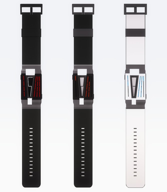
Design submitted by Moatasem from Egypt.
Moatasem says: As an Architect and a Design developer, the idea came from applying architectural principals to form a dynamic geometry that is both minimal and attractive. The flow of a basic module helps to create accurate spaces in buildings; that also applies to objects such as wrist watches.

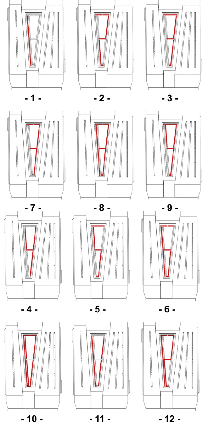
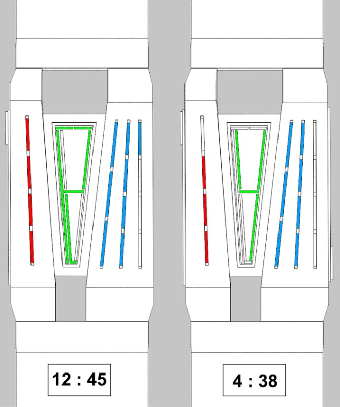
The monitor in the middle tell the hours by showing the numeric shapes. The right geometry has 3 lines, divided to 11 segments, each segment represents 5 mins. The left geometry has a single line divided to 4 segments each represents 1 min.

The fact that it’s unusual, yet simple. It expresses plenty of thoughts and feelings. Perhaps its mysteriousness and attraction play the biggest role in making it special.


Hi Moatasem, the project this a very original form.
5 * / Yes.
LikeLike
Hey bro. thank you for your kind words. ^_^
LikeLike
Looks cool! 5y
LikeLike
Thank you ^_^.
LikeLike
Bought instantly when I saw the first image 🙂 5*/YES I like me some edgy case and red and white lights!
LikeLike
5* FOR ORIGINALITY AND VISUAL INTEREST!
LikeLike
I like edgy and geometry of the face. Something that I would consider buying. Time telling is okay but the overall watch is my type. 5*Y 😀
LikeLike
Cool ….when can I buy it….
LikeLike
Thank you ^_^,I hope it becomes reality.
LikeLike
Great design, Moatasem. The first two images sell this perfectly and I would definitely want one if TF make it.
I noticed that the lefthand example on the last image shows 12:44 not 12:45.
Good luck and 5*/Y
LikeLike
>.< ohh my sincere apologies for this mistake..lol its even more embarrassing as I am the designer… (sheesh I am gonna kill myself for this). But Thank you so much for letting me know about it, I will be more cautious in my future works. I am also glad you liked the design too ^_^.
LikeLike
Cool looking watch, this… I can certainly see the architectural inspiration, it reminds me a little of perspective grids, but that might just be me…=)
Not much to find fault with, really. I suppose it could be a little more cryptic for those who favour that sort of thing =), but it’s not really necessary for the concept.
Also, it’s always good to see submissions from places other than europe, asia and north america. Best of luck!
LikeLike
Thank you for your support ^_^,and I totally agree with you. It certainly needs to be more cryptic, in fact i thought about this as a disadvantage, but I guess in the end I chose to work more on the casing design rather thinking about a new pattern.
LikeLike
People’s tastes differ so different levels of ‘crypticness’ will appeal to different people, I’ve found. As long as the concept as a whole has integrity (which I’d say this does) I don’t think it makes a whole lot of difference.
LikeLike
Damn man of course I like it 🙂
It’s just amazing 😀
5 stars bro ^_^
LikeLike
Thanks Bro ^_^.
LikeLike
Nice shapes, forms and lines. Feels very edgy and modern! I like the time telling, it’s not as cryptic as some but I like its simplicity. It’s cool enough for hardcore TF fans while being easy enough to read for more mass appeal. 5/Y best of luck sir! 😀
LikeLike
I like the odd shape. I would prefer if the hour digit 1 was on the right. I would also prefer if the 5’s & 1 minutes lights would be inverted. It would also work great as a 12-5-9 ! I would buy.
LikeLike
The “lights inversion” is because I’m ok with passing over the central part when reading Center > Left > Right but I don’t like to do it Center > Right > Left.
LikeLike