Design submitted by Peter from the UK.
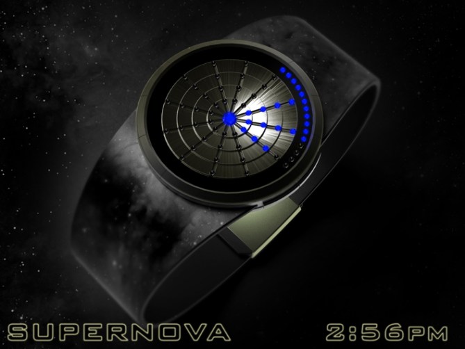
Peter says: This is “Supernova” a back to basics LED watch design.


Supernova uses a time telling method that I used on a previous design called “Hypercoil”
Hypercoil used LCD segments arranged in a spring shaped coil that descrided 15 minute incruments in 12 rows. An eliptical ring of segments described single minutes.
Supernova uses a similar system but this time around arranged in a circular array.


There are 12 rows of 4 LEDs highlighting the 12 hour positions of an analogue clock.
Each LED describes a 15 minute incrument. There are a further 14 or 15 LEDs outside of this array that describe single minutes.

This layout could also display alarm and date modes.
In date mode I propose that the 15 single LEDs could describe the months and the rows of LEDs describe the days.
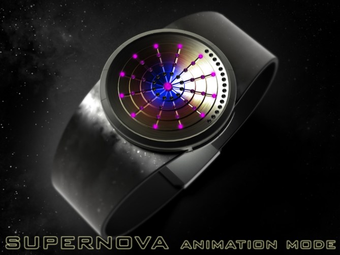
This design is simple and bold and would perform fun animations so should appeal to people who like fun products. The star like theme should appeal to sci-fi fans and people into astronomy.
The funky yet simple display arrangement and intuative time telling sets this design apart from others.


Cheers TF for adding this design to the blog! 😀
LikeLike
This watch is really good. I love it – stellar!
It is easy to read, when you know how, but cryptic enough to make it a perfect TF watch.
The finishing touch of the starfield in the NASA versions is a must!
I have always wanted to do a starfield-based watch, but in the absence of design skills or tools, nothing has come of it. This was the name I would have chosen – good to see the name appearing with a really great watch.
Has to be 5*/Y – I hope this gets made.
LikeLike
Thanks a lot Nev, I like the way you see the concept. Yeah the basic idea was to have the lights radiate from the centre of the watch like a starburst. A starfield is a cool inspiration too. I choose against calling it starburst as it sounded a bit too cute and also there is a soft chewy candy with that name. Cheers for the excellent comment and support sir! 😀
LikeLike
Me want it so badly please make it real ASAP awesome design nuf said!
LikeLike
Great comment! Many thanks! Nuff said! 😉
LikeLike
Hi Pete, yes it has an air of my “Radius-LED-Watch”?
https://blog.tokyoflash.com/2011/01/laser-radiusbeam-watch-design/
Just for that, I’ll put 5 * and Yes.
LikeLike
There is a hint of GMSA (great minds style alike) 😉 They do share a sense of style don’t they, luckily the time telling is different enough not to cause issues. Cheers for the vote and the comparison sir! 😀
LikeLike
The great minds think alike and if I’m part of the great minds, I am very happy!
Congratulations Pete, we really have the same taste, that’s fine.
LikeLike
How can I contact you outside of this blog?
LikeLike
Pete will send you my e-mail, I do not want to give it on the blog, thank you for your discretion.
LikeLike
Damn, Patrick–that design is worthy of higher merits than a measly 2.5 stars! Who are these voters?
LikeLike
Yeah that is cool Patrick. I hadn’t seen that one before.
LikeLike
Nice collection you have. I want one of these. Can we order online?
Buy Night Vision Spy Camera Watch
LikeLike
Spam!
LikeLike
can we become friend? i believe ur an interesting person.
LikeLike
nice watch Pete, has a very tactile pleasing look to it
LikeLike
Thanks a lot Gordon! I’m looking forward to seeing your latest design on the blog! 😉
LikeLike
me too
LikeLike
Looks really nice Pete. Good luck with it. I gave you 5Y earlier. 😉 Just a thought. What about making the 15 min markers into 12 mins markers so that you could have a complete outer ring of individual minute markers in line with them?
LikeLike
Yeah nice idea Mushy, that would look cool! I’m not sure what you would do with the extra 3 mins tho, maybe they would live around the 12O’clock position for tidiness.
I must admit I do like a little a-symmetry on occasions so would be happy to go in either direction. Fingers crossed such decisions need to be made at some point 😉 Cheers for the feedback sir! 😀
LikeLike
Pete, I just meant for each radiating line to have 5 LEDs (measuring 12 min intervals) instead of 4 (measuring 15 min intervals), plus an extra one to indicate the number of individual minutes. So there are 6 LEDS in each radiating line if you exclude the centre one. Sorry for the confusion.
LikeLike
No worries Mushy, after re-reading your original comment I realise I was being thick. You make a fair point, that would certainly make for a more ordered appearance. I dunno if 5 groups of 12 is more intuitive than 4 groups of 15 tho, a subjective matter id be interested to see what the consensus is. I guess it would make the individual minute reading more intuitive and the hours are still clear it’s just the part hours you would have to remember are made up of 12 min increments. Cheers for the suggestion sir! 😉
LikeLike
Yeah it really depends on which you find more intuitive. Hope you didn’t mind me mentioning it. Good luck Pete.
LikeLike
Hi Mushy, I certainly don’t mind, all feedback is very welcome! 😀
LikeLike
awesomed design! the ones of Patrick’s are not bad too… either designs if considered ill have it in my wishlist. 5y and good luck sirs!
LikeLike
You are very kind Fir, cheers for the comment and the luck! 😉
LikeLike
Great design Pete. I think that’s your standard. 🙂 I was trying to find something that misses, but everything is there, in it’s place. 5* and one big YES. Good luck!
LikeLike
Thats very lkind of you to say Igor, if only there was some way of convicing TF! lol
Cheers for the kind words, vote and support sir! 😀
LikeLike
I like the overall look & the time-telling method of dividing the hour in 4 segments of 15 minutes and using 1/4 circle for the precise time. My favorite display background is the “NASA” one. But I prefer the “dirty” black strap. (I would keep the case in gray for contrast) Certainly one to consider.
LikeLike
hehe I like your “dirty” strap description 😉 Cheers for liking sir and thank your for the feedback! 😀
LikeLike
Time expires for this one soon so all that’s left to do is thank TF for adding it here and everyone who voted, commented and shared. Cheers everyone!
Pete from the UK 😀
LikeLike