Design submitted by Andrew from the UK.
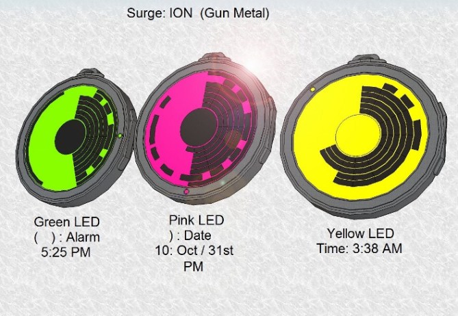
Andrew says: Surge: ION, is a Hybrid Analogue /binary E-ink / LCD fob / pocket watch inspired by Iron Man’s / Tony Stark’s Chest ARC reactor. Constructed in various Materials
Black IP, Gun Metal, Stainless Steel or White acetate. Each Watch has a retracting Bezel that selects the LED Color by exposing the bezel & turning it clockwise or anti clockwise. (See Diagrams Provided)

The Alarm, Date or Time is displayed in a binary / analogue format: The outer most dial / Purple is the mode indicator, ( ) : Alarm , ) : Date, None: Time.
The second dial / red displays: Hours 1 to 12 or Months: 1: Jan to 12:Dec.
The Third dial / Green: Minutes 1-60 / Days: 1st-31st. Center Disc: AM / PM Indicator, AM: LED Back Light color or PM: Charcoal.

Comic book fans (Iron Man) & people looking for a futuristic styled watch display.
This Pocket Watch will stand out from the crowd & is very easy to set.
By the user Pressing & holding their finger on the Screen & drag the finger on the hour / months & 5 Minute / days (outer most sector)dial clockwise to increase & anti clock to decrease. Single Minutes / Day Inward: Decrease / Outward: increase.


Very cool! I’m particularly love the orange version, kinda techy. I’m gladly adding these in my consideration list. Minimalist radar design pocket watch must be a yes. 5*. Cheers and goodluck!
LikeLike
Thank you for your comment/s & support.
LikeLike
I don’t know why, but it took me a while to see how the individual minutes were being displayed, then it seemed obvious. Looks good and definitely worth 5*. Hope it’s not going to be the size of the ARC reactor, though!
LikeLike
hopefully it will be big enough to read but still fit in your pocket. However the owner could attach it to a lanyard, cord or chain & place it around the neck as a pendant.
LikeLike
Cool inspiration leads to cool design. I love Iron Man so love this by default. I’ve been very tempted to go down the arc reactor route myself. This works well once I realised that you can’t see all the gaps between the min blocks on some of the time examples. If it were my design I’d be tempted to rather than show the minutes in semi-analogue just spread them out. You end up counting them anyway so you might as well use more of the display more of the time. A fairly empty display looks less arc reactory. Anyway enough rambling from me 5/Y best of luck 😀
LikeLike
You raise some good points Pete about how this concept could be improved,
LikeLike
I seem to like it more the more I look at it, which is always a good sign…=) The Iron Man connection isn’t obvious to me, but that’s probably a good thing when it comes to copyrights and such. And it was a while since I saw any of the films…=)
The minute display I think is fantastic! Simple and clear, but cryptic to the unknowing. The only thing I’d be tempted to explore (not sure if it’d look any better) would be to make the ‘completed minutes’ full circles, just to fill the display a bit more as it might look a bit empty at certain times (as Pete already mentioned). It’s only a detail and a matter of taste, I’m just curious to see what it’d look like.
Good luck!
LikeLike
Your right the Iron man Copy right could be an issue but hopefully not. The Full circle minutes is an interesting to alter the Minutes Display.
LikeLike
As it is, I don’t think it’s similar enough to cause comment, unless it’s marketed with the Iron Man name or something like it…
LikeLike
ironman pocket watch like a new Z. titan pocket watch?
LikeLike
The Surge: ION is the pocket watch version of a previously published wrist watch concept that I created Surge : Iron Man’s / Tony Stark’s Chest Arc Reactor. Copy & paste the following link for more details: https://blog.tokyoflash.com/2013/08/surge-an-ironman-inspired-arc-wristwatch/
LikeLike
I like the display. I like the parenthesis usage for the option indicator. I prefer this version vs the original.
LikeLike