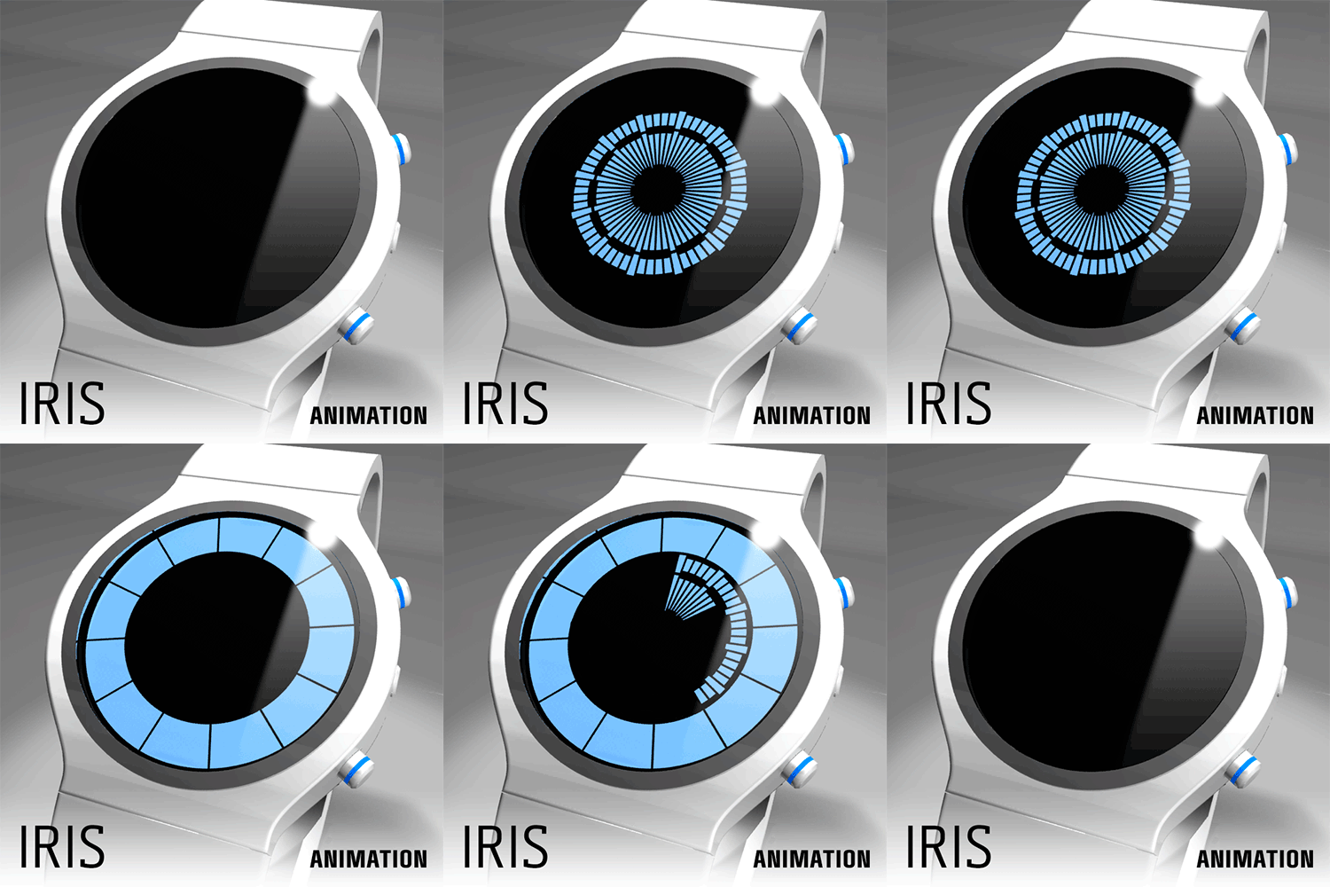
Design submitted by Laszlo from Hungary.
Laszlo says: Iris is an easy to read LCD watch concept with optional always on animated display.
The segments (in traditional positions) of the outer ring is indicates the hours, the middle ring is the minutes and the internal is the seconds.


Nice and clean, I had a similar submission https://blog.tokyoflash.com/2011/06/lcd-eye-watch-design/
LikeLike
That one was nice. I prefer your version overall look. I would buy one (probably with a strap vs metal band)
LikeLike
I would love to own one. Better come in variant colours ^-^ Great work Laszlo
LikeLike
It’s very simple and sharp looking and would be mass marketable. I don’t know if its a little tame for TF but defiantly cool. My only suggested change would be to put the hours in the centre and the seconds on the outside, this would feel more logical to me and make the segmentation/size of the segments easy to make. 5/Y best of luck sir! 😀
LikeLike
I don’t understand why most designs on TF insist on putting the hour on the inside.
I find having the hour on the outside to be more logical. People tend to read from biggest to smallest, so the most important value should imho be the biggest one. So, for me, it makes more sense to have the hours as the biggest number.
You could argue that minutes are the most important value (because you usually have a rough idea of time, so you don’t need to check the hours), but seconds are definitely not the most important thing on a watch.
Anyway, it’s probably a matter of habit/personal preference, so i guess there is no point arguing one way or another. But I would be interested to know why you think having the seconds on the outside makes more sense.
LikeLike
If I were designing a watch of this nature I would put the hours in the centre for two reasons. One is that the hour hand on an analogue watch tends to be the smallest/shortest hand. So for easy recognition this seems the most intuative (subjective thing). The second reason and the reason I mentioned it here is that a small area in the centre of the face is easier to divide into 12 than 60, with 60 segments they start getting very small. I understand why Laszlo has done it the way he has on this design becasue the smaller number of segments look one like one big segment as in the white part of the eye. The more segmented area in the centre looks darker like the pupil etc etc.
There is no right or wrong answer here just my opinion 😀
LikeLike
Yes there IS, and it will be MINE! Wait–what?
LikeLike
I agree with you, on both points.
LikeLike
Sometimes there is limitations with the segments and how much space we can have in between each, so 60 segments on the outer ring gives more space between than if it was a smaller inner ring. This depends on the actual LCD being used. Rogue SR2 this was the case due to using bright colour LCD. But in Rogue Touch we used a different LCD and was able to have 2 times with 60 segments in the middle. Just to let you guys know some of the issues we face. Nice work on the design!
LikeLike
Hey Laszlo. I don’t think you responded to my last positive feedback, but for the record I think this is cool. I would however recommend implementing what Gordon’s design did and color the iris for contrast. The color could even match the case and band (blue, brown, green, hazel or vampire red). Ooh, you could even leave the center open and have the inside mirrored like Richard B. Riddick’s shine-job retinas!! Now THAT I will have you put me down for one. 4* as of now, 5* if you implement iris color and 5*/y with Riddick retina!
LikeLike
Reminds me of Turkish evil eye amulets. I like it!I’d buy one!
LikeLike
Maybe some dragony-looking ones?
LikeLike
I like the iris. Looks good while still easy to read. Happy with hours on the outside. I rarely look at seconds, so would probably ignore. Only things I would change are the backlight and animation buttons, which are too large for my taste. Good luck.
LikeLike
it definitely looks like the watch in here.
http://www.saatturk.com/urun/ziiiro-saturn-black/
LikeLike
It look to much like “Ziiiro Saturn” watches, but with the addition of the seconds & bolder hours segments. Switching the hours & the seconds would help to make it different instead of a “Ziiiro 2.0”.
I like the manner the minutes & seconds markers are made. I like the manner the crown is hidden & that all the button are on the right side. But the display/case look too plain. I wouldn’t buy.
LikeLike