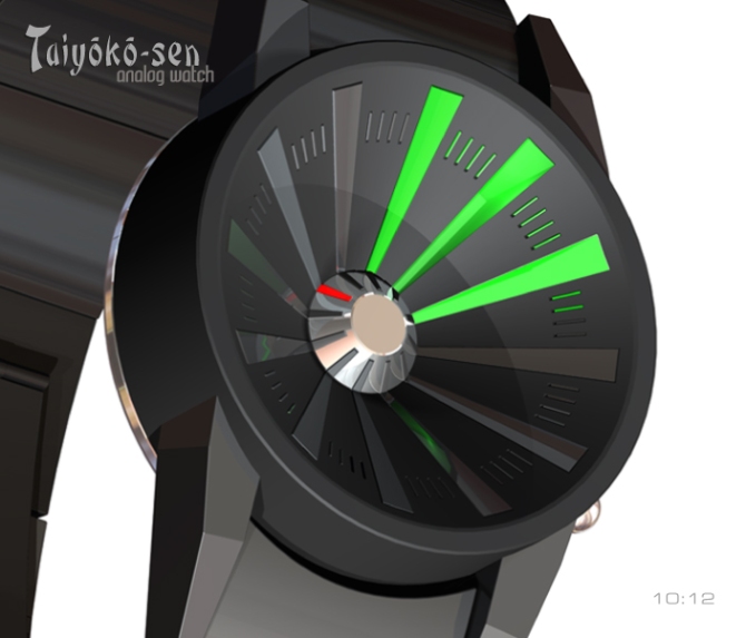
Design submitted by Patrick from France.
Patrick says: The “Taiyōkō-sen Watch” was inspired by my “RadiusBeam-Watch” revisited. It is an analog watch & is intended for dynamic men and women.
The “Taiyōkō-sen Watch” has a losque easy reading the vision is perpendicular to the dial and its dynamic form will allure in love ones with the mechanical sports.


WOW I think it looks cool but I’m not sure if its purely analog… More explanation is required I believe. 5*!
LikeLike
Hi Firdaus, the reading is very simple, on the small central dial which indicates the Hours, you choose only the led lit or in another version, the led more with right, as the needles of a traditional analogue watch. For the minutes, it is the same thing. I started from 0:00 to light the led, because graphically it was more beautiful and that does not change of anything with the reading.
Thank you very much Firdaus for your comment and your vote.
LikeLike
A detail: for a more cryptic reading, the hours and the minutes could have the same color of LEDs. (see image n°5 with Leds in red -12:00-)
LikeLike
That’s WAY cool! I’d buy it! Simple to read, but cryptic looking.
LikeLike
Thank you very much Anbreen, I’m glad I made this analog watch, a bit cryptic.
LikeLike
Nice! Very nice, indeed!!
LikeLike
Thank you very much Dzign555 for your appreciation very friendly.
LikeLike
Looks very cool Patrick. I would be interested to know if its analogue (ie discs/hands behind the display) or LED in an analogue format. Either way has an industrial feel that I like and a straight forward time telling. 5/Y best of luck! 😀
LikeLike
I just checked out your Radius beam watch and realised that a recent submission of mine has a few similarities to it. So if “supernova” does get posted please excuse the similarities. The time telling is different but has a similar layout. Doh!
LikeLike
Pete, if one of your projects resembles the mien, I am flattered by it!
LikeLike
Pete, if one of your projects resembles the mine, I am flattered by it!
Excuse me for this unfortunate translation?
LikeLike
Hi Pete, if I understand correctly, you would put a mechanism for rotating the hours and minutes, for a display “always on”, as with an LCD display?
Pete thank you for your vote, your comments are always interesting.
LikeLike
Oh, I love it. Very easy to use.
LikeLike
Lola thank you, I’m glad this project of watch, also likes the women.
LikeLike
A big thank you to all the team Tokyoflash for this new publication.
LikeLike
love the case, the strap could use a little more detail or perhaps leather would look nice. Never the less i think you got something here, nice job!
LikeLike
Thank you Gordon for your vote and your comment, all new proposals is good to take.
LikeLike
This one could be a winner. Simple but so what! -Best of luck sir 🙂
LikeLike
Peter number two, I do not know if this is the name that does it, but Peter’s are especially nice on this blog, eh eeeh
Thank you very much Peter, I dream to be chosen by you all.
LikeLike
It is simple, but very effective. I prefer the different colours for the hours and minutes. I like both options for displays (single LED for each or all to the required number) – two watches in one if you can choose! Good luck. 5*/Y
LikeLike
Hi Nev, thank you very much for your comment and your vote.
I agree with you, so would be a choice in programming the watch.
LikeLike
It looks cool Patrick! 🙂
LikeLike
5Y
LikeLike
Lloyd, thank you very much for your appreciation and your vote.
LikeLike
I like the japanese sunshine look. My favorite would be the white watch with red light. The minute sunbeams could be half as long between 6pm and 6am. The concave case is interesting and it gives the concept more depth which is cool. Giving you 5*/YES and it would be nice to wear the watch in Japan the next time 🙂
LikeLike
Thank you very much Sam, I do not have any more that to expect the manufacture of this watch to go to reserve my flight for Japan, we will go perhaps together with the other friends of Blog, that would be brilliant!
LikeLike
I love the case design. Concave is really a nice design touch.
LikeLike
Thank you to the production of Tokyoflash for this nice comment, it’s good and it’s great!
LikeLike
Nice design Patrick! I also like the depth of the face, the shape of the hours indicators,
as they draw your eye into the central hub. I also prefer the different colors for the hour and minutes,
as it seems to contrast or define the visual a bit more…. WELL DONE!
LikeLike
Hi ALinCAL, thank you for your comment and your chromatic choice, it approaches the mine.
LikeLike
Voilà une montre originale et fonctionnelle!!! Beau travail!!
LikeLike
Thank you very much, etixidor.
LikeLike
I like the overall look. I like the small dashes for the + 1-4 minutes. I like the central part with the hours on. Having that part in a different color than the rest would be nice ( check the blade leather & blue LED ) but I prefer having the hour & minute LED’s in the same color. My fav is the 1st pic but with all red lights & black around the hour.
LikeLike
& the original was nice!
LikeLike
Thank you very much Makkovik, for your comment interesting and your preferences, that proves that it is necessary to vary the elements in the same design, because the tastes and the colors are always different and always to take into account.
LikeLike