Design submitted by Sam from Germany.
Sam says: “I was sketching for a simple iconic image as a watch face and came up these two arcs. I like the simplicity and the futuristic style of their look.
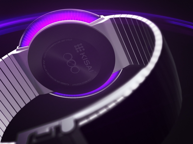
In order to read the time, I divided these arcs into segments, represented by single LEDs. Time is told in a simple 12-5-9 way with the hours and the PM indicator in the left arc and the 10-minute increments and the single minutes in the right arc.
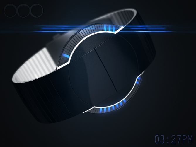
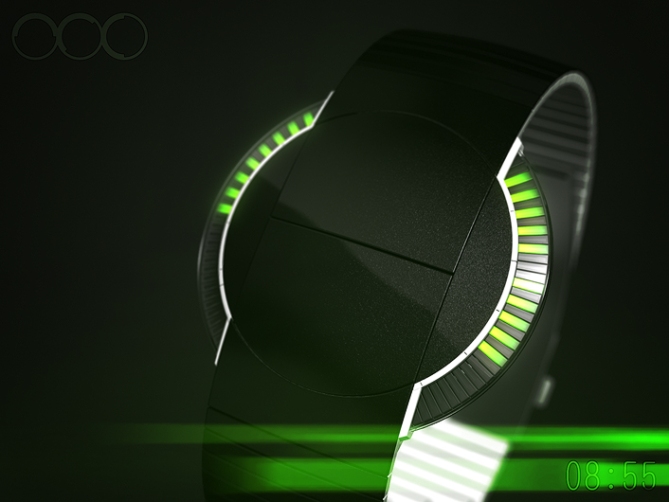
The usual places for buttons is occupied so I let the top surface of the case be the buttons – well integrated with no unnecessary details.
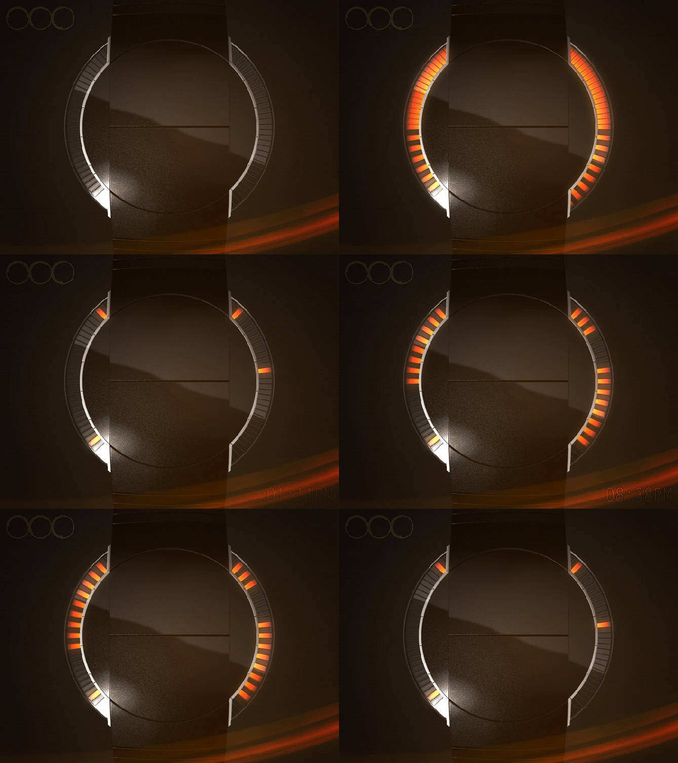
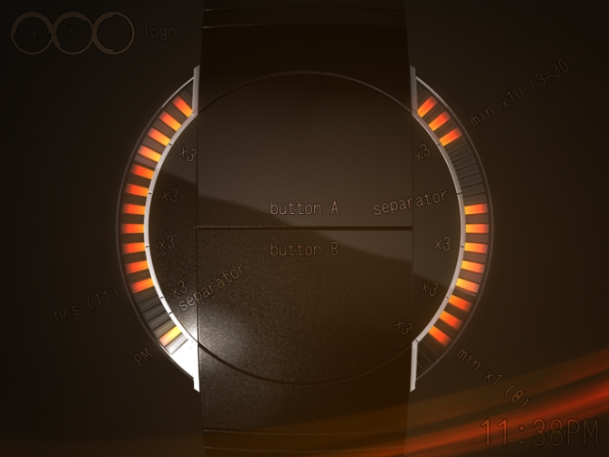
The arcs are accompanied by white borders that contain indicators to help counting the LEDs (small indicators) or just to define the four groups of information (big indicators). There is still space for a date indicator next to the PM indicator. The date can be told similarily to the time in a 12-3-9 way.
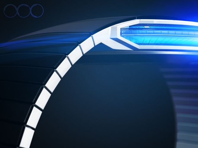
I am showing different colors that I like most. If they could all be in one watch (like in the ADJUST watch ♥) that would be awesome.
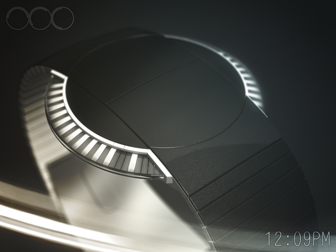
This is the ARC LED watch concept for minimalists and futurists.


I agree. If all the colors could be in one watch, that would be Awesome! The style of this watch is ahead of the game. Very sleek & futuristic. Displays the time in an easy to read method while involving the excitement of scrolling LEDs.
Will it run on batteries or will you be able to charge externally with a USB connection?
Please make this watch!!!
LikeLike
Hi Robert! Good question about the battery. USB would be cool. I’m open for the best solution hehe. Nice description of how you see the watch. Thanks for the support!
LikeLike
Hey Sam, I’ve been looking at the feed below. There are a lot of great comments. I’m really hoping TF decides to produce this watch.
Can we do something to help Tokyo Flash decide to produce the ARC? Are you allowed to let us know when it goes into production so we can get first dibs?
Every time I check on the status the ARC I love it more.
LikeLike
Hi again Robert! You and the other people who are interested in this watch are doing the best already. If you vote honestly and leave a comment with your thoughts if helps Tokyoflash to see if it’s worth producing it. But besides the blog they have other rules why a concept becomes reality. They are very creative people but they are also a business, so for example they have see if the watch is feasable at an appropriate price and if it’s different enough for the rest of the catalog.
Any information about a watch production has to come from Tokyoflash alone. Sometimes they tell us here in the blog about the watch concepts they are working on currently.
So cool you came back! I hope the watch takes the next step 🙂
LikeLike
Great design, looks like an UVO.
LikeLike
Meant UFO. Lol.
LikeLike
Maybe UWO, an unidentified wrist object 😀
LikeLike
Hi Sam, very nice watch with a nice animation. I like very simple and designed profile.
5 * / Yes, nice work!
LikeLike
Merci beaucoup Patrick! I’m glad that the mix of simplicity and bling bling seems to work.
LikeLike
Very simple and very sleek design, me likey! I think it would be nice if there were a few time telling methods to give the wearer choice. 5/Y best of luck sir! 😀
LikeLike
More time telling methods would be cool indeed. If it’s possible to have different LED colors (like the ADJUST) then those can be used for additional modes. Actually I hade a multicolor display in mind at first and reduced it to the simple one. But yeah, diversion ftw. Thanks a fluff sir!
LikeLike
WOW… cool… very, very cool. Damn… I love this idea. Best of luck.
LikeLike
Dayum, nice one! Thanks Peter!
LikeLike
On of the biggest achievement I(ve seen so far, a rara elegance, must bi grouped signatures for TKF makes this watch 🙂 🙂 🙂
LikeLike
Salut Alain 🙂 Thank you for the nice comment. I’m just not sure about the “bi grouped signatures” but I think you mean it friendly.
LikeLike
That just means you’ll have to leave North Carolina to buy one 😉
LikeLike
Ooooh. I can’t choose which one I will buy first, the blue or the white! 😉
I love the very subtle markers that help you count the hours and minutes! beautiful!
5*/YES YES YES
TF, make a slim and small version for ladies! 🙂
LikeLike
Hehehe, at least subtle markes this time 🙂 They ease up everything so easily. I should use them more often. In my theory, the center would be a thick as needed while the edges are thinner, leaving an overall thin impression of the case. The edges would float a bit over the wrist and the bottom cap would sink into the wrist a bit, making the watch look thinner too. Theoretically hehe. Thanks a lot Heather!!
LikeLike
Beautiful renderings, Sam. I dig the logo too! Clever arrangement swapping the button placement with the display. Maybe different color for hours vs min x10 vs min single, or minimum hours vs min?
LikeLike
Ow yeah, the logo! It’s a mix of “i want arcs, period” and “whoa i can actually write ARC like that, nice info” ^^ I agree about the different colors. As for the iconic image of two arcs, I wanted to have them simply in one color, just for the first illumination to show off. But if different colors (for each LED segment) can be done, oh yes please! Animation and time telling would benifit from this.
LikeLike
This is pretty darn close to perfect in my book. I really like the restrained styling that still manages not to be boring, and the simple but clever LED design that makes it more than just a panel under a bit of flat glass (not that that is necessarily bad). Good one Sam, best of luck!
LikeLike
Oh brave words Anders 🙂 I like the way you see this concept. It’s quite a thin line between simple and boring. I bet one of my upcoming ideas will land in the b-territory. But I can still defend it hehe. It’s fun if it works! Thank you for the comment and the support Anders!
LikeLike
Well, you have to take a chance on some ideas; I find it almost impossible to judge which of my submissions will do well and which ones won’t (within reason, some are pretty obviously not my best work…=)
No worries, I’d like to see what this would look like in reality.
LikeLike
I really dig this design, both because it doesn’t immediately say “watch” when you look at it and it just looks so slick. Hopefully RGB LEDs would be possible for customization, and just so you can adjust the color for different scenarios. 5 */y for me, and hopefully this is picked up because I would immediately buy one.
Good luck Sam on another great design.
-Meteor
LikeLike
Thank you Meteor for your comment and the support! Yeah, you can only see it as a watch because it’s on your wrist. I like this effect. Scenario customization is fun! I hope you get the chance for a purchase 🙂
LikeLike
One word from a simple minded; WOW!
LikeLike
Ha, simple minded. You mean a mind that can create simply amazing concepts hehe. Thanks for the WOW Fir!
LikeLike
I LOVELOVELOVELOVELOVELOVE THIS WATCH
LikeLike
Haha, your name and your super nice comment made me laugh. Thanks Aefoyw 😀
LikeLike
Love this design. Sleek and elegant, a true classic design. I would by this immediately. The white and orange light works the best for me. Keeps it classy.
LikeLike
Greetings! Thank you for coming by and commenting. I hope you get the chance to buy it 😀
LikeLike
I am a new follower to the Blog and Design Challenge, and I am a huge fan of your designs! Your concepts and renderings (what programs are you using?) blow me away every time, and this is one of your best, in my opinion. The possibility of color choices, and the ‘display’ itself sets this design apart! Can’t wait for your next effort! I would definitely buy this watch! Best of luck!
Note: You and many others here on the Blog (Peter, Lazlo, Heather to name a few!), have inspired me to try my hand at a design myself… stay tuned!
LikeLike
Nice comment ALinCAL! Good luck with your submission! We look forward to seeing it here! 😀
LikeLike
Hi AL! Thank you for your nice comment! I am using 3dsMax and Photoshop for 3D models and images.
I must admit, wishing a color change doesn’t need much skill 😉 I just hope that Tokyoflash adds levels of customization to their watches. For example 12h/24h mode, different crypticness of the display, color change, replaceable elements, random things that make you see the watch differently throughout the day. They did so and will do so again and it makes a watch a cool companion.
The real creative ideas are fun – just making something up or translating an inspiration into a watch. So cool that you pull out some inspiration from here. This blog is quite a collection of ideas. Tokyoflash can’t turn all of them into reality but there is a chance and if you check out what the people like, you could make it. Or if you just do your thing and ignore all influences.
I agree that Peter, Laszlo and Heather are a big part of the blog, among others of course 😉 I’m looking forward to seeing your concept. Welcome to the blog already!!
LikeLike
Looks cool Sam. :o) 5Y
LikeLike
Thank you Lloyd, much appreciated! : o )
LikeLike
An orange and black for me. Immediately!
LikeLike
I forward this to Tokyoflash ❤ Thanks for the comment Laszlo!
LikeLike
mhhhh-YESSSSSS!
LikeLike
WAAAHHH OK COOOOOL THANKIES!
LikeLike
The housing design and the renderings are just amazing. Have you noticed the button being pressed in the animation? – Very nice detail. Still, I am not very intrigued by the way the time is being shown. Not sure how to say this, may be it fills like unnecessary complicated. I counted at least thirty leds on each side, sixty in total. This makes it perfectly suitable for analog time telling.
LikeLike
Very wise thoughts about the amount of LEDs. Actually 50% would totally suffice to be honest. Actually I thought about a derivation of analog time telling… maybe coming later this year 🙂 Thank you Ninth for your thoughts. If you intent to comment more, don’t hesitate to criticize. Such thoughts are really helpful. For me for further designs and for Tokyoflash if they let their thoughts sink in.
LikeLike
I love designs with the information around the edge and nothing in the centre, so this really appeals. Making use of that space with buttons is very clever, so another plus point. The real problem here is choosing the colour – white, blue and green all look great. 5*/Y
LikeLike
Hehe, thank you Nev! Maybe you have to solve this problem in the future 😉
LikeLike
SUPER sleek!! very nice 5/Y
LikeLike
Thanx diclo!!
LikeLike
This with RGB LEDs would be amazing. I like always-on time, but I think for a watch this beautiful I could take the plunge to push-to-reveal-time watches. 5*/Yes to multi-color
LikeLike
Hi Darin, thanks for the comment! Cool that this concept convinces 🙂 Crossing fingers for RGB
LikeLike
this looks like a winner to me the only suggestion would be different band colors I like bright colors and variety.
LikeLike
Ooo variety, good point. Definitely worth considering different band colors. Thanks for telling!
LikeLike
An amazing overall look. I like the idea to hide the buttons on top. I agree that it would be better if the lights color choice would be like the “adjust”. My fav is the white lights. I also like the orange & green lights option. 5 * & I would buy.
( Having date & alarm would be nice, but it’s optional. Always on LED’s would be nice but probably not practical at all )
LikeLike
Completely comprehensible comment Makk. The Kisai Seven deals with regularily illuminating LEDs. Always on would be epic but this solution the Seven does its job. Maybe you enjoy light more when it’s not always there… Hehe anyway, thank you for your support Makk ^^
LikeLike
This is from far the best concept I’ve seen on that blog! Can’t wait to know if it’s going to be a reality!
LikeLike
Thank you for the compliment Ezekiel. I’m crossing fingers too ^^
LikeLike