Design submitted by Matt from Canada.
Matt says: “This is Ransū, which mean “random numbers” in Japanese. The idea is to have a grid of numbers and hide the time inside it.
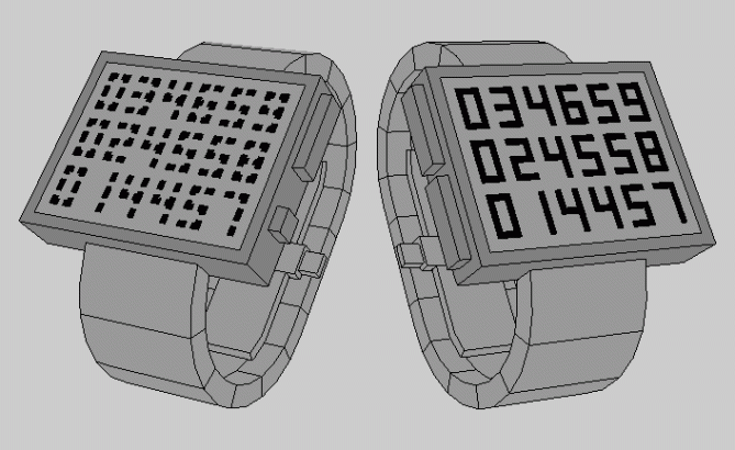
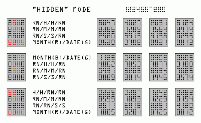
There is a hidden mode and a normal mode. The hidden mode consists of using 6 segments instead of 7 by having only the junction (T, L and I shaped) and extremity of the digit visible.
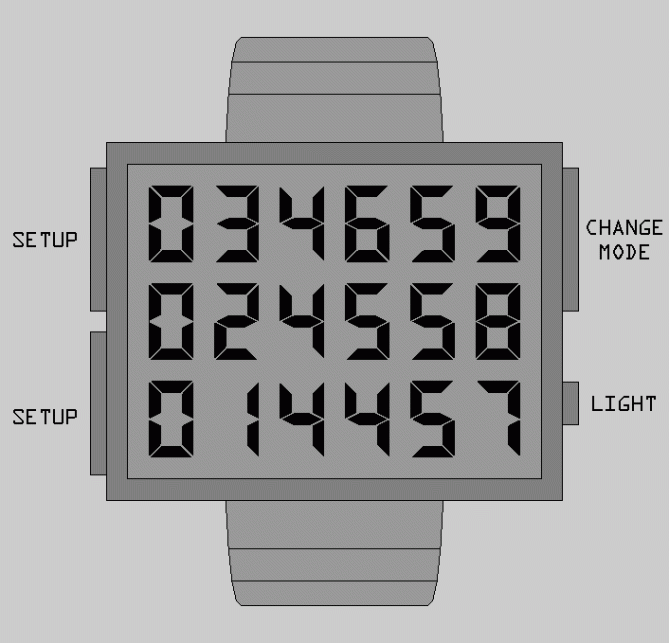
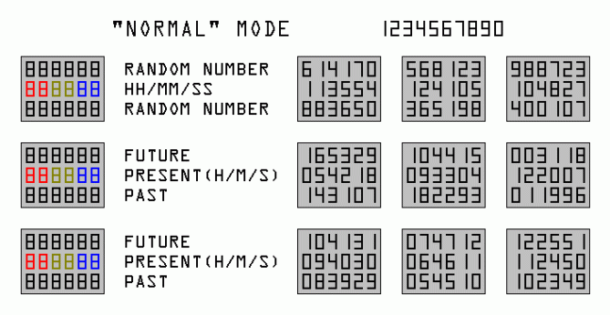
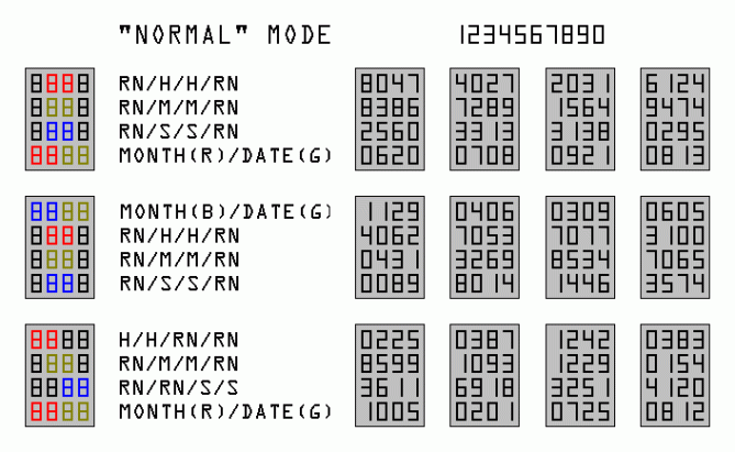
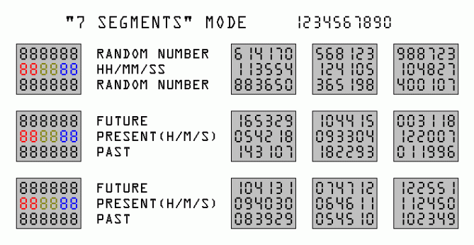
The normal mode has “full rectangle” digits, or could be a conventional 7 segments.
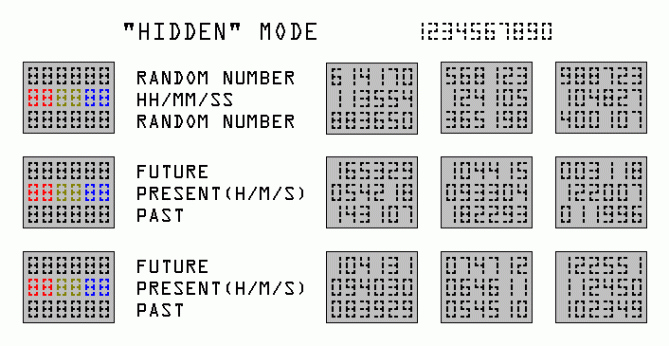
The useless numbers change to a random number when the time, on that column or row, change. Or can be previous/next digits. The 1st model consists of a 6×3 grid with the exact time on the 2nd row.
The 2nd model consists of a 4×4 grid with the exact time positioned as a column. This one also include the month and date, which fully take the 1st or 4th row.
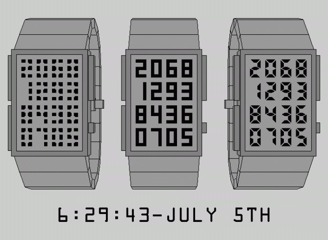
Peoples who like Sudoku, or any other logic-based, combinatorial number-placement puzzle, are the target market. Here are some examples of the time in different modes:”


A bit complicated for me, but 5 * / Yes for research.
LikeLike
If it’s LCD, you can’t really have all those modes. I’d say stick with only the “Hidden Mode” 4×4. The rest are not as good IMHO. But I really do like that one. 🙂 The shape of the display is better for the size of the watch, and less useless info. I do like the random number idea to fill in the extra digits on the sides – tricky, tricky. Very creative. 5* for the Hidden Mode 4×4. (I should mention though, that it is not 6 segments – you need 8 segments to distinguish the 0 from the 8)
LikeLike
it made a smiley with sunglasses, but it was supposed to say “distinguish the 0 from the 8”. lol.
LikeLike
TY Heather.
I also prefer the Hidden mode. If it was possible to put multiple mode, the others could be used for practice. I made the 4×4 after the 6×3 because I like to have the month-date always on & the watch is less wide.
But I like the previous/next possibility of the 6×3. (I also didn’t want to send multiple submission)
You don’t need 8 segments to distinguish the 0 & 8: For the 0, the two segments in the middle go like this | |. For the 8 they go like this |- -|. (the |- are connected)
LikeLike
The “Maze” is LCD & have 2 mode !
LikeLike
Looks complicated at first glance but is pretty simple when you know which digits are doing the work.
I would like the other unessesary digits to also mean something too (not neseserilly the time) just so they have more purpose than just camoflauge. (subjective thing) Nice work Matt! I support it but is not for me. 5/N Best of luck sir! 😀
LikeLike
A nice comment ending with 5 no = ouch. (probably a typo)
For the 6×3: The purpose of adding useless number was to have a grid & not a normal 6 digits on a row. This is why I made 2 previous/next mode. On the 4×4, they are used for symmetry. But a “T” or an “anchor” could work.
The Hidden mode was made to look complex with all the small rectangle/dotted lines.
Ty for your support.
LikeLike
Sorry for the no Makko! Not all designs will suit everyone unfortunately. But I think the concept has merit and is definitely support worthy just doesn’t get me hot under the collar for some reason. I think the 6×3 version with previous and next digit appeals the most to me as the extra numbers have a reason for being and should give the seconds plenty of animation. Hopefully it will get others more excited and get the ratings it deserves! 😀
LikeLike
“Not all designs will suit everyone unfortunately.” That’s ok. & ty for sharing it on fb.
The seconds animation should be nice. (I haven’t tried it)
What do you think of this: adding a 4th row to the 6×3 for the month-date-year or 2 digits weekday-month-date.
LikeLike
I think an extra row would make the design more complicated looking personally. I would be more tempted to have a date mode rather than complicating the display further. I think it would be nice to add three distinct sections to the lens, facets if you like which would add clarity and stylie feature. 😀
LikeLike
One of the trial had continuous lines between each number, but I wasn’t satisfied.
For the 6×3 : I could try to have continuous lines between each row. Another trial had month-date under it but I wasn’t satisfied with the result, because it had 4 digits, not 6. Having a faceted lens would work, but I didn’t know how to make a lens. ( now I know how & it’s being used for the next model )
LikeLike
A date mode using previous/next would work. It could use the 3rd button. ( top/right)
LikeLike
Ty TF for posting it.
LikeLike
I love this design. At first it seemed to me that it would be challenging to figure out the time, but it is pretty simple. I really like the idea of having the time “hidden” within random digits.
LikeLike
The hidden mode would be my choice. The others look too traditional for me. Stacking all informative numbers together is not a too bad idea. I thought about such just for fun before I knew there was Tokyoflash hehe. But how it could be made purchase-worthy? For me personally it’s just numbers, just more numbers than normal. No aesthetic twist, no artistic theme. I know, applying a theme could turn the watch into a cheesy geek toy. But this would be Tokyoflash’s route and they would take this risk rather than goind mainstream or traditional I think. That’s why I prefer the hidden mode. It looks new/strange/unidentifyable at the first moment. That would make people go wtf when they first see it on your wrist xD That’s what watches can do these days – not being mere time tellers but telling a little story or being a communication starter. Well keep it up Matt. Enjoy the creative process and good luck!
LikeLike
I understand your point about theme because I had a few idea similar to TF “maze” without the maze theme so I never did them.
Personally, The hidden is my favorite because the 16/18 digits are slashed in many tiny rectangles.
I like the “normal” mode because it’s like the “maze”, but still vertical rectangles.
The “7 segments” where planed at the last minutes.
For the case, I prefer a sober look, like the Adjust/Logo/Maze/Optical illusion/Oto/Upload/X. The links could be divided by 3, but again I prefer a simpler look.
A note about the size : my models are 42x33mm for the 6×3 & 30×42 for the 4×4. ( – 2mm per side for the case ) This mean that the “Time examples” are a bit smaller than reality. Each digits are 4x7mm & each spaces are 2mm wide.
LikeLike
Great job and a very interesting concept.
My support. Good luck Matt
LikeLike