Design submitted by Peter from the UK.
Peter says: I was trying to think of a really intuitive analogue style time telling method that could be easily made using an LCD display. I have played around on previous designs with rings that describe the hours (orbital decay) and others that use dots to highlight the analogue positions on a watch face (Tri-Ripple) so I decided to combine both of these elements.

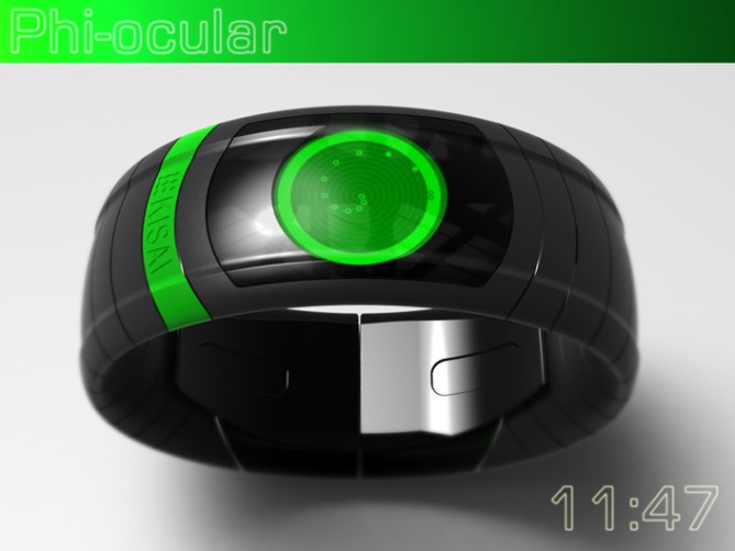
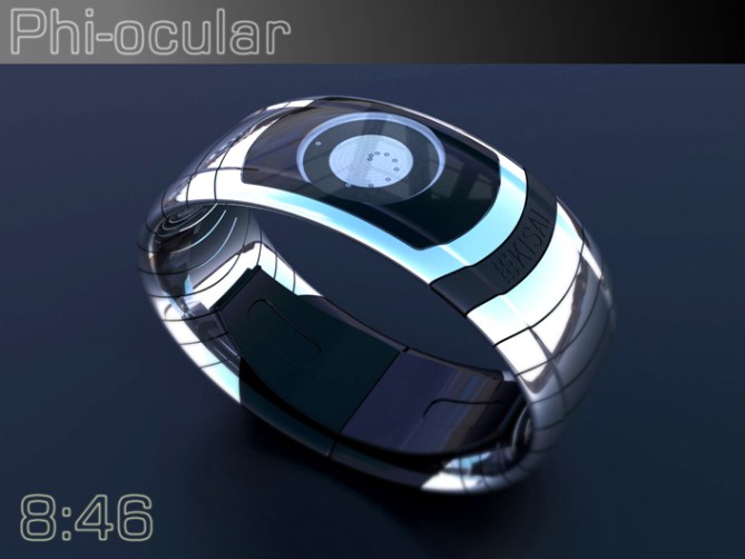
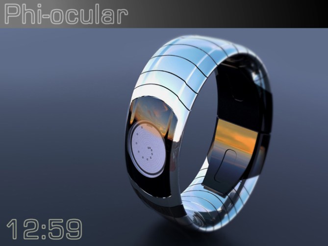
The result is a display that kind looks like a robot eye which features a spiral of dots that highlight the analogue positions, hence the name “Phi-ocular”
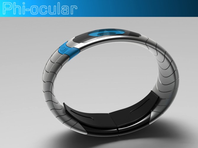
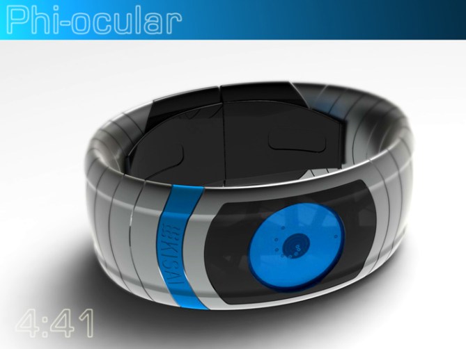
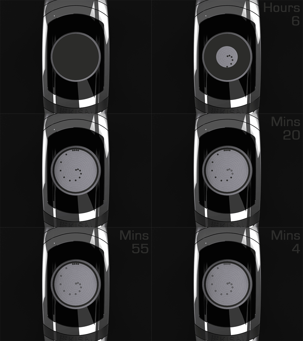
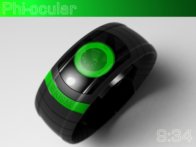
The rings that radiate from the centre of the display describe the hours. They feature dots that are positioned appropriately as per an analogue display (this creates the Phi like spiral) These dots are also used to describe the 5 min positions. The hour dots will feature a smaller dot inside them to describe the minutes when those rings are highlighted, if the minutes exceed the rings they are displayed in negative (like a small donut). Single minutes are show by four dots or donuts in the twelve o’clock position. The whole display could be inverted and used in negative and would include a backlight for poor light conditions.
This display is very intuitive and simple to understand so should appeal to the mainstream. The display still maintains a futuristic look, kind of like a robot eye. This sci-fi element may appeal to the sci-fi fans and more geeky amongst us. The curvy bangle like form should keep the ladies interested.
The stylish display and curvy strap combination sets this design from others.




Nice look and feel. Great renders
LikeLike
Very kind sir, I’m glad you likey! Cheers for the support! 😀
LikeLike
Dayum I managed to give my own design the thumbs down accidentally! lol
Cheers TF for adding this design to the blog! 😀
LikeLike
We appreciate you giving the rest of us a chance to measure up 😉
LikeLike
Pete beautiful imagination!
5 * and Yes.
LikeLike
You are too kind Patrick! I thank you sir! 😀
LikeLike
This is a very elegant, organic & futuristic styled concept fantastic.
LikeLike
Thanks a lot Andrew, I love your choice of words and I thank you! 😀
LikeLike
That’s again, a really beautiful one. As Andrew Joy just said : Elegant and futuristic 🙂
The time telling is really simple and easy to learn, but still cryptic, and good to train your mental skill to count and multiply (ok, juste the multiplication table of 5 but.. still that 🙂 )
I appreciate particularly the 2 silver ones : the blue, and the negative one 🙂
Hope it will be developped soon !
Thanks you for this new design !
LikeLike
Thank you Shana! As always your comments are insightful and supportive. The time telling is hopefully intuative for most. It is similar in concept to RPM so will hopefully keep some of the well established customers happy and hopfully attract a few new ones. Thanks again! 😀
LikeLike
Thank you for your kind word. Yo’are welcomed !
But well, I don’t find it similar to RPM. SO yes, there is the 4 digit at top for minutes, and it’s around….
But yours is in spiral, and the style is really different for me. 🙂
LikeLike
Very yummy look!! The blue one is my favorite :)~ Time telling works fine. It’s not breathtaking but it looks stylish. It really has to come with an animation, maybe one cycle each 5 seconds if possible. Thumbs up, crossing fingers, gimme gimme
LikeLike
Your right Sam, this one is more about understated simplicity than shock and awe (hopefully that will come with some of my other concepts) Yeah more animation the merrier! (hopefullys thats a word! lol)
This display lends itself to LCD so allways on and frequent animation are musts! 😀
LikeLike
Hmhm, I do have some simple designs too… even simpler ones for the reduced needs of special geeks hehe. So I don’t shock’n’awe so often. Well, keep having fun and good luck sir!
LikeLike
Nice job Pete, very easy to read. It’s–dare I say it–Tubular!
LikeLike
Thanks a lot Xian! when you dare say Tubular do you mean it gives the impression of depth like a cylinder?
I googled it just in case Tubular was the name of an existing design! lol
LikeLike
It wasn’t, was it? I was just commenting how every aspect of the design was harmoniously circular like cylinders, yes.
LikeLike
Fair enough, I thought for a bit it might be a skateboarding phrase. But I didn’t want to embarrass myself by trying to talk streeeeeet dawwwwg! lol
LikeLike
Looks very cool Pete and it’s easy to read. 5Y. 😉
LikeLike
Thanks Mushy, like the mixed up saying goes: I’m stupid so keep it simple! lol 😀
LikeLike
😀
LikeLike
Do you ever not design awesome watches, Pete?
LikeLike
My modesty means I have to say…all the time! In my eyes they are never awesome, just ok. We are our own worst critics after all. But if others think they are awesome that’s gotta be good so thank you sir! 😉
LikeLike
The display looks really cool, Pete. Blue one definitely the best and animation a must.
Not totally sold on the chunky bangle look of the strap, but it does complete the design. Stylish, but maybe not for me.
LikeLike
no worries Nev, not all designs will suit everyone. I’m glad you like the concept even though its not neceserily for you! 😀
LikeLike
I don’t know. This one’s just not as interesting to me as many of your other designs. Cool renderings, though.
LikeLike
Yeah this is from my simple to read, simple to make folder. I have a few designs with evolutions of the basic concept. Maybe one of the other ones will tickle your taste buds 😀
LikeLike
this concept is fantastic and i’ll buy it right now! (c’mon TF!)
LikeLike
Great comment Topsider! Thanks a lot and I hope you get the chance to buy some day! Cheers! 😀
LikeLike
May I know which software you have used for drawing this design?
LikeLike
Hi Arash,
cheers for the interest. I use SolidWorks for the model and renderings. Photoshop for any tweaks, corrections and final images and Microsoft gif animator for the animations. Cheers
LikeLike
EPICEPICEPICEPICEPICEPIC
LikeLike
THANKYOUTHANKYOUTHANKYOUTHANKYOUTHANKYOUTHANKYOU! 😀
LikeLike
I like this one. I didn’t realize that the 11 dots are place where the 11 markers would be place. That’s clever. I like the position of the 4 single minute. I like the overall look.
I like that you can get 2-3 tones by having 1 link (where the KISAI is) in 1 color; the display in the same color; the case plate in 1 color; and the band & outer case in one color, in the same color as the case plate, or not. (I prefer when they are not the same)
I like the last pic rendering. My fav is the 1st model (1st pic). 5* & I would buy.
LikeLike
& sorry for almost missing this one & your last.
LikeLike
Great feedback sir, I couldn’t have put it any better myself!
Im glad you likey! Cheers! 😀
LikeLike
Time runs out for this one soon so I say a big thanks to TF for adding it here and everyone who voted, commented and shared! Cheers! 😀
LikeLike