Design submitted by Sam from Germany.
Sam says: The basic idea for Genesis is a molecular looking displaying method made of sticks and dots.

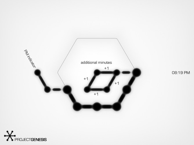
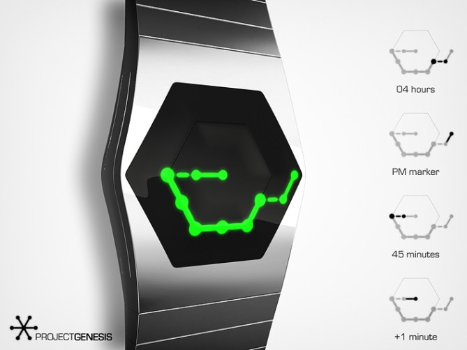
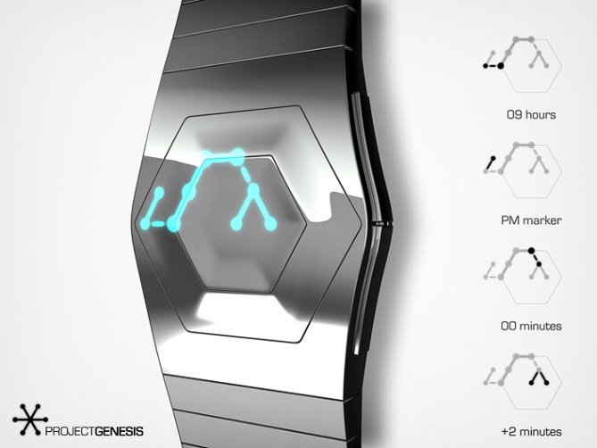
The display consists of a string made of sticks connecting big dots. This string is placed on a hexagon that has to be seen as an analog watch display. Each big dot represents the analog watch marker position of hours and five-minute-increments.
The end dots of the string are important. They show either the current hour or the current five-minute-increment while the dots in between are there to create the molecular look. There is a smaller stick-and-dot placed at each end dot that helps distinguishing the marker types. If the small stick is OUtside the hexagon, it indicates the hOUr end of the string. The other stick is automatically INside the hexagon, indicating the mINute end of the string.
The PM indicator is another stick-and-dot connected to the hour indicator. The additional minutes to tell the time precisely are one, two, three or four stick-and-dots connected to the minute indicator inside the hexagon.

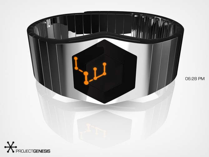

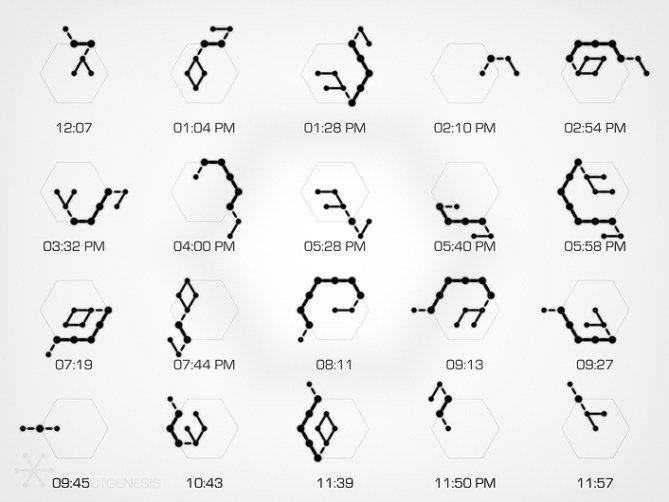
I like the various different types of displays of this concept. They can be short or long, simple or complex. I also like the different ways you can see the display – as classic stick-and-dot model for molecules, as metro plan or as some circuitry. Everything started small and developed. This is Genesis, a watch for bionic and biomemetics fans.




Thank you Toky for posting! ~^^~
LikeLike
This is brilliant! Food for the eyes and the brain.
*****/Y
LikeLike
Nicely said Laszlo! Thank you for the support!
LikeLike
Looks great and very cryptic until you know how to read it! Me likey! I prefer the dark screened versions most. 5/Y best of luck sir! 😀
LikeLike
Thank you Pete! It’s cool when the look can beat the functionality which was always an edge TF walked on. Crossing fingers 🙂
LikeLike
Phew, but how is the brain of Sam structured?
Most astonishing it is that I arrive at reading the hour.
5* and Yes, Sam belong to the others…?
LikeLike
Haha my brain… My brain just looks for fun 🙂 Congratulations for reading the hour. I know it’s a bit difficult at first. Thank you for the support! Hm I don’t understand the last sentence :°
LikeLike
Yes Sam, you may come from another planet? aaah
LikeLike
I like both, the dark background and the silver one, juste wondering if it’s easy to read the silver one with so sun or light 🙂
A really great concept ! I really love that one.
A question about the hour indication : for the 12, 2, 4, 6, 8 and 10 hours. There is two possibilities : the dash going to the previous hour, or to the next hour.
If I just take the first pictures where you explain the time reading : it’s going forward for 8hour. But just after, in the pictures with all the different example of hours, the 8hours dash is backward.
In the same way, most are forward but not the 12 hour that is backward.
Is there any rules about that, is it just random ? or is it just some non-uniformity in your modeling ?
LikeLike
Hehe, good observation Shana. The direction of the dash is not important to tell the time. There are two options of how to plase the dash on the edges of the hexagon and there are three options on the corners. As for the edges, I tried to avoid acute angles there so then the big string comes from a certain distance, I chose the dash that doesn’t create a sharp bend but continues more smoothely in an obtuse angle. As for the corners, I picked the middle dash so there is no acute angle or a colinear continuation of the string. The PM indicator though… it’s random when there is a situatuion where more than one option is available. It marks the very end of the string and I allowed diversion there. Phew, quite complicated description for something not important for time telling 🙂 So I deliberately chose the layouts you see there. It can be that some of the actual 1440 patterns don’t follow the rule but in the end these still show the correct time – that was the minimum.
As for the readability at sunlight, that’s a reasonable comment. I think it could be difficult in direct sunlight. But indoor light should work fine. That’s the deal with making shiny glossy things 😀
Thank you for looking closely and sharing your thoughts!!
LikeLike
Thanks you for the answer, so this is the more obtuous angle 🙂
And for the sunlight, the black one should be just fine !
LikeLike
Wow!!
The silver face might make viewing the time a little hard in the sun light, but I would definately buy one with the darker face 😀
5/Y
LikeLike
Coolio, thank you for the hint and the support!!
LikeLike
Thank you for another great design without traditional digits, Sam. So if I understand correctly, the dots along the perimeter represent both the hours and 5 minute blocks; is there a reason you decided to have the bars inside represent single minutes instead of the inside dots? That seems more consistent to me and 4 minute dots would allow for a completed rhombus inside as you show with the 4 bars. Perhaps you didn’t like the small bar connected to a single inside dot when showing a single minute?
LikeLike
Very good thinking Chris. Only one thing stands against it. When there is no additional minute there, it would mean there is no dot on this end of the string. This was a very early base rule for me, to let the string end with dots because there are only connections when there are dots – a connection (by definition if you will) never goes to an empty area. Now one could say, let the connection away because there is already the hour dash that indicates the hour so there is no need for the minute dash. But it makes things easier – I like rule of haveing the hOUr and mINute indicators. So when you imagine the molecule analogy, there is always an atom at the end. In the subway plan analogy, there is always a station at the end, never just air. Yep, that’s the reason ^^
LikeLike
Very clever with hOUr and mINute!
LikeLike
must have this one!
not yet sure what color …
*where’s my purse?*
5/Y
LikeLike
Hehe, thanks for that Toppy ^^
LikeLike
OMG !!! This is absolutely fantastic ! I need it !
I’ve been lurking on this blog for a long time, liking several designs, but this one is very special. Totally original, cool effect, and yet very much readable. Made me post for the first time.
LikeLike
Man, that’s cool. Thanks for telling. I hope you stay tuned ^^
LikeLike
Love the reflective work. Very nice, Sammy!
LikeLike
😀 Thank you Dzy!!
LikeLike
Wow…?? Cool. -You’re a very clever man, Sam 😉
LikeLike
Hehe thank you Peter! I do have my moments ^^
LikeLike
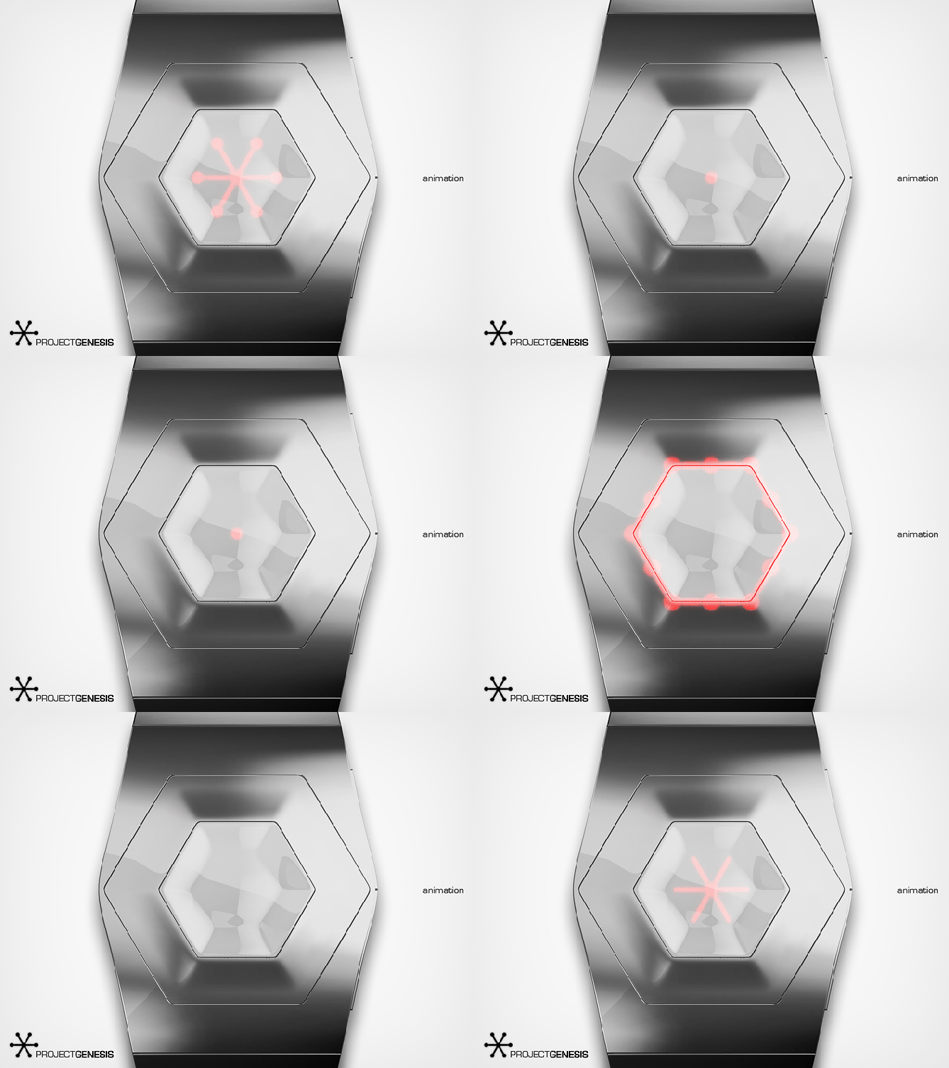
Looks great. The first animation reminded me of the old TF. Infection watch, which I still love. The black face would be my preference (both for appearance and readability). Definitely 5*/Y.
LikeLike
Thank you Nev! Oh yeah, animation is a must 😀
LikeLike
sorry it took me so long to comment on this one, sam. I haven’t been that present on the blog lately. you know I like this one, though. 😉 I especially like the green on black display.
5*/yes
LikeLike
Yay, thank you ruoy nainotulb ssenhgih ^^ Then green one for you then!!
LikeLike
Too difficult for me to learn and understand…
LikeLike
Don’t worry, it’s normal. Maybe you find another cool concept here that rocks your world 😀
LikeLike
Would definitely buy! Thumb’s up! 5*
I LOVE this design!!! I told myself I wouldn’t buy another TF watch until I can get my hands on Laszlo’s PCB design (’cause I’m crushing on it so hard), but if somehow they rolled out the Genesis first I’m not sure I could control myself!
I do have a display question, however: Shouldn’t minutes always be displayed fully INside the interior of the hexagon due to dot and bar sizes? I ask because in two of the above examples, minute bars/dots are using the main, bigger hex band. In pic#4, “07:44pm,” wouldn’t the northwesternmost two dots, 10/50 and 11/55, along with the interconnecting bar, be thicker (you called them “big dots” above) seeing as they are on the main hex? And again in the last set of examples, “05:52pm” (ex. 2 spoiler!), wouldn’t the true north dot–12/00–be thicker? It seems like the dot and bar thicknesses would be preset and non-negotiable.
Maybe it’s just a rendering error. Maybe I’m missing something. Either way, hurry up and make this watch a reality TokyoFlash, then I can give you more of my money!
LikeLike
Woofzy, you looked at thes time very closely! Yeah, these two are errors. The correct time telling isn’t affected by this error, but the smaller dots should never touch the hexagon. The hexagon is reserved for big dots only assuming that an underlying LED can’t be made size changing (and if, it would be too expensive and wouldn’t serve an epic purpose anyway) So being small is ok because big dots are reserved for the main string between hour and 5-minute-increment. Good that you saw this 😀
Thanks alot for checking and for supporting this design Robert!!!
LikeLike
This one is nice. I like the moving pm indicator. I like the similarity with the Maru. The 4 single minute make it more complex but also more interesting. I like the hexagonal shaped display. (When I was younger, I liked molecular chemistry/molecular physics but never studied it)
5*
LikeLike
Thanks for the comment and the support Makk!! I see what you mean by “similarity with the Maru” now. Oh I like this relationship between complexity and fascination. That’s fun. Keeping a certain degree of readability can be tough at times 😉
LikeLike