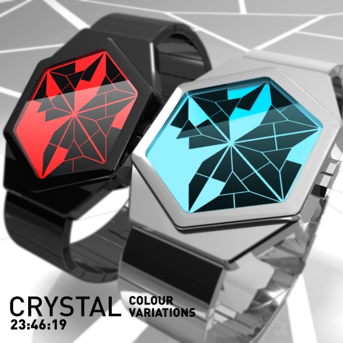
Design submitted by Laszlo from Hungary.
Laszlo says: This LCD watch indicate the time with cryptic crystallized numbers in three rows. Hours, minutes and seconds (from top to bottom). Hard to read at the first time but not too complicated if you have some time to invest in learning. (the seconds are very helpful in learning)


Your best design so far. 5*
LikeLike
Thank you Nev!
LikeLike
Thank you Tokyoflash for posting this concept.
LikeLike
These are some very clever digits, for sure! Took me a good while to work them out at all, and I suspect it’d take some time to be able to read them at a glance. Not that that’s a bad thing…=)
I really like the way the digits fit the display and vice versa; very nice integration. Simply put, one of the best hexagonal designs so far, in my opinion.
LikeLike
😉 Thank you Anders S for your detailed comment!
LikeLike
good job/5*
yes!
LikeLike
Thank you Timur.!
LikeLike
Looks pretty good, but the readability isn’t great. I think the numbers are too indistinctly shaped for how tight the placement is.
Not speaking specifically about this watch; but that’s something a lot of the watch designers on this blog miss, I think. If you’re trying to display infomation in a dense format, then you really need to focus on making it readable. Around here, it seems that there’s often very little thought put into the numbers beyond the asthetics.
It kind of goes against the entire point of a watch if it’s not conveying the time in a clear manner, is my point.
(That’s not to say obfusicating or stylising the display is inherently bad, just.. it needs to be done with consideration)
LikeLike
No problem Naggarok, thanks for your comment I heed your advice.
LikeLike
I like the look of this thing, I initially assumed it was analogue time telling, so was quite a suppose to realise it was digital. I had some trouble getting used to the digits (they could be less cryptic) but that is something you would soon get used too. 5/Y best of luck sir! 😀
LikeLike
Thank you Pete!
“soon get used”… The time is our best friend! 😉
LikeLike
I am a fan of this display. It reminds me of the LCD version of my CRAX display. The digits are cryptic in a similar way, but I like that yours has seconds too, and the display shape is more unique. The color choices are really nice, and I like the name. I’m not crazy about the case itself, but the main idea here is the display, so 5*/yes.
LikeLike
Knaht ouy yrev hcum Rehtaeh!
LikeLike
I think it looks great Lazlo (as usual), but the numbers seem a little ambiguous to me, especially since they are all in such close proximity to one another. Maybe you could come up with clearer numbers by dividing up the triangles in another way. Another problem for me is that you can’t have a “quick reveal” with this design. My only other criticism is that the buttons might be a bit awkward to use for some people as they are quite small and very close together, but that’s not important at this stage as the overall design is really TF’s area anyway. Good luck with it! 😉
LikeLike
Thank you Mushy.
The numbers are directly placed so close together that it is very puzzling to read the time. At first glance, might seem a bit difficult to actually decipher but little experience can easily learn. (I think)
…The key problem: you’re right!
LikeLike
OK Laszlo, it’s growing on me. 😉
LikeLike
Please put the “s” in my name! (Laszlo)
LikeLike
Sorry La”s”zlo! 🙂
LikeLike
(cool)
LikeLike
Very nice usage of the hexagon. The chrystalline numbers look very cool. It really has to be an LCD watch so you can always see the interesting mosaik display. Good luck Laszlo!!
LikeLike
I’m glad you like it Sam. Thanks for the good wishes!
LikeLike