Design submitted by Heather from the USA.
Heather says: My brother actually came up with the idea for a watch called PART TIME, and originally designed the digits for it. I submitted these digits back then, but did not have a good presentation for it, so it never showed up on the blog. Now that my 3D skills have improved, I decided it is time for me to resubmit.

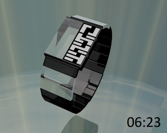
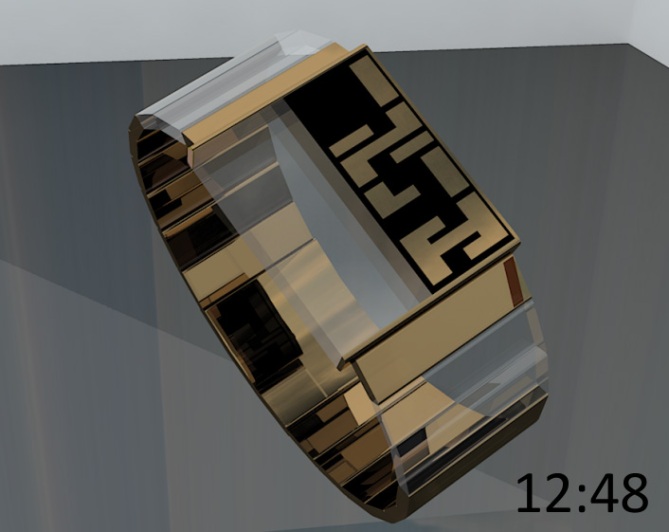
PART TIME has a case that is half crystal (clear, ornamental), and half LCD, displaying four stylized digits of time from top to bottom. Each digit was created by using familiar digits, with small sections removed. The segmented strap also has a few clear links to reinforce the theme of “PART TIME” – like you can only see part of the watch.

I can see this unisex watch appeal to many, as it is not only easily readable, but also futuristic and stylish.
This watch stands out because of the unique look of the case and strap created by the clear sections.


Cryptic and cool! Lovin the half transparent nature. Has a real retro futuristic look, me likey 5/Y Best of luck Heather! 😀
LikeLike
Thanks for your support, Pete! 🙂
Yeah, I have about three watches in my collection with transparent features on the case, strap or both, Kisai Spider included. I’m definitely a fan of the concept. I haven’t seen it done this way, however, so hopefully it will be popular. 😉
LikeLike
Pretty sharp, nice watch 5*
LikeLike
thank you, Gordon!
LikeLike
This is rather special. I really like the transparency. I can imagine some blue LED’s hidden away to make the glass glow at night. Excellent job Heather!
LikeLike
Toky, it’s so nice to see you in the blog comments. 🙂
Thank you for your compliment! This made my day!
LED’s to make the glass glow? AWESOME! 😀
LikeLike
Expand on that somehow. Instead of just the glass on the face glow,
maybe the initial pieces of glass on the band glow as well? Just a thought.
Amazing Concept. It is easy to read and the Gr/Bl/Glass with Blue LEDs
will definitely be an eye catcher in the real world.
Great Job Heather!
LikeLike
LED’s in the glass would be nice.
LikeLike
Nice, not difficult to read! 5y
LikeLike
Thank you, DZ, for your short but sweet comment! Much appreciated. 🙂
LikeLike
Hi Heather, I Love Typography numbers, criptique and legible at a time. I also like the transparent parts of the bracelet, on the other hand I understand less the transparent part of the dial or, like known as the production of Tokyoflash, to add something in this zone.
5 * / Yes.
Heather is soon the best in 3D!
LikeLike
Merci beaucoup, Patrick. I thought the half transparent part of the dial would be a nice attention-grabbing feature, as it would be quite a new look on the wrist. Plus, TF’s comment for LED’s to make it glow at night would make it super-droolworthy! Thanks again for your comment and support! (and for recognizing my improvement with 3D) 😉
LikeLike
This is definitely my favorite of all your works. It’s really good.
Congratulations for your right solution for the numbers as well as the design of the shape.
My support for this concept. Good luck Heather. 🙂
5*/Y
LikeLike
Thanks for your support and good luck wishes, Jose! Your favorite, eh? What a nice compliment! 😀
I really appreciate the time you took to leave a comment, and help make my day more cheerful!
LikeLike
Lovin’ the transparent sections; having the odd see-through link really makes the concept. I don’t see anything that I’d have done differently, nice stylish shapes and digits to match. I think it’d look fantastic with an aged bronze look and a matching mirror LCD for the numbers. Kinda like the third image suggests. Great work Heather! =)
LikeLike
wow! thanks for your detailed review, anders! 🙂
quite a compliment, especially coming from you.
LikeLike
Very nice work Heather! 🙂 I prefer the black version. Good luck with it.
LikeLike
thanks Lloyd. with any luck, maybe you can buy a black one some day! thanks again for your support! 😀
LikeLike
Amazing design. Unigue, beautiful and interesting.
LikeLike
thanks for the very nice compliment, bdeborah. 🙂
LikeLike
This one is really cool… awesome 🙂
LikeLike
woohoo! thanks, peter! 😀
LikeLike
gonna do a flavor flav and say wooooooooow!
i like it very much 5/Y 🙂
LikeLike
haha, well, thank you very much, diclonius, for the excellent review! 🙂
LikeLike
ANOTHER BRILLIANT DESIGN BY HEATHER SABLE WHO HAS AN UNCANNY PERCEPTION OF FUTIRISTIC BRILLIANCE.I LOVE THIS DESIGN.
LikeLike
Thanks for your support and your so eloquently worded compliment, Vito!
LikeLike
Very nice work Heather! 🙂 I prefer the black version. Good luck with it. http://hi-techs.com
LikeLike
Hi, Tony. I think I like the black version best too, although I find it hard to choose just one. I quite like the other variations as well. Thanks for your support! 😀
LikeLike
This is a great look and design, the only question I have is why does the 9 have the extra piece on the bottom left, makes it a little harder to read but it is a great design and if I weren’t so lazy i’d just learn to read it just fine.
LikeLike
Heather great design! You go girl!!!!!
LikeLike
Exceptional! Great design! Five stars for me! I’ll buy this immediately, if it were available right now 😉
I’d rather use Plexiglas instead of glass, for better resistance and edge lighting. And what about using e-ink instead of LCD?
LikeLike
This one’s special. The numbers are cool and shown in an interesting way. I like the empty transparent part although I normally want the case as much informative as possible. It’s a nice twist for fashionable reasons and it works. It’s really a mix of bracelet and watch. I’m not sure if it’s something for my wrist… yah, the different look is worth a purchase 😀 Good luck!
LikeLike
I like the overall look. I have one suggestion: Center the LCD screen. 5*
I like TF suggestion to add LED’s in the glass.
LikeLike