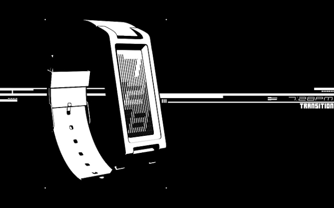
Design submitted by Sam from Germany.
Sam says: This is a project, I couldn’t properly sketch for on paper. I imagined a pattern that consists of LCD lines with different thicknesses. I wanted to create a cascaded gradient from dark to bright (or vice versa) that contains the time telling numbers. The lines of the backgrounds and the adjacent numbers should be interlocking and create a black and white mesh.

I tried around to let the pattern look stylish and Peter Fletcher asked, if this system would work with italic numbers. It does and this simple action results in a nice dynamic and eye-catching effect.

I let the gradient go brighter in reading direction (up to down) when it’s a.m. When it’s p.m. the gradient is inverted and goes darker. Doing so, the gradient reflects the daylight condition of the relevant daytime – increasing in the morning, decreasing in the evening.

For the presentation, I reduced everything to black and white. The transition pattern can be translated in very different ways. Black, colored or mirror LCD on quite a selection of backgrounds can be done. The result would always be stylish and fashionable. I chose a smooth and angled case with soft straps and hope to have achieved a unisex watch for arts lovers.


I am very attracted to the no-nonsense approach for this watch – its simple style. Just enough to be perfect.
LikeLike
Oh wow thank you! I contained myself this time. Right now I’m working on a watch and also went some steps back to a less complicated version. It’s interesting how differently ideas can be translated into presentable concepts.
Also thanks for posting this concept!! Pretty poetic headline up there 😀
LikeLike
pretty friggin’s awesome. 5*, and i will definitely buy it if it’s not too big/clunky for a woman’s wrist.
LikeLike
friggin’, not friggin’s. lol
LikeLike
I like it. It reminds me the old-fashioned digital signs, like those on Times Square. I don’t know the right name… neon billboards? “Rain” also would be a good name.
LikeLike
This is my new favorite! I really like the graphic display. Fresh, bold and to the point. Congratulations, fully support this idea!
LikeLike
This design has got to be up there with the best that have been on the blog! So simple (concept wise 😉 ) but so effective. Also the sin city style graphics are super cool. 5/Y best of luck Sam!
LikeLike
I love it, very origional . If it comes with a Metel strap I’d buy one.5stars
LikeLike
Spendid work. One of the best ideas I have seen on this blog 🙂
LikeLike
I mean “Splendid”, not spendid 🙂
LikeLike
Hi Sam, splendid job, as usual, Black & White effect successful.
I have a little side note, I have to have mind warped by TF, I find that the reading is too easy, it’s just a point of view in relation to the mind “Tokyoflash”.
I love the work and the surprise of Black and White, with 5 stars and the inch in the air!
LikeLike
Hey, Sam! Kudos on the simple elegance. It’s friggin’s cool.
LikeLike
come desing demo ni Sem tapi wat gapo demo wat style ite puteh ni mace komik pun ada. tapi kawe tetap sokong!
LikeLike
Thank you guys and lady for your comments! Very inspiring how you see the watch. Hope you all have a nice weekend!
LikeLike
Not sure why, doesn’t grab me all that much. Am I the only one? I think I’d have to see it for real to be swayed 🙂
Anyway, 5y for effort!
LikeLike
Thank you DZ! Maybe others are afraid to tell, or it’s just too okay to say something. We’ll see how things develop 🙂
LikeLike
I really like the concept
Great job as usual. Inspirational Black, White and Cosmopolitan. I remember the big luminous advertising of Times Square but in BW. congratulations. Good luck Sam 🙂
5/Y
LikeLike
Thank you José! Very nice association 🙂
LikeLike
I agree that italic # are super nice. I like the 3 rows division. The monochrome is ok. I don’t like the gradient idea.
LikeLike