Design submitted by Heather from the USA.
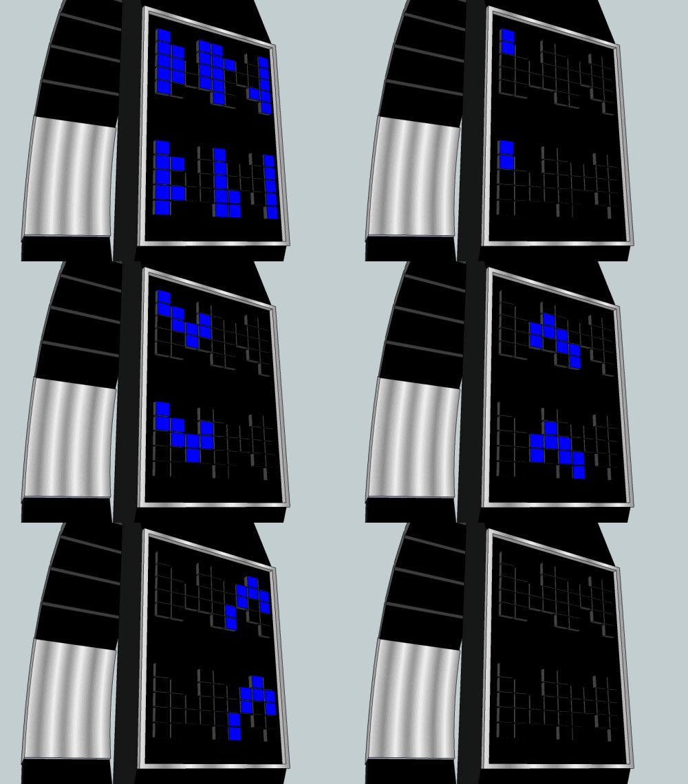
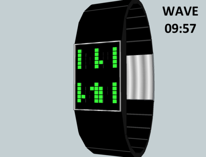
Heather says: I was actually inspired when I tried to read a watch display concept by Lloyd from Australia. I was reading it incorrectly at first, looking for digits that weren’t there to find. But then I thought, that would work. So I developed this LED concept with animation that is basically an LED version of Kisai Stencil. Because the only LEDs necessary create a somewhat wave-like layout, I decided to give it a wave-like animation and entitle it WAVE. The animation can be set to automatically turn on at various intervals.

I gave the LED layout a somewhat asymmetric look so it would look cool even when the LEDs are off. Just like STENCIL, the digits are read by looking at the black space in between the columns of LEDs, rather than reading the LEDs themselves. Two digits for hours at the top, and two digits for minutes at the bottom.
This unisex watch (intended to be slim) will appeal to those are fans of LED watches, and enjoy baffling their friends.
The LED animation followed by the reading of negative space makes this design stand out from others on the blog.


Thank you, Tokyoflash, for posting this concept! 🙂
LikeLike
It’s excellent I like that!
LikeLike
Thanks for your support, Laszlo! 🙂
LikeLike
Looks great and is easily read. Ideal every day watch suitable for all TF and non-TF fans alike. 5/Y best of luck Heather!
LikeLike
Thanks a lot, Pete!
LikeLike
Good job Heather! 5Y 😉
LikeLike
Thanks, Mushy, for the comment, rating, *and inspiration* 😉
LikeLike
Well Heather, not easy to read at the start and then blinks a little the eyes, it becomes very simple. Congratulations to Heather, and Mushy who is really strong!
5 * / Yes.
LikeLike
This is a watch that can also be performed with the LCD.
LikeLike
hey patrick – thanks for your comment, support, and rating!
i also considered the “EL Sheet” technology that TF mentioned in their last progress report – like LCD, but glowing like LED, so more of a cross between the two. That might be neat for this if it could be made with a slim case. 🙂
LikeLike
Hi, Heather! This is my favorite design of yours to date. I love negative space! And I appreciate the asymmetrical design when the display is off. 5 stars and yes!
LikeLike
Thanks, xian, for your comment, rating, and support!! That’s quite a compliment. 🙂
LikeLike
I love it! The concept is hard to read at first, but then after a few minutes I was able to realize how to tell time. Very colorful and a nice design. 5 stars and yes!
LikeLike
Thank you, Matthew. Yeah, it is meant to be a similar experience to the Stencil watch when you read it. First you don’t see it, but then it appears. Thanks for the rating and support!
LikeLike
Yeah, great for confusing others, but easy to read if you know how. I love it. 5*/Y from me.
LikeLike
haha, yeah, confusing others is what i do for a living (teaching math – lol). thanks for you comment and support, nev! 🙂
LikeLike
Wow! Very sleek and attention getting. Beautiful style. A 5 star yes.
LikeLike
Thanks, Ron! 🙂
LikeLike
Similar idea as my posting Leftovers 2012-10-10 (or was Leftovers similar to Stencil) :-),
but much more colourful and slimer with an awsome animation. GMTA!
Best of luck!
LikeLike
My support for this idea
5/Y_ 🙂
LikeLike
Couldn’t take my eyes off it! Beautiful job 😀
LikeLike
Very nice negative display. If you concentrate on the light, it’s pretty cryptic. The wave animation is cool. Good luck Heather!!
LikeLike
The overall look is nice but I prefer to count light that are on & prefer LCD.
LikeLike