Design submited by Dietrich from Australia.
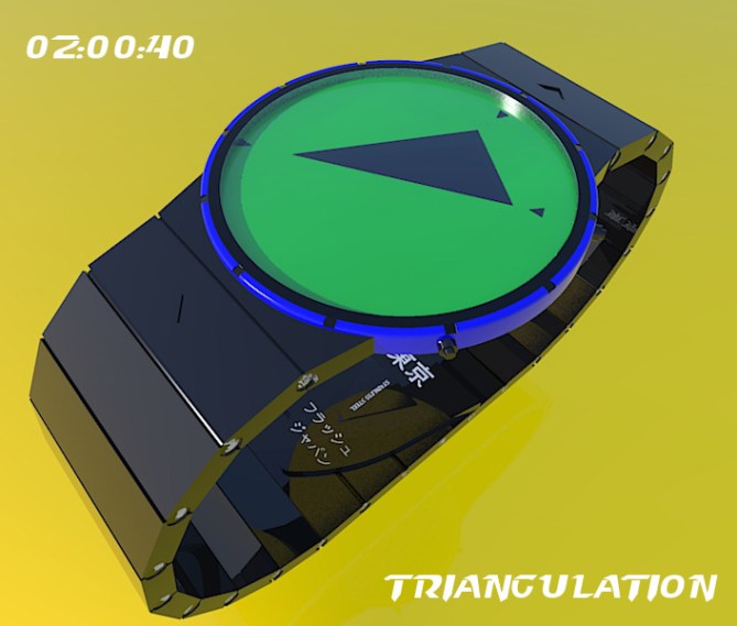
Dietrich says: This is a revamp of my previous submission, which was inspired by sundials and the video game Qix. This version is e-paper, instead of a mix of LCD/ LED, and is USB powered.

To tell the time:
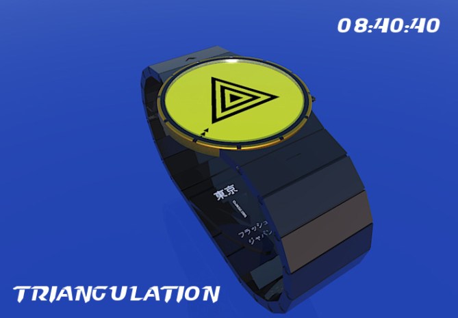
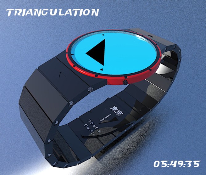
Small inner wedge = hours/ month
Small middle wedge = minutes/ day
Small outer wedge = seconds (this updates every 5 seconds)

The large inner triangle helps orient to where the wedges are located. It is formed by the positions of the small wedges, and updates every 5 seconds. When the wedges align, a mesmerising triple triangle appears…out of nowhere!!
Sleek, stylish, a little bit quirky. It is not often that you see a watch with a triangle being the main feature of the display!
It has been carefully crafted according to Pythagoras. It is strong and sturdy, being the base shape of all engineering structures. It will prop you up in times of despair. It will love you unconditionally!


http://www.tokyoflash.com/blog/2010/10/vector-watch-concept/#more-3497
LikeLike
Thanks TF for posting my revamp of Triangulation!
LikeLike
Hi DZ, this is definitely an improvement on the original design (which I liked a lot) much simpler and cleaner style. The only thing I have issues imagining is the transition from solid triangle to concentric triangles when the points merge. Don’t suppose you have a simple animation for that situation? Would be useful I think. I support this design 5/Y best of luck! 😀
LikeLike
Hi Pete,
Thanks for your support. I was trying to make it a bit sleeker…I think I’ve succeeded. Regarding the transition, there would be a slim triangle for 5 seconds before it turns into the concentric triangles. Sorry…no animation…it’s a real labour of love for me to put anything out…
Cheers,
D.
LikeLike
Good to see you back on the blog DZ. 😉 5Y.
LikeLike
Thanks, puzzle man!
LikeLike
Actually its not very easy to comment on this design with being honest. Plus, I have a watch shown by Barnie above, and my own Art watch which I believe can be made with epaper too, in addition to one submitted by Laszlo as better alternative to this design. I’m terribly sorry because I hate to be hypocrite to myself or to you for some purpose, but I wish you goodluck and sure, you can improve with more unique and original designs in the future. I obviously rate 5*, inclusive to this one, but I hope you don’t complain much to the average rating and take it positively as ignition for better improvement.
Best regards from the tropical peninsular.
LikeLike
Hi Firdy – I’m not too fussed about the rating, as my best rating so far has been 3.7. I’ve had a look at the Vector one before, and I actually think that design is a bit confusing. I do think it looks good, however – but I prefer mine.
There is a significant difference between the two designs which is easily overlooked – the wedges. In my design it’s possible to take away the inner triangle and still tell the time. If I were doing it again, I would make the three wedges slightly different in terms of size, that way time-telling would be even easier. Also, mine is in colour, something I like :). Maybe too much rainbow puke for you? LOL
When you mention yours and Laszlo’s designs, which ones are you talking about?
Cheers, and let’s agree to disagree 🙂
LikeLike
Hello Fausty, sorry I missed up ur comment, BTW, I don’t wana talk about my design, but have u ever heard about MATCHUP MUSICS? Try this…. goodluck to any either or both of you.
DISCLAIMER: NOTHING SHOULD BE CREDITED TO ME.
LikeLike
Looks cool, Firdy! Did you do that pic? Groovy.
LikeLike
1st, I prefer the band on this one. 2nd, I like the “cut-out” indicators. 3rd, I like what you did for the 8:40:40. But, I prefer the case/bezel of the previous version. Mainly because the 3 outer triangle where in different size. ( it doesn’t mean that this one is bad )
LikeLike
Yes, you’re right, Makkovik. I was going to make the outer triangles different sizes (refer to my comments above), but I ran out of energy. Cheers.
LikeLike
I like the new approach to the triangle display 🙂 It’s simple and good looking and I would definitely get it. Not sure about wich triangle idea rocks most. But it shows that Tokyoflash has to make such please. Cool idea about the triple alignment to show up special triangles. Happens rarely but it’s fun. Good luck Diet!
LikeLike
Thanks, Samukun! Hopefully we’ll have a triangle celebration one day. 🙂
LikeLike